Oolite Arts
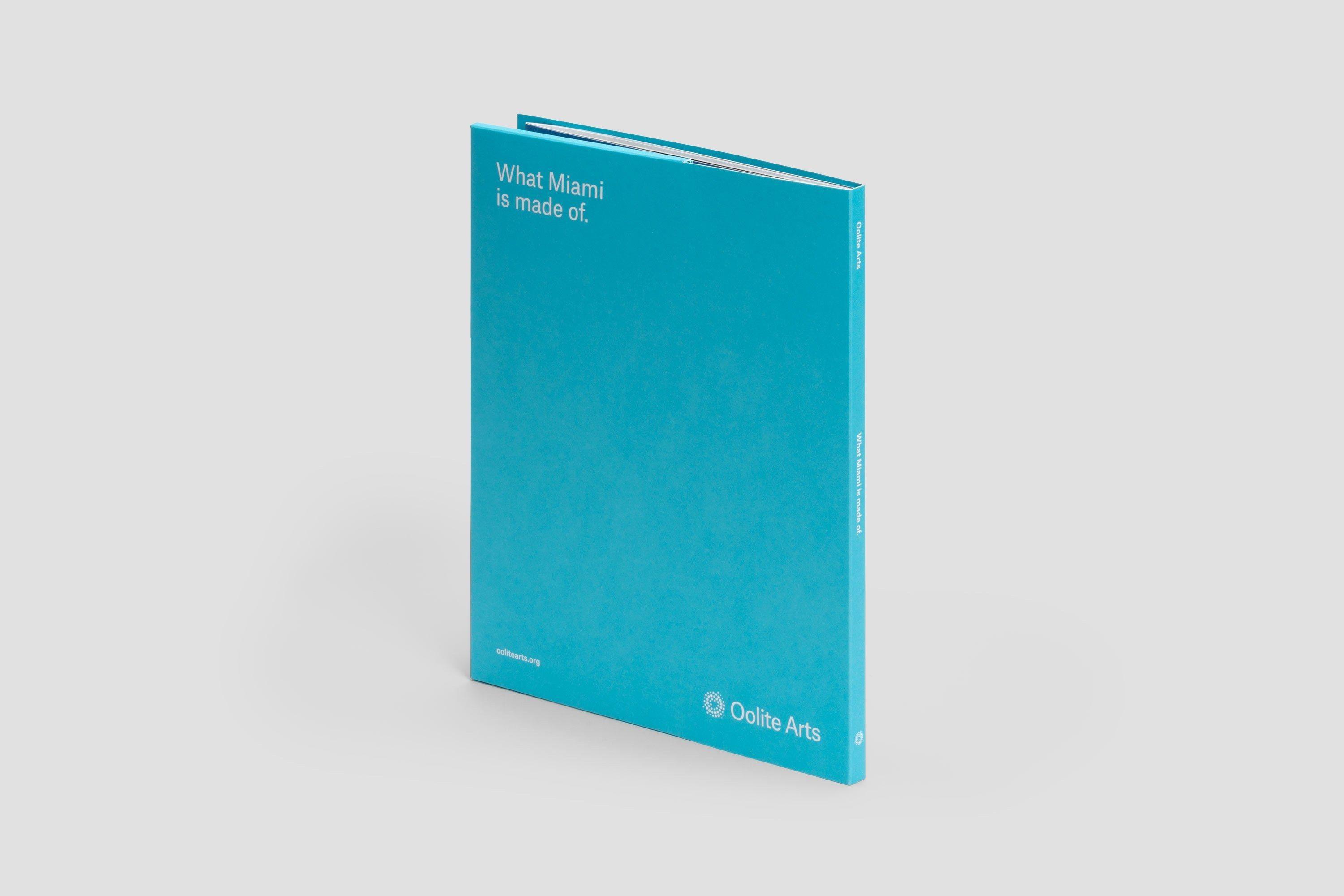
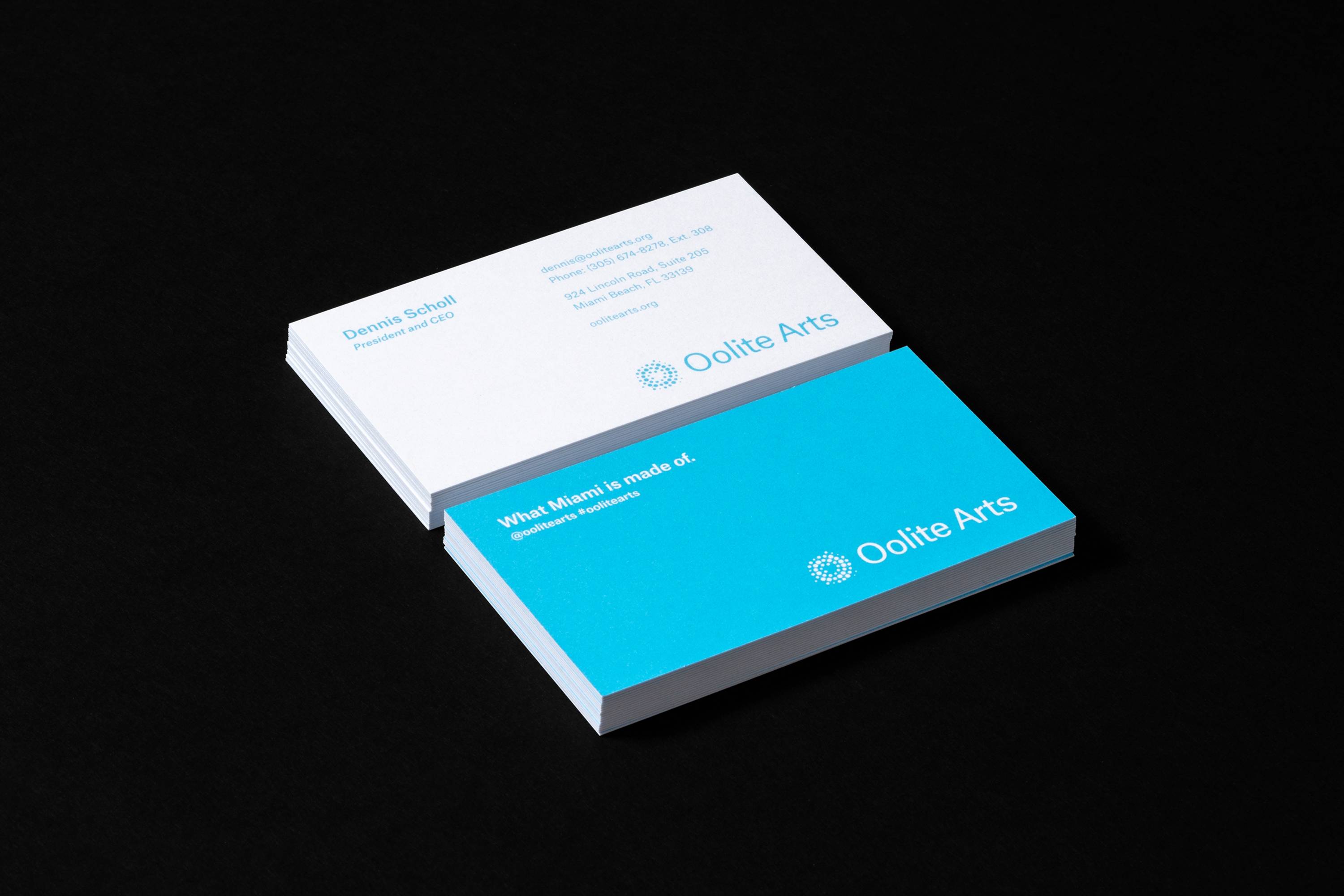
What Miami is made of.
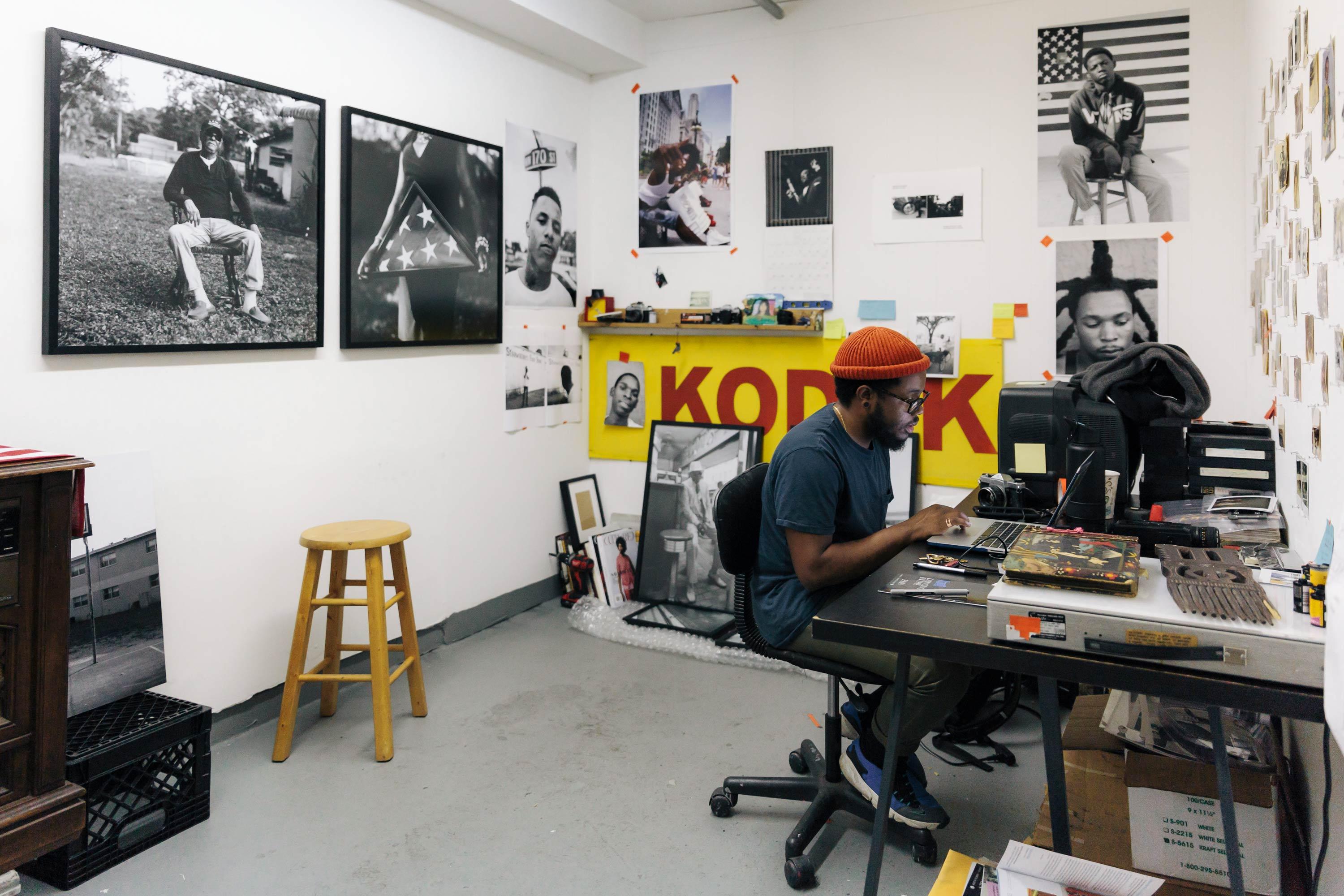
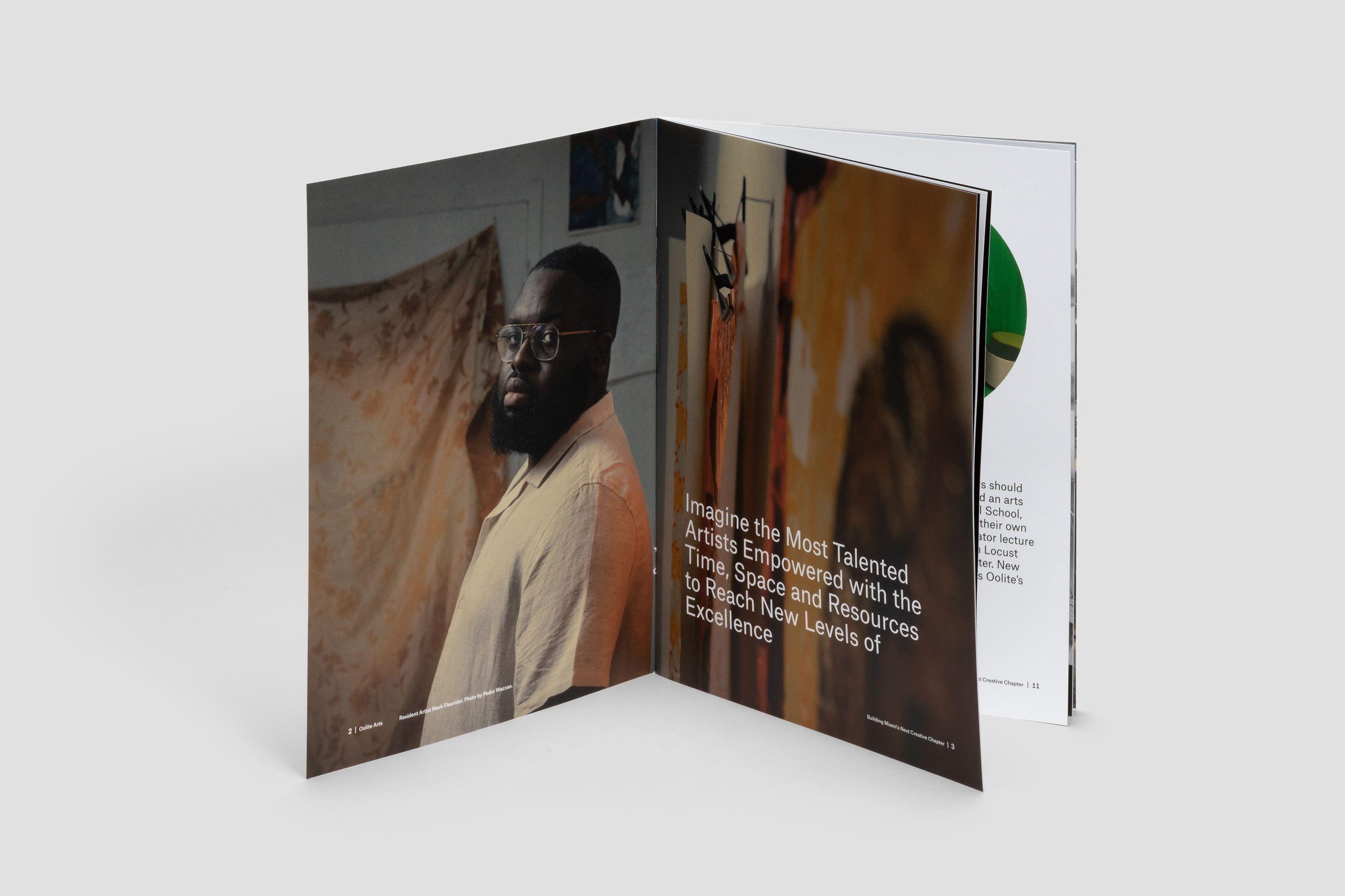
Oolite Arts is a community and a resource, providing artists with the free studio space, exhibition opportunities, direct support, and programming they need to advance their careers. They offer programming to the surrounding neighborhood and the wider community to help them better understand and create contemporary art.
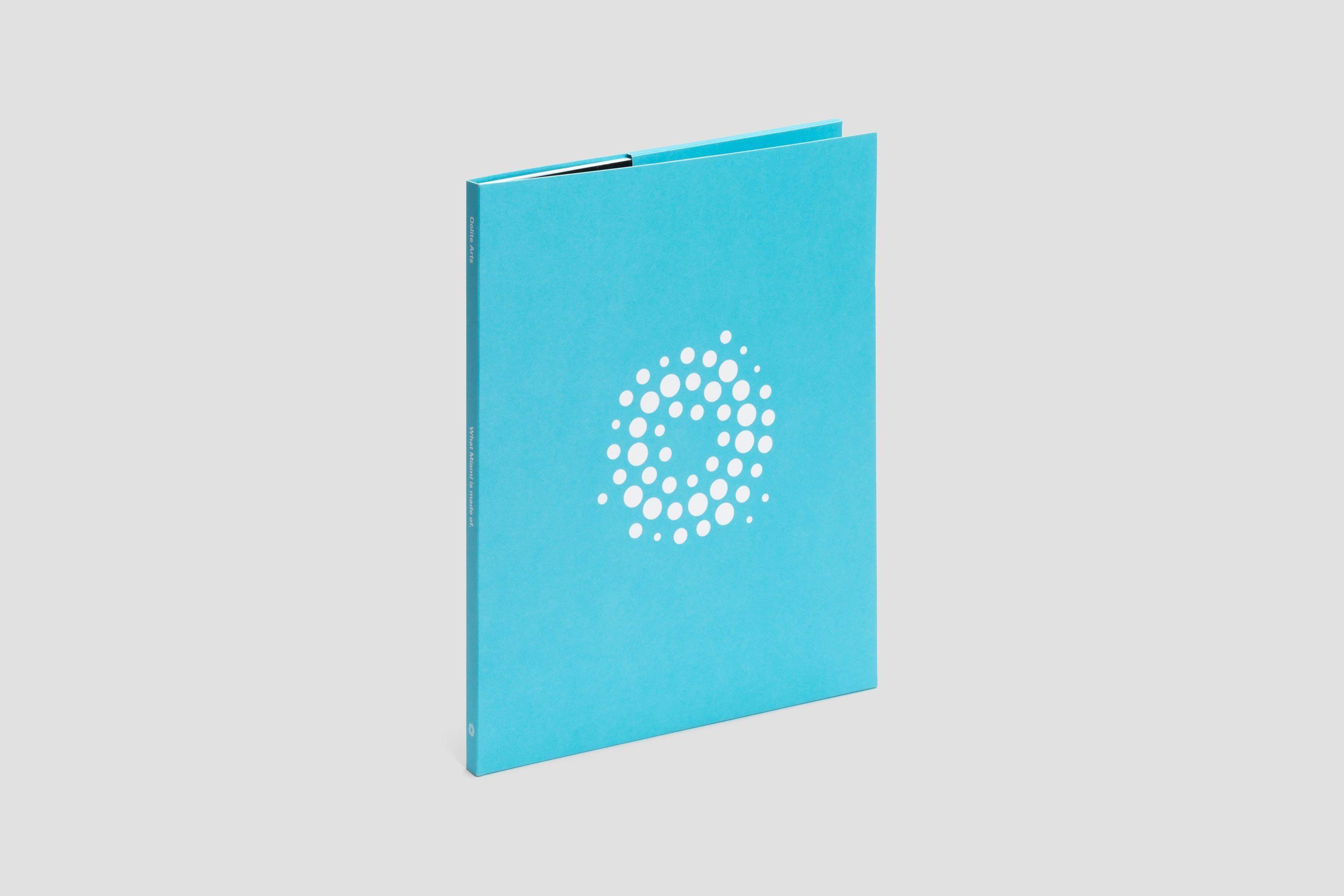
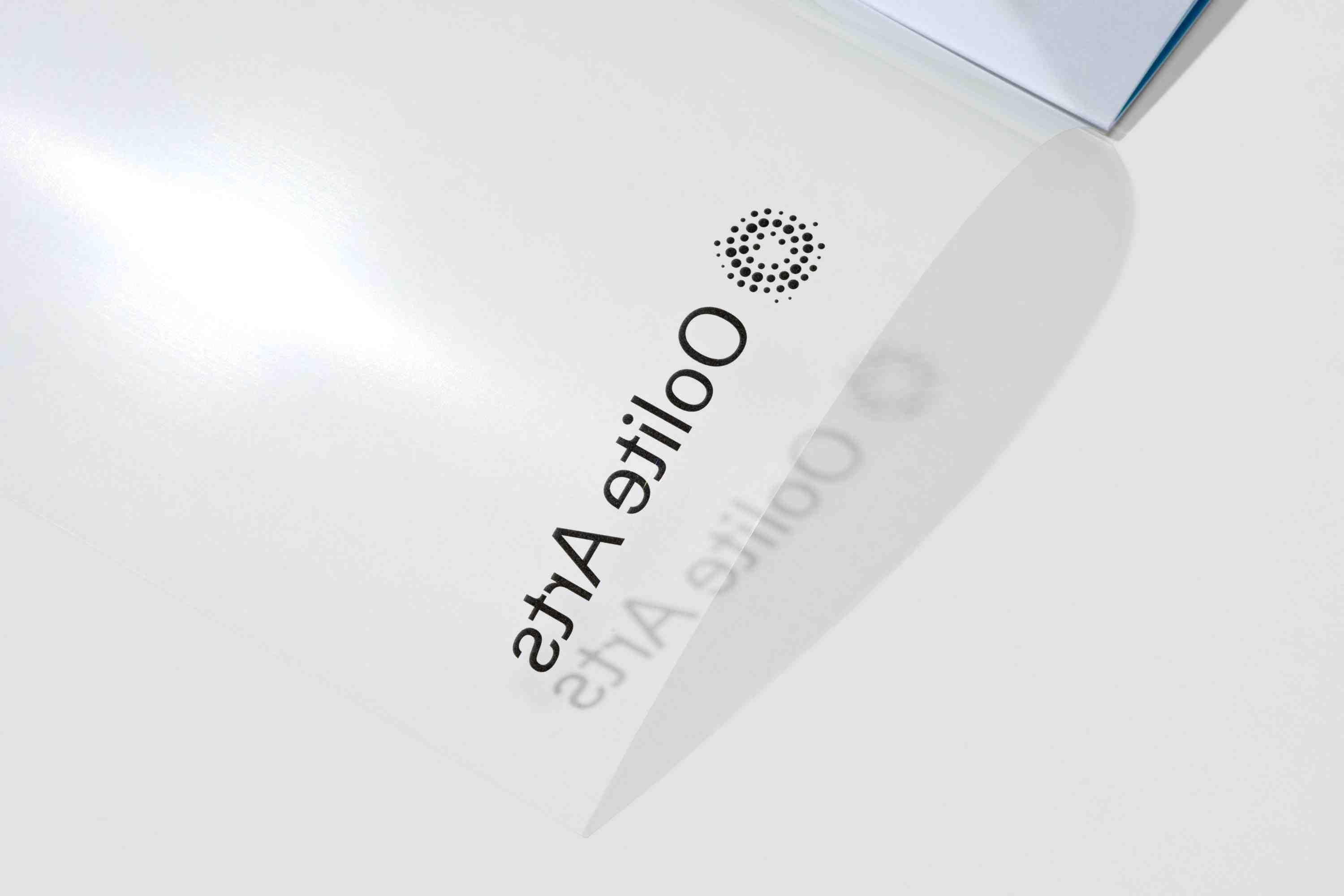
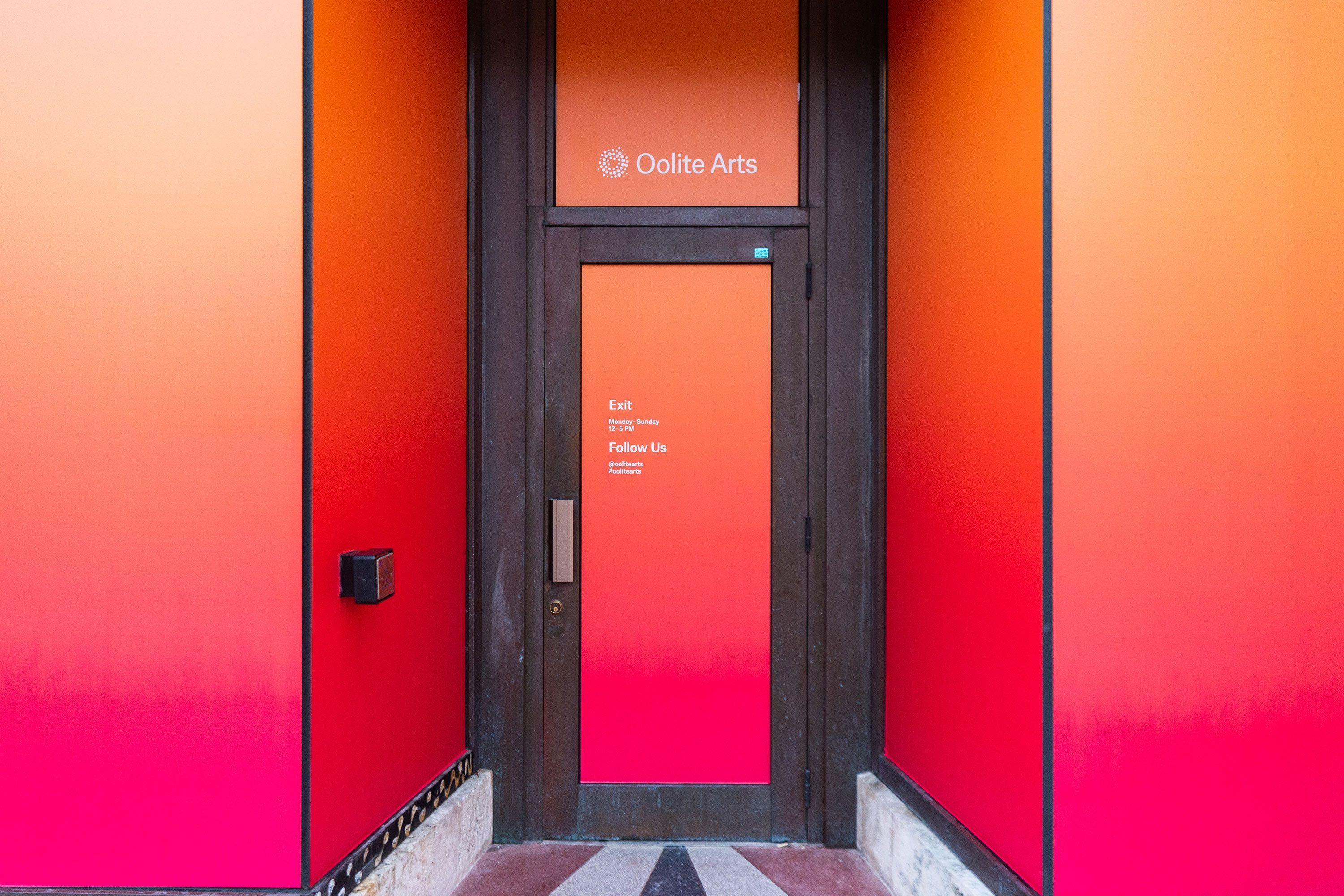
Oolite Arts’ logo utilizes round grains of varying sizes to represent not only oolitic rock itself but artists at different stages of their careers and the organization’s broader cultural community. Arranging the round grains with clear intention establishes movement and connection while signifying creativity. It unifies while remaining open and permeable.
Topos Graphics served as the principal Creative Director for Oolite Arts 2018–2024.
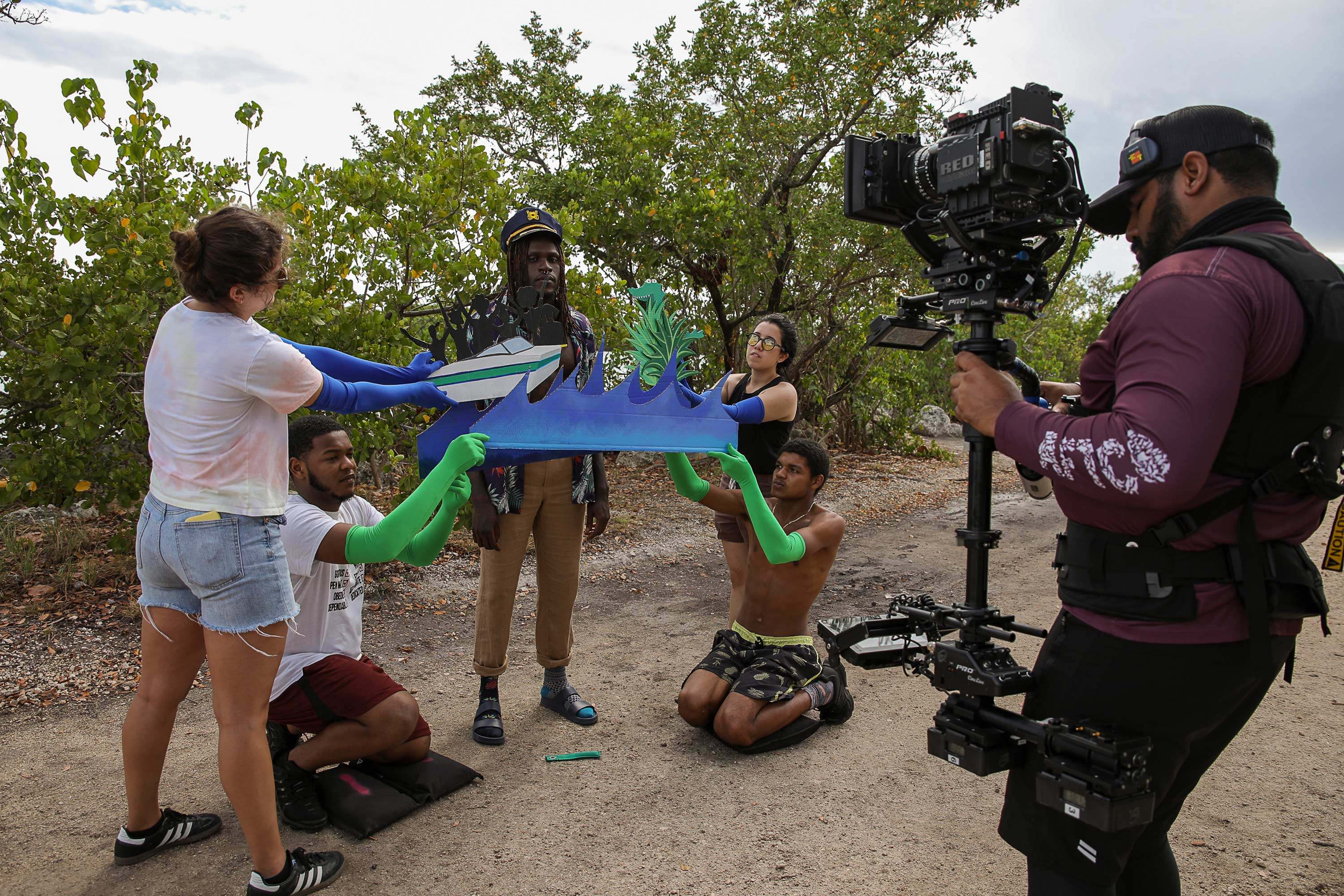
Art classes photograph and artist in studio photographs by Diana Larrea. Open studios and opening reception photographs by WorldRedEye.com. “Save the Bay” BTS courtesy of Jayme Gershen. Video Art Box photograph by Carolina Menendez.
Context
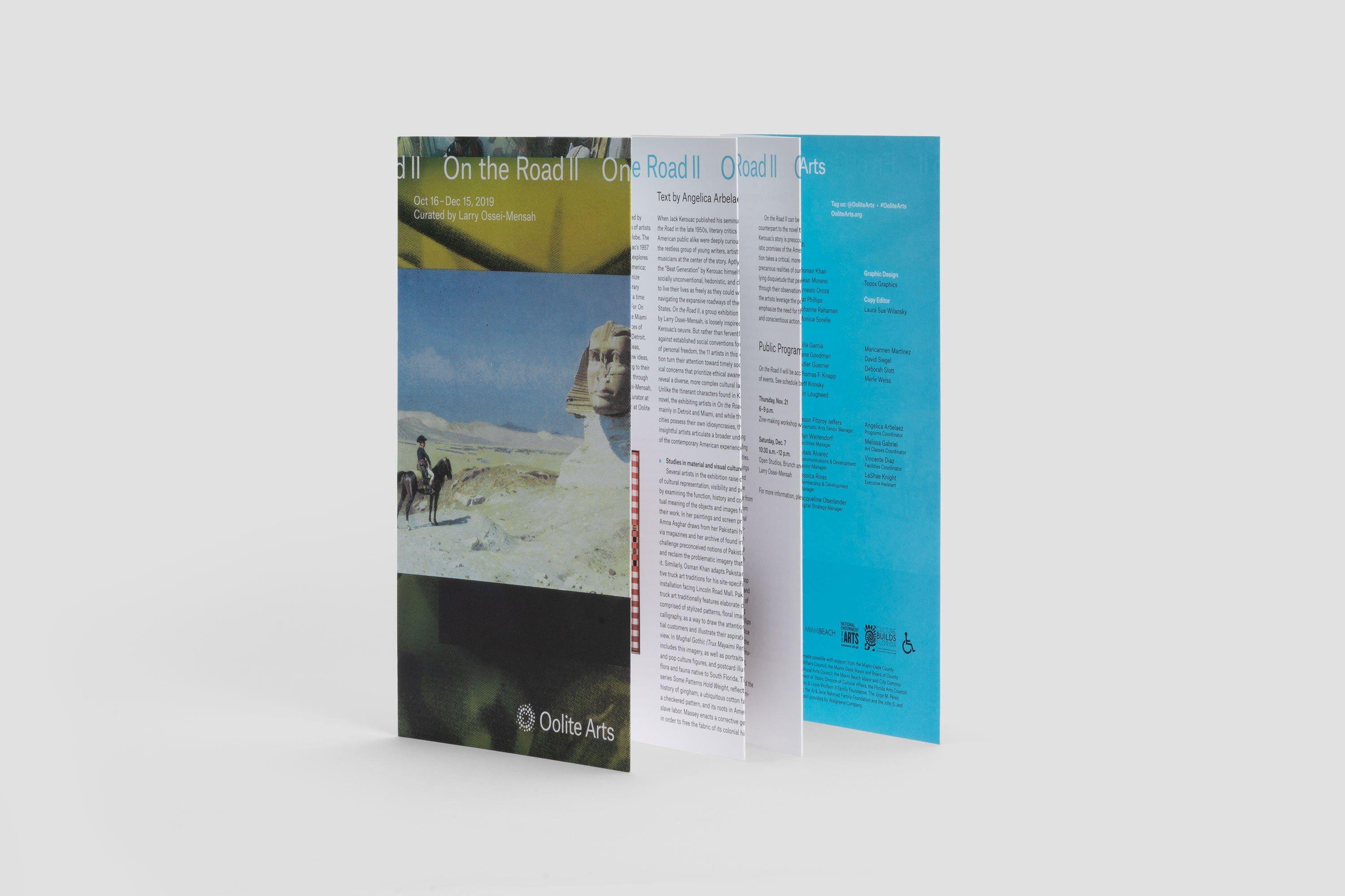
Initially established in 1984 under the moniker of ArtCenter/South Florida, Oolite Arts wanted to better reflect its mission through a new name and brand identity. The organization aims to be a foundational resource for its visual arts community and wants to carry that through in how they present to the world.
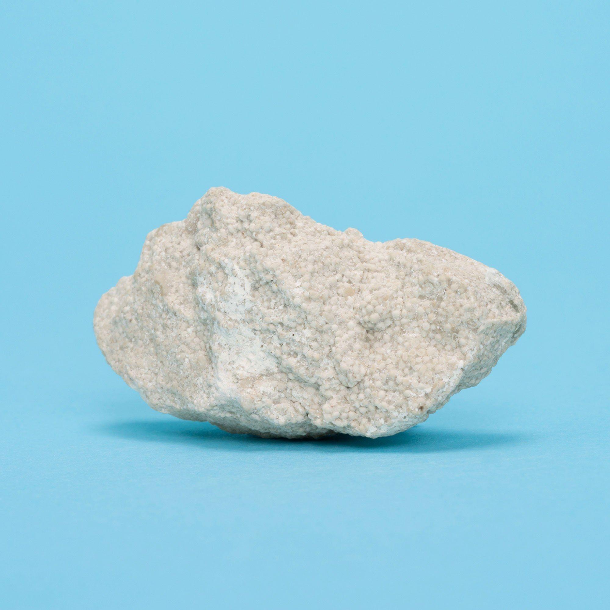
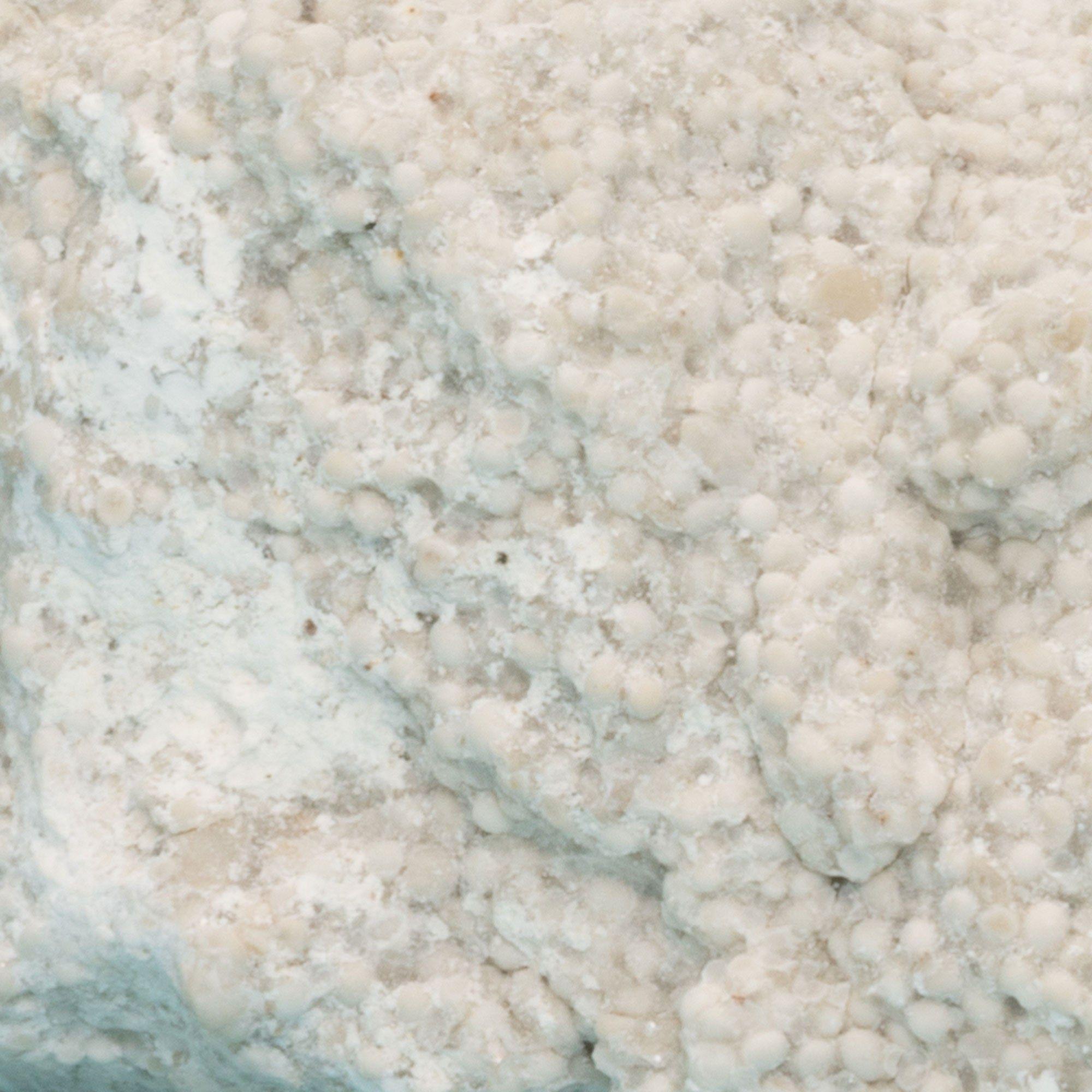
Oolitic limestone composes the bedrock beneath South Florida, an aggregate consisting of small, round grains that come together over time. Extending this concept as a metaphor for the artist residency, cultural destination, and creative learning center, we arrived at “Oolite Arts” which similarly connects and re-shapes individuals of the visual arts community in Miami.
“Originally formed as ArtCenter/South Florida, we felt that growing meant finding a new name that reflects both who we are and where we are going. Oolite is the sedimentary rock just beneath the street surface — literally the bedrock of Miami. As we think about how we continue to grow, we strive for Oolite Arts to be the bedrock of the visual arts community.”
Dennis Scholl, President, and CEO
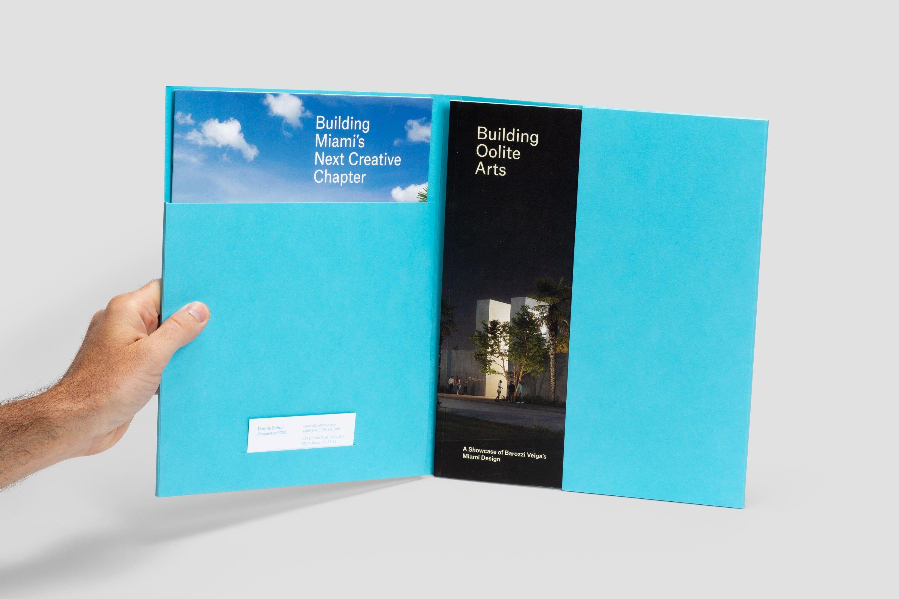
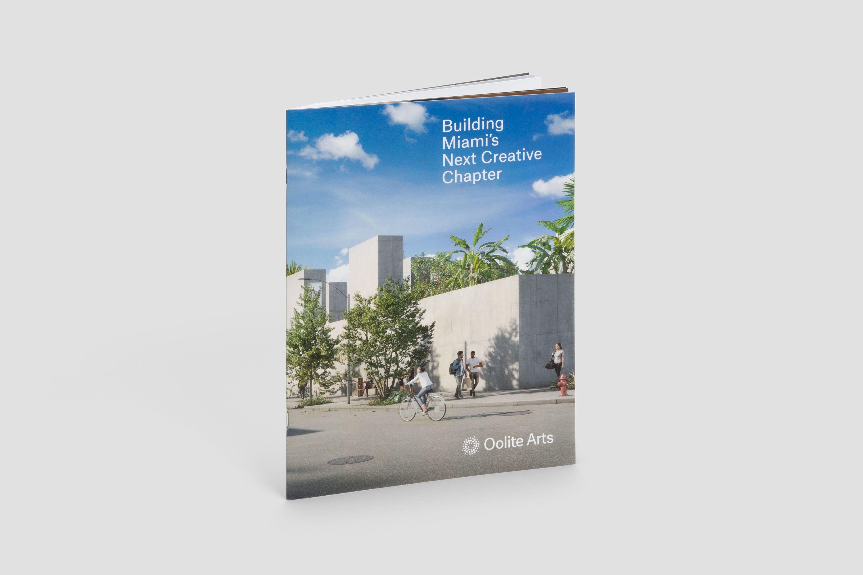
In 2018, we reintroduced Oolite Arts as the new name and brand identity of what was previously called ArtCenter/South Florida. This coincided with the announcement of its land purchase in the city of Miami. The move to this new home will shift its geographical location away from Miami Beach for the first time since its founding in 1984.
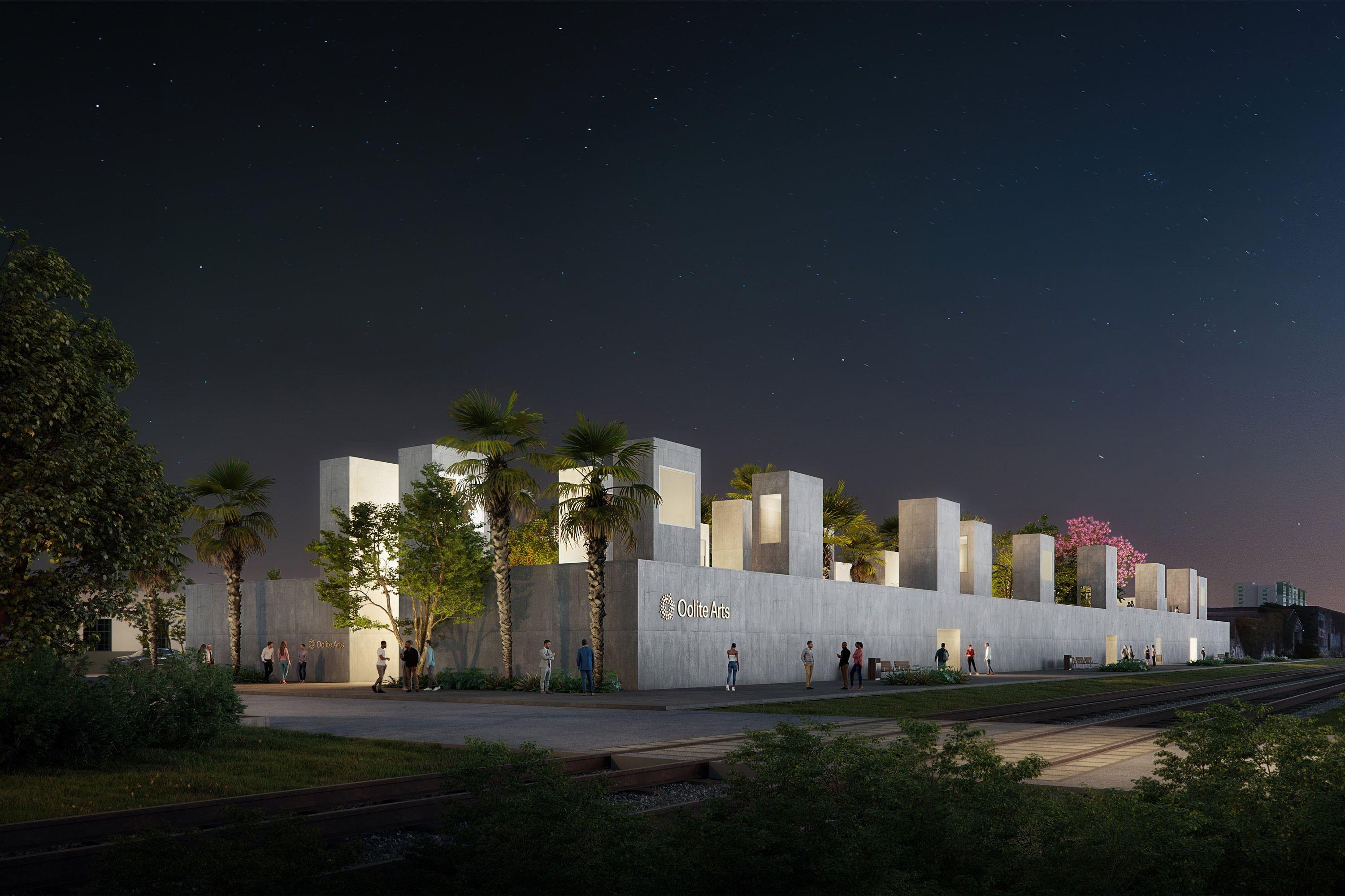
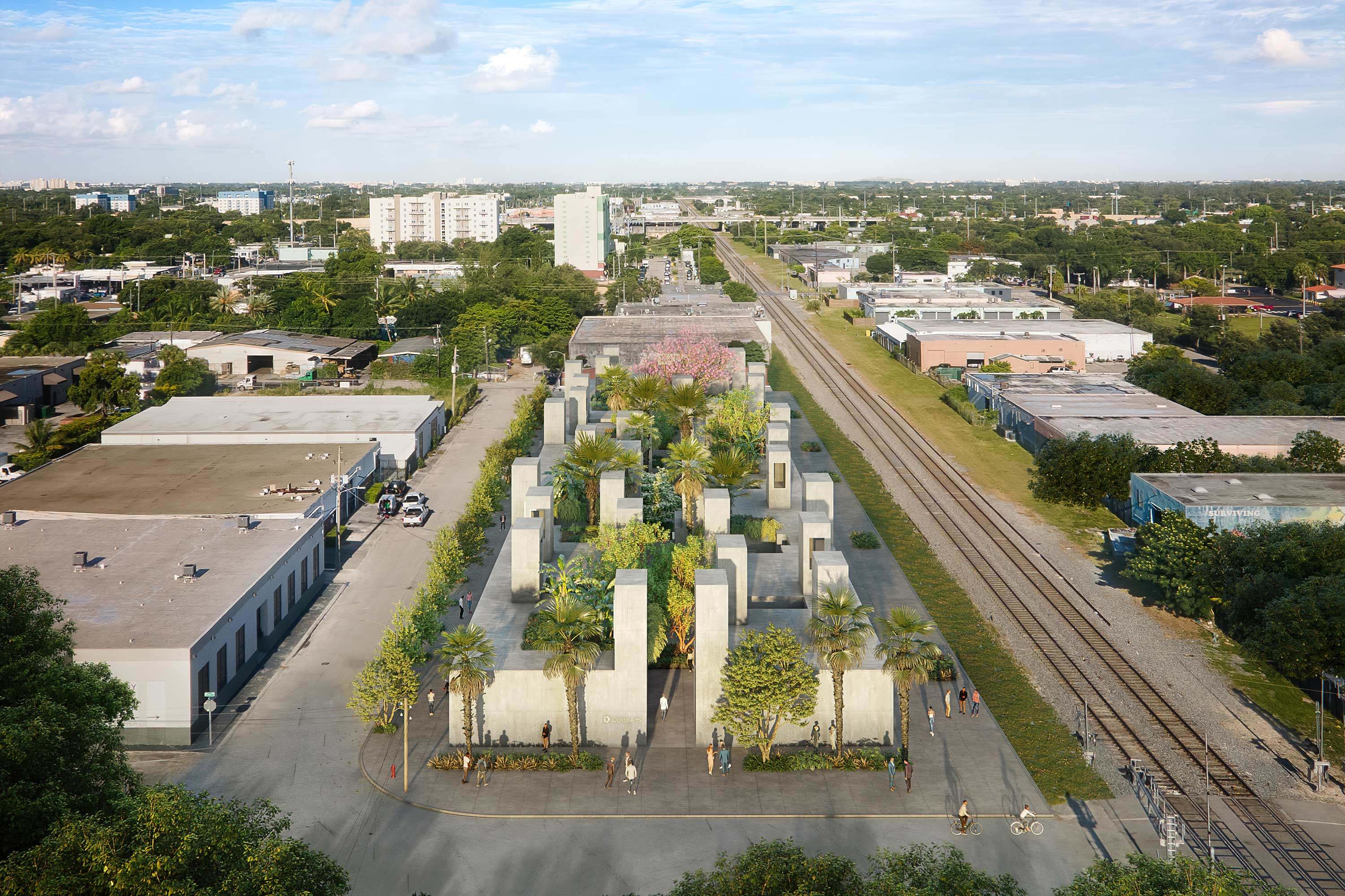
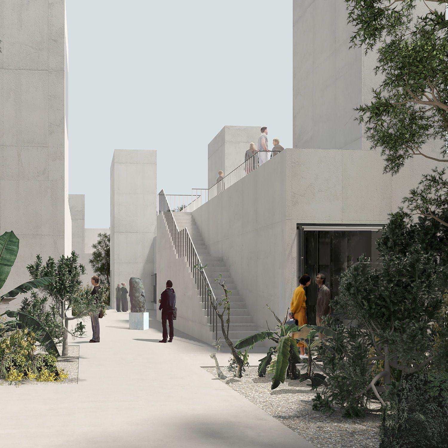
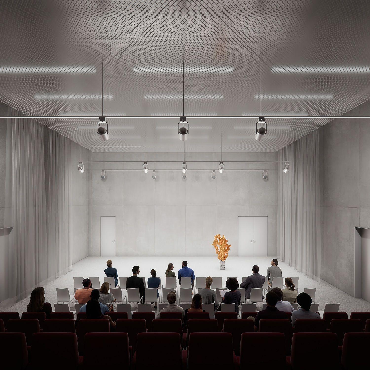
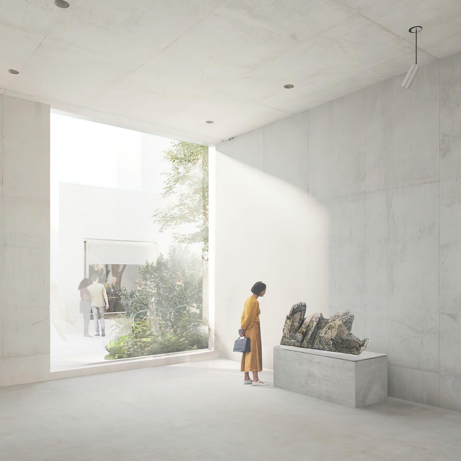
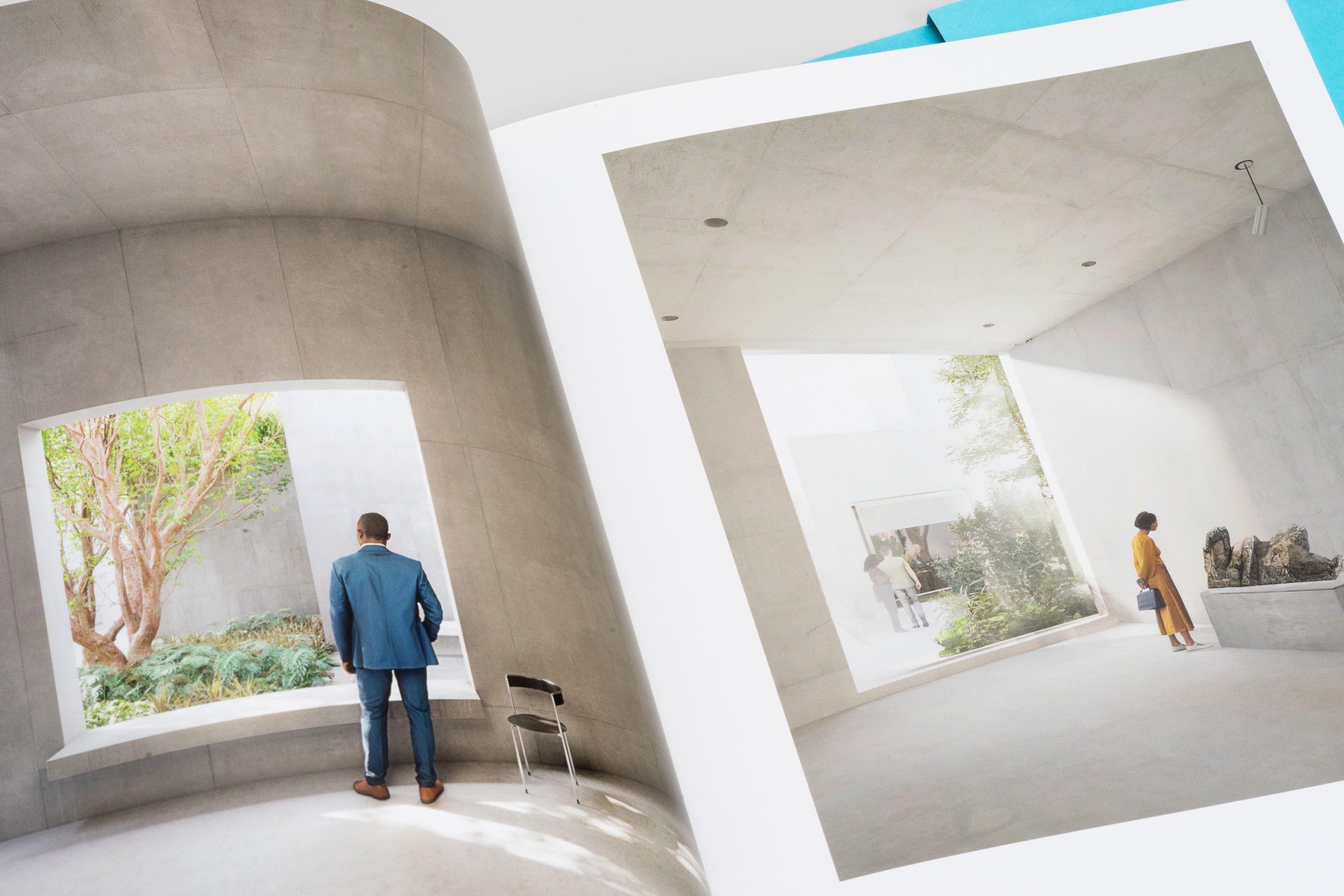
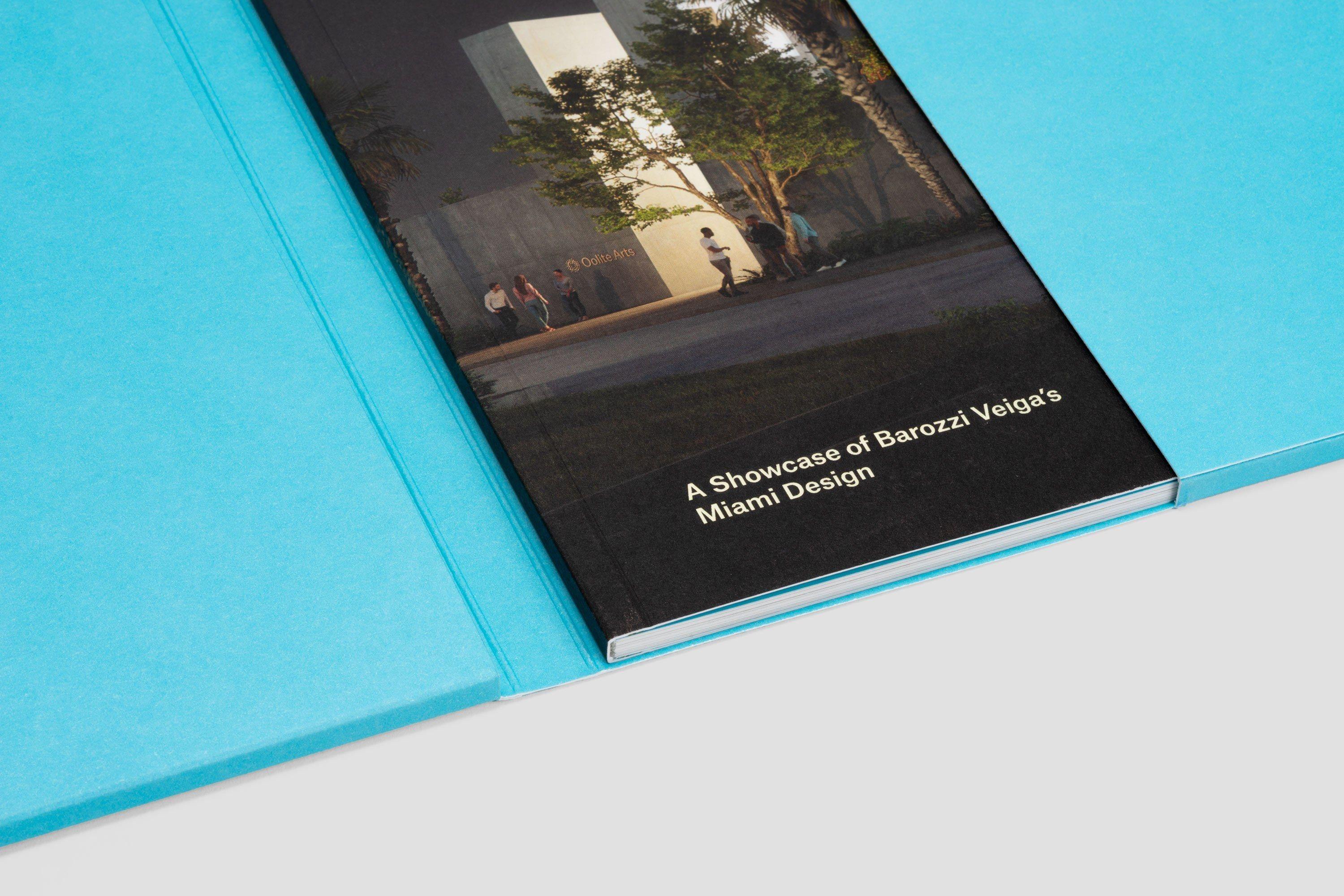
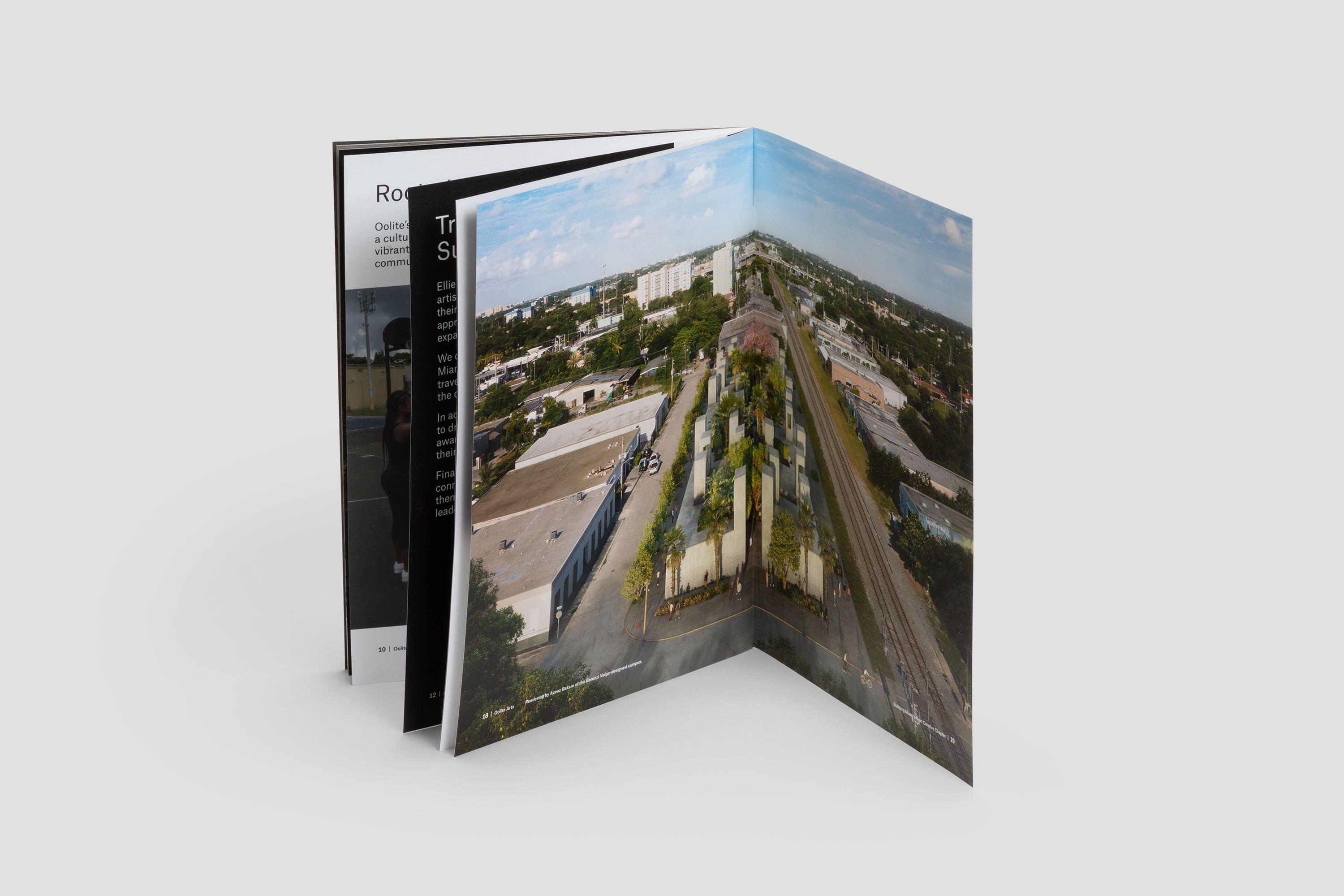
Renderings by Azeez Bakare of the Barozzi Veiga-designed campus
Oolite Art’s new campus, designed by Barozzi Veiga, is projected to be completed in 2024.
Read more: 3 Important Lessons Any Arts Organization Can Learn from Oolite Arts’s Expansion in Miami.
Brand Identity Elements


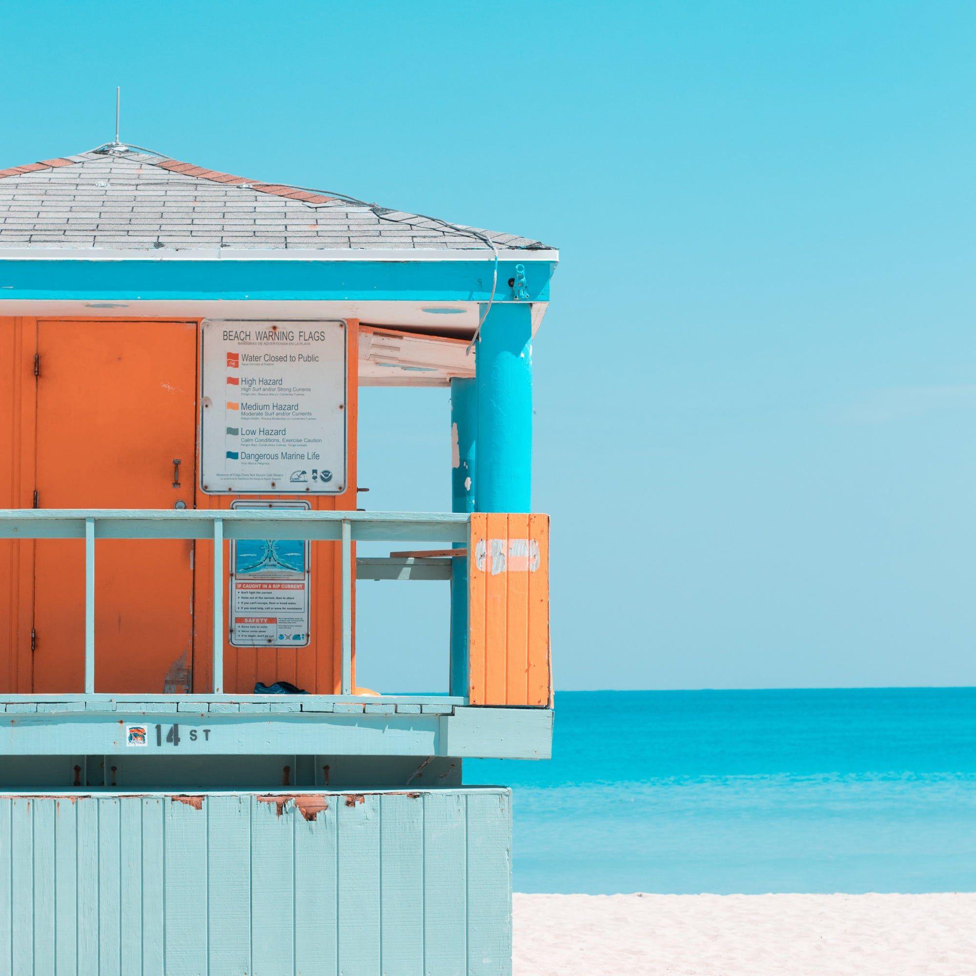
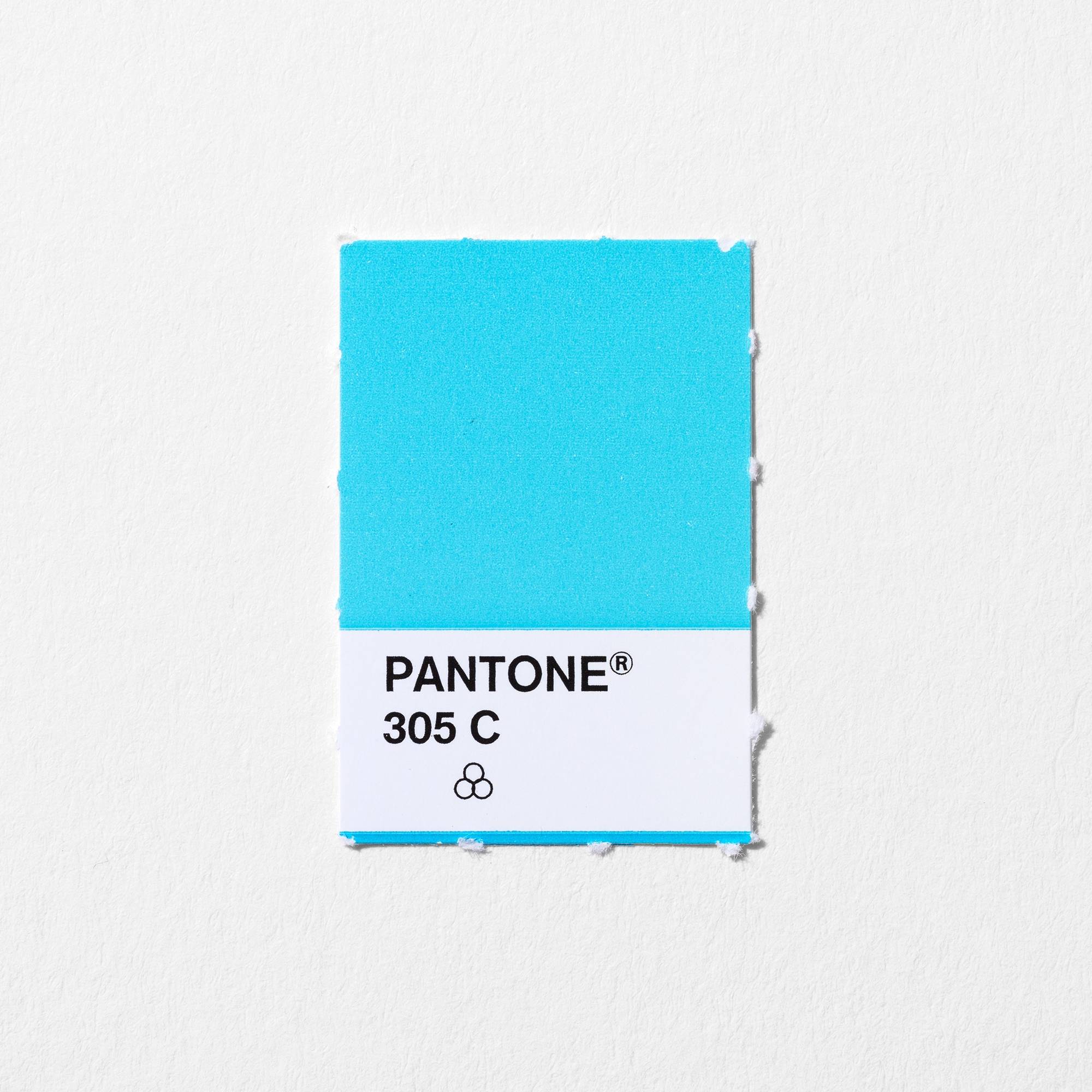
Miami and its local artist community are rich, diverse, colorful, and saturated. In designing Oolite Arts’ graphic identity, we wanted to create a stage that displays and celebrates this diversity, a context that allows every visual form to stand out without competition.
To do this, we utilized a reduced visual language. As a result, there is only one color (in addition to black and white) and one typeface. The color, a fresh blue not unlike the gorgeous skies of Miami, is Pantone 305. Its number moniker matches the region’s immediately recognizable zip code.
The typeface, Atlas Grotesk, was chosen for its utility and contemporary characteristics.
Brand launch video made to announce the organization's new name, logo, branding, and eventual location.
In Use
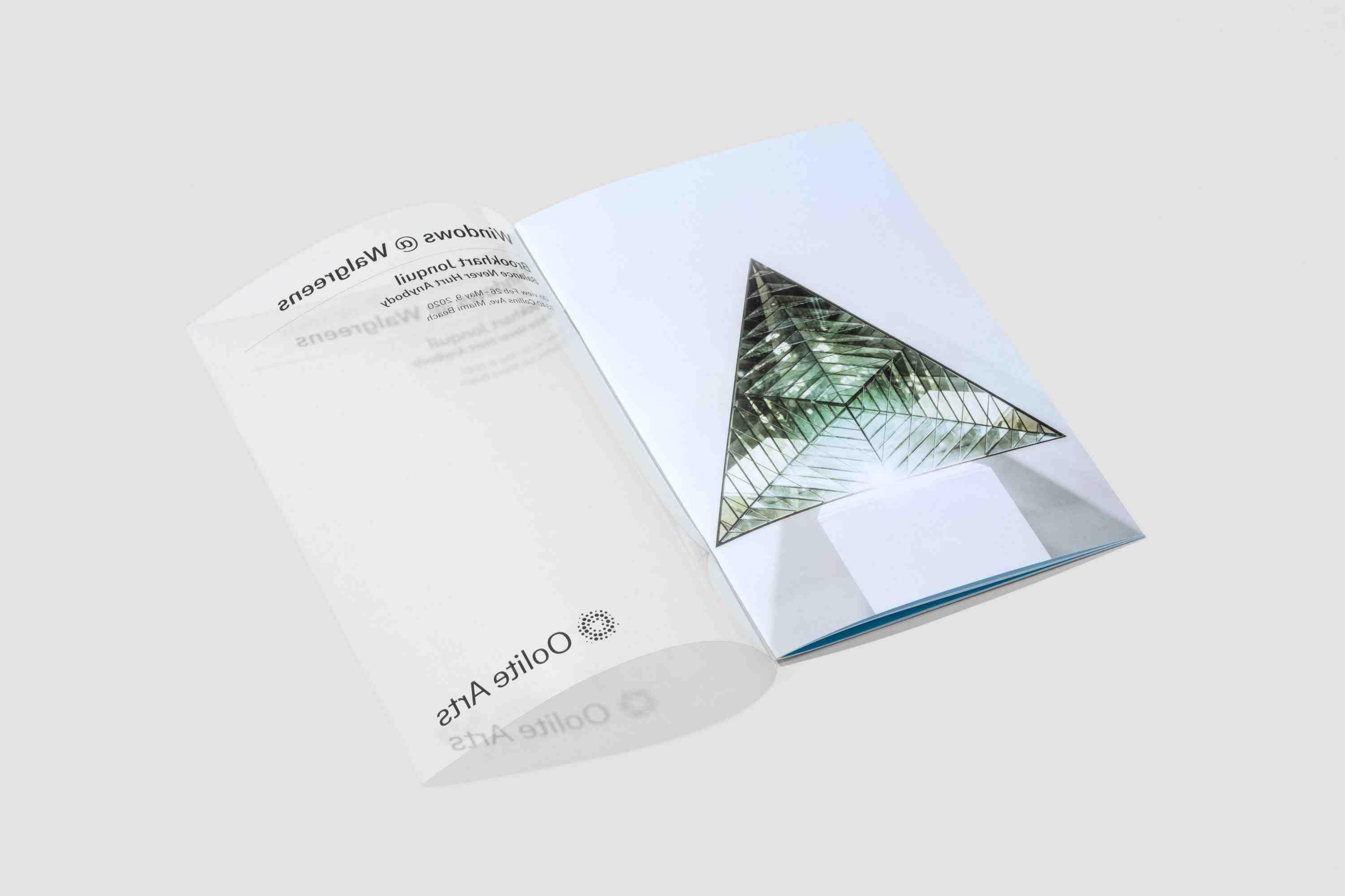
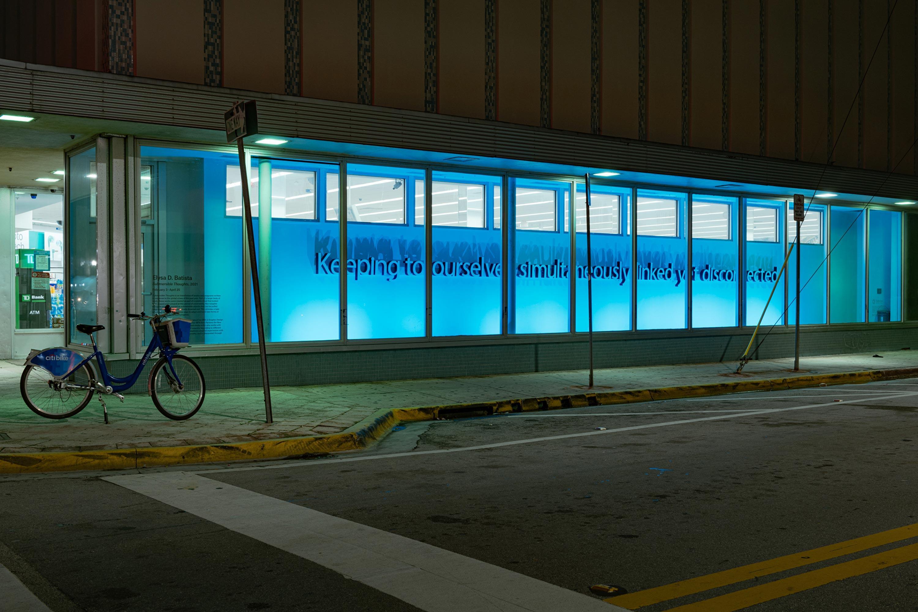
Elysa D. Batista, “Submersible Thoughts” installation at Walgreens windows. Photograph by Pedro Wazzan
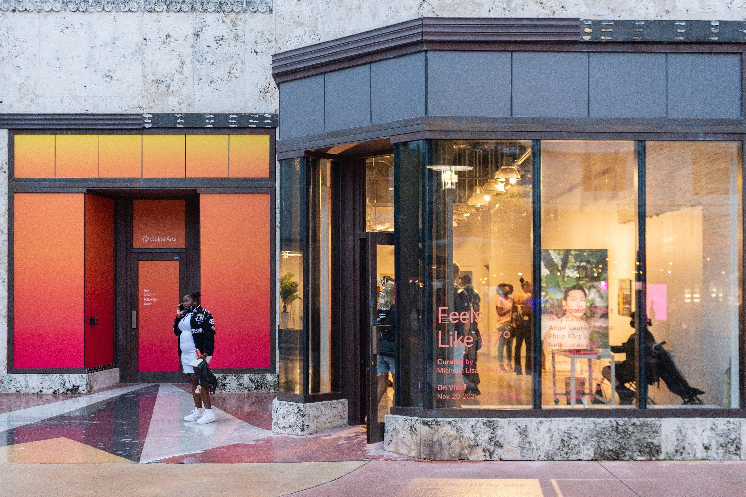
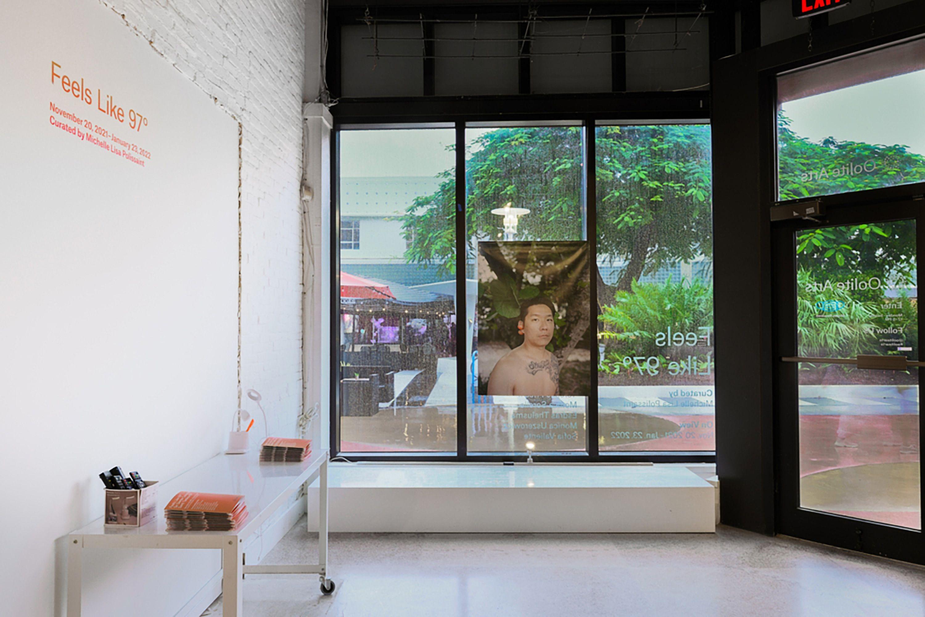
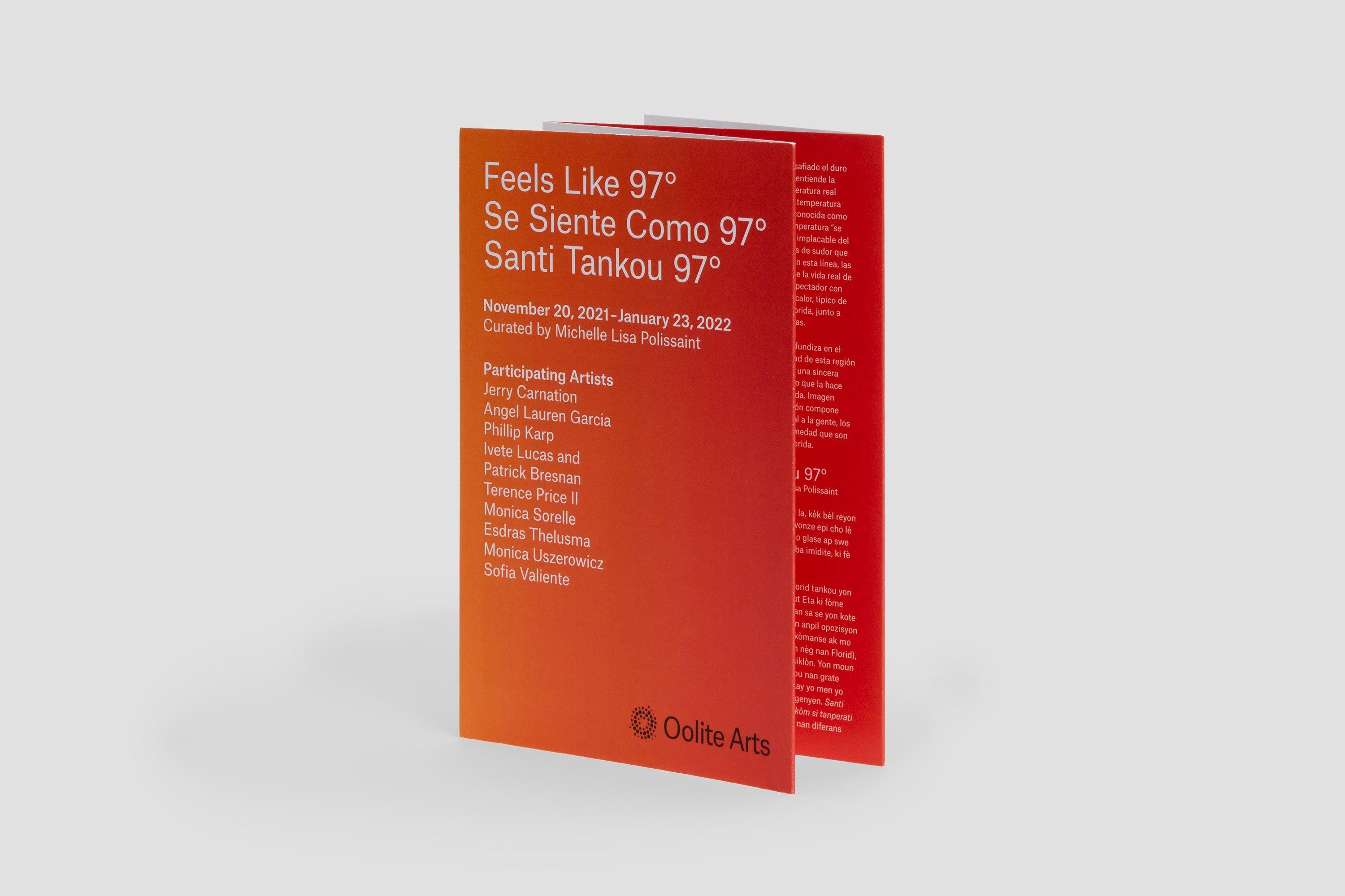
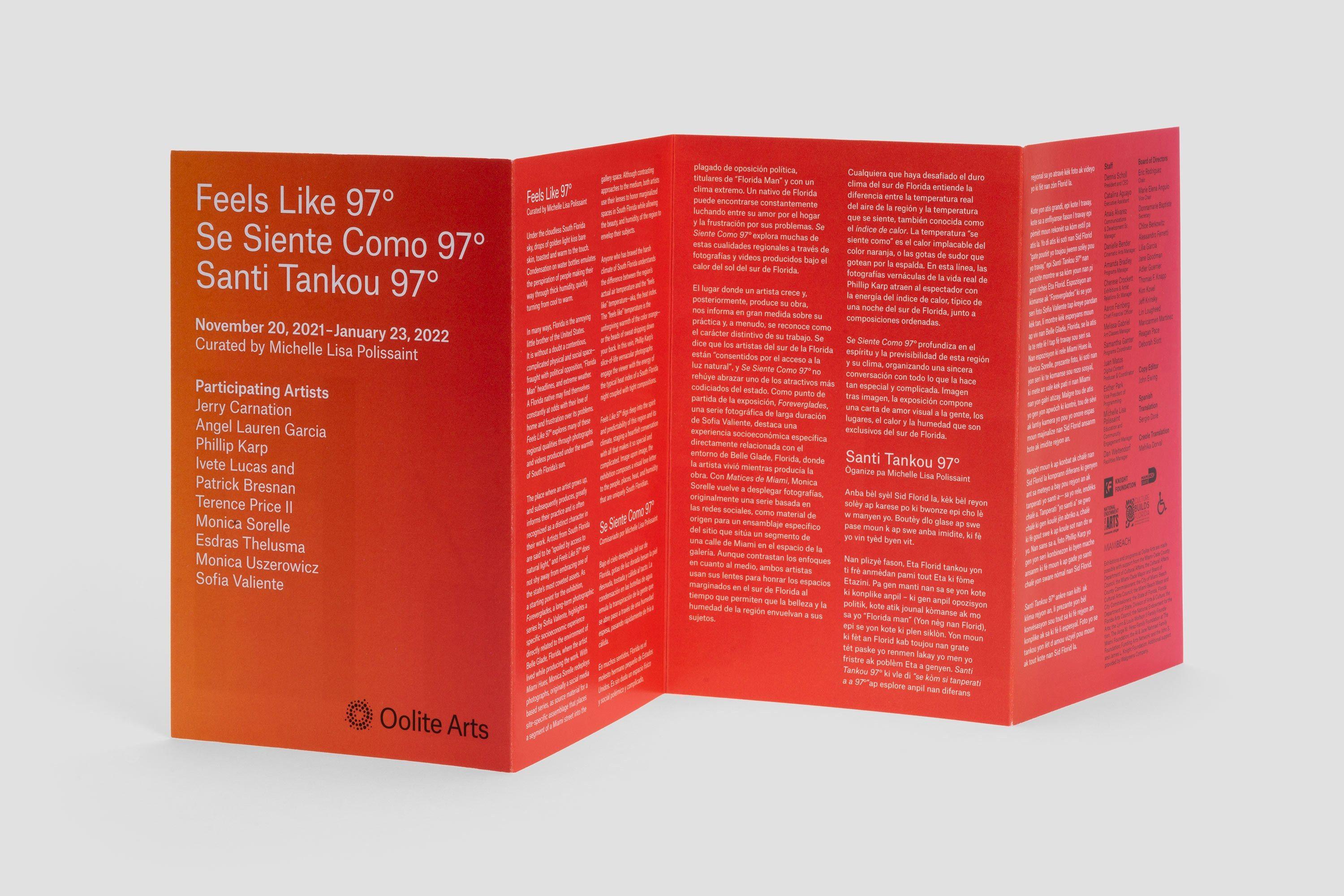
Oolite Arts faces a unique challenge when unifying its brand. They engage with such a wide range of programs that it might be easy to think of each initiative as functionally independent. By implementing a strategic use of Oolite’s now signature Pantone 305 and the typeface Atlas Grotesk, however, each program’s collateral is bonded to the next.
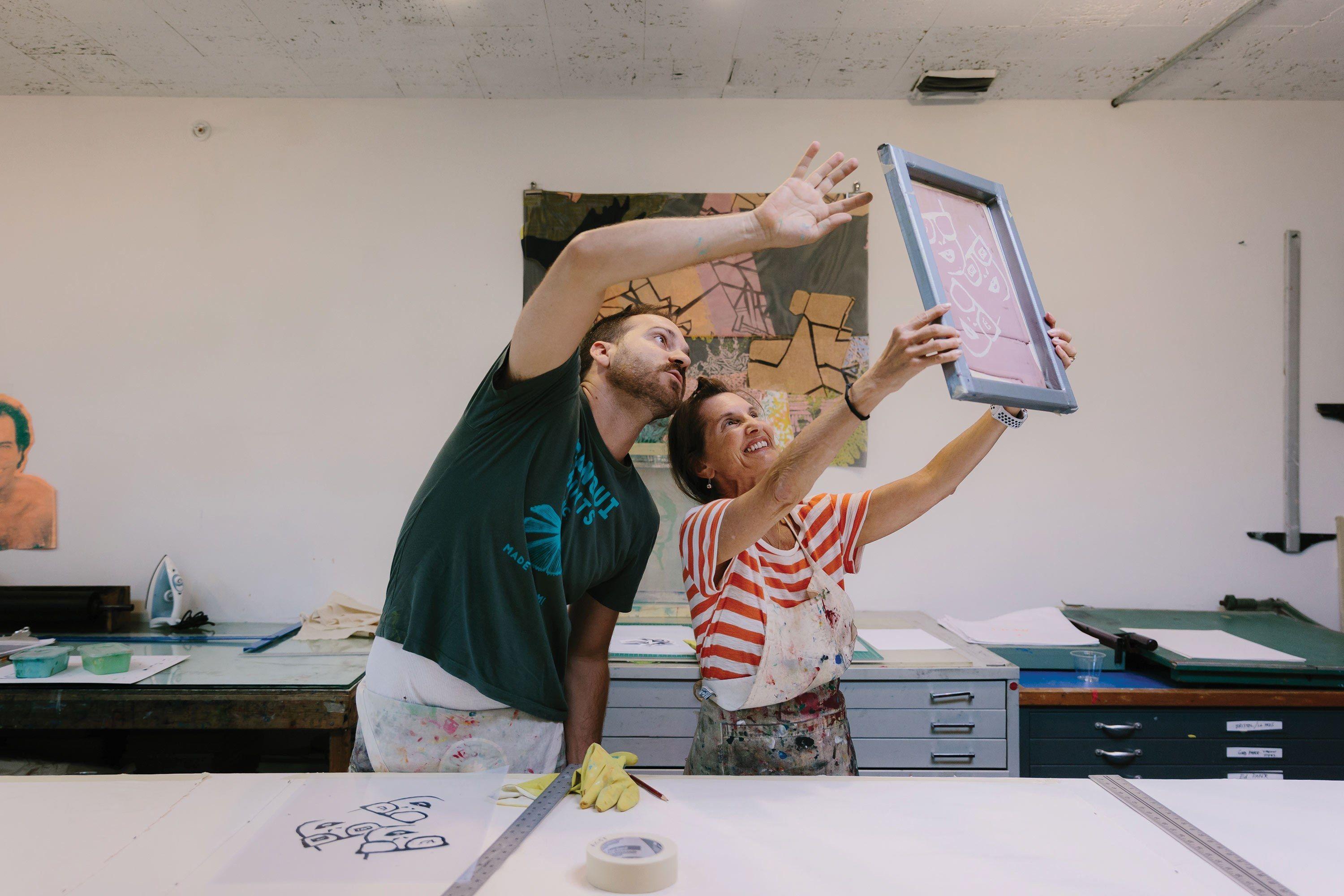
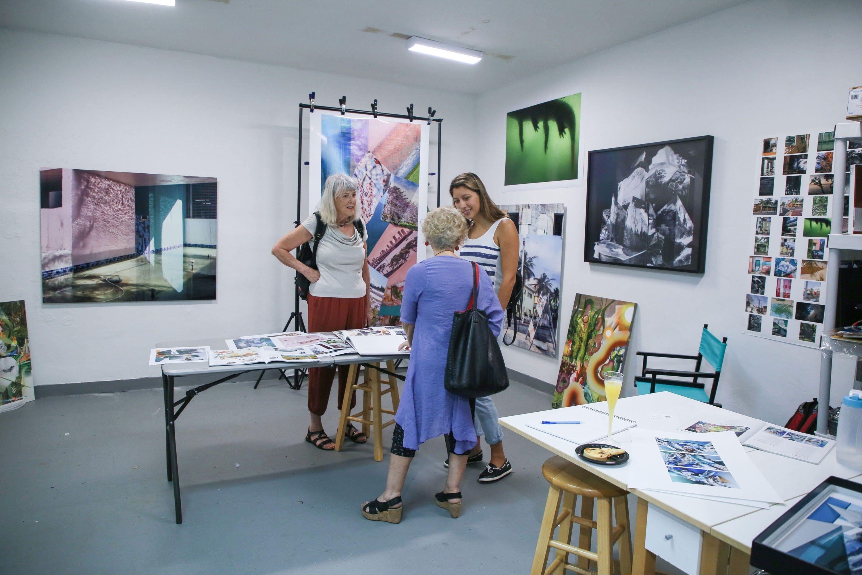
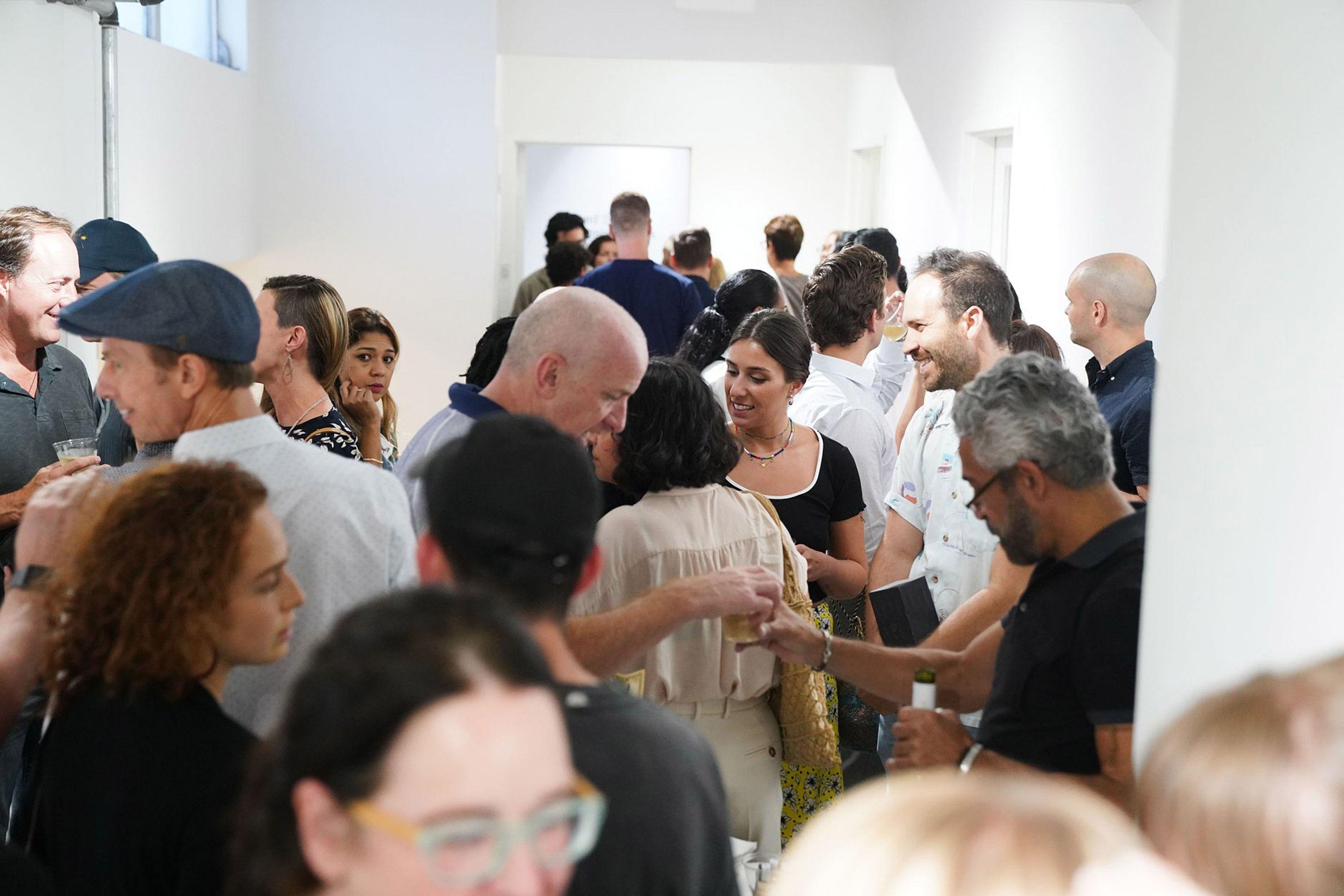
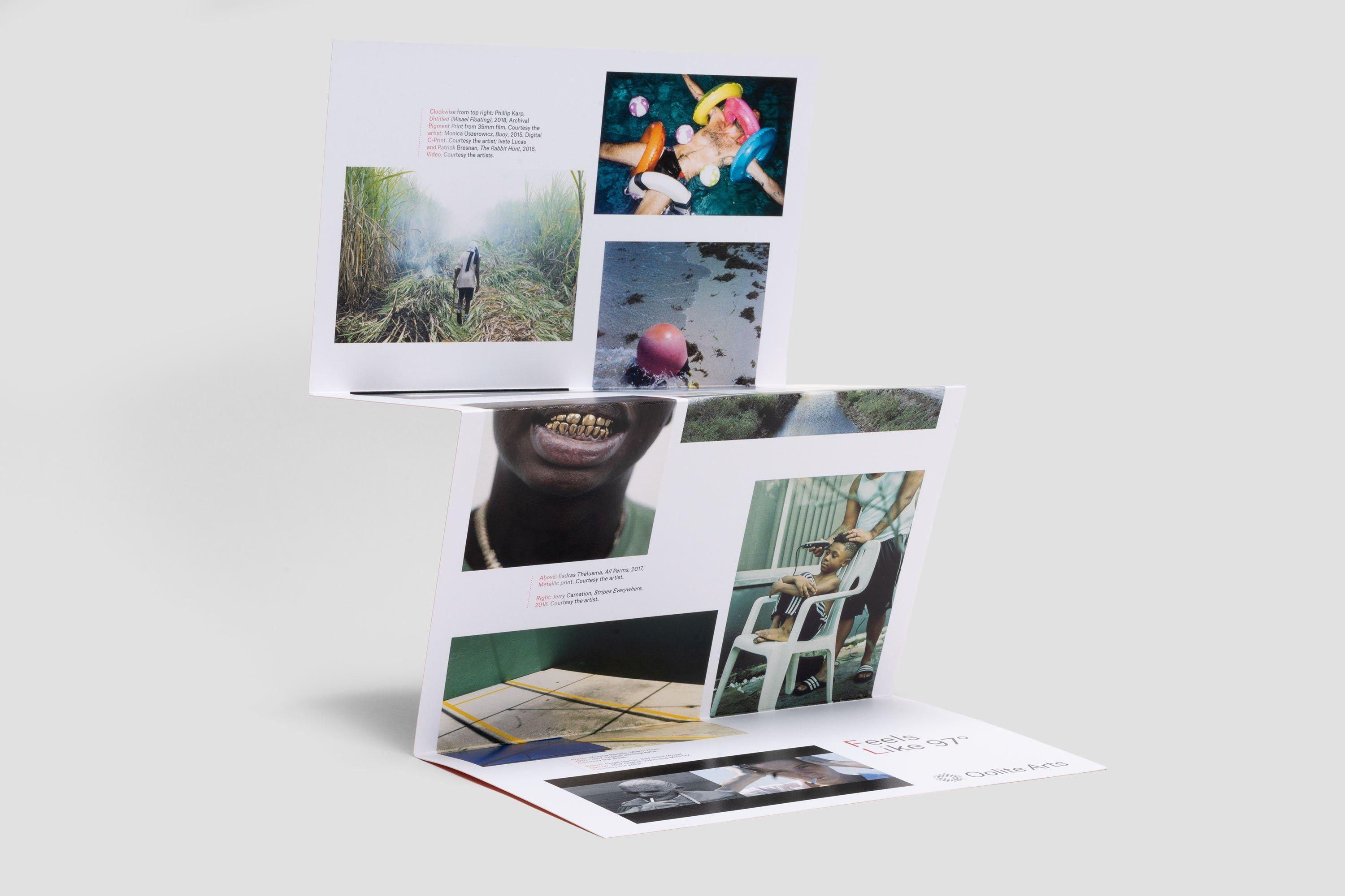
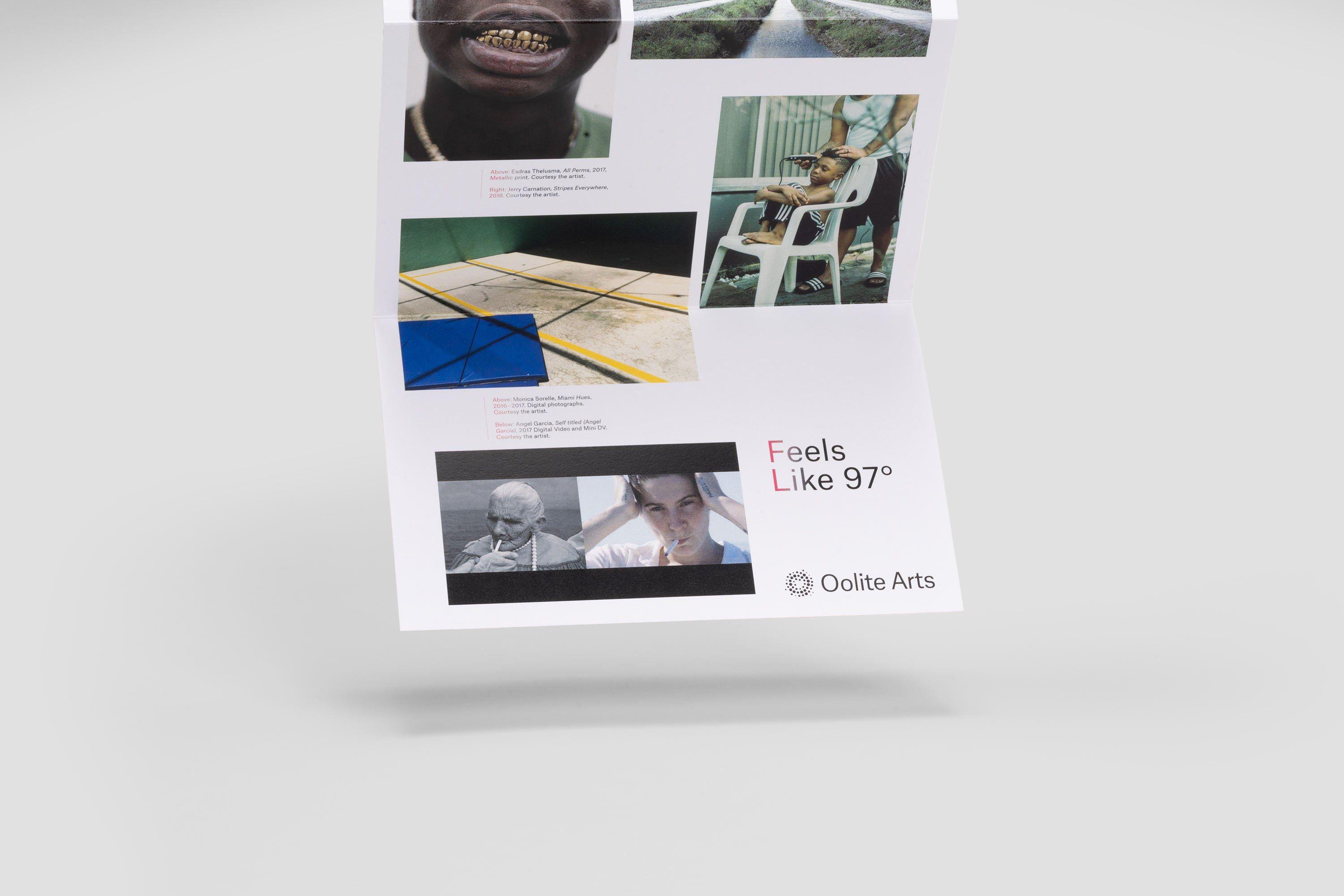
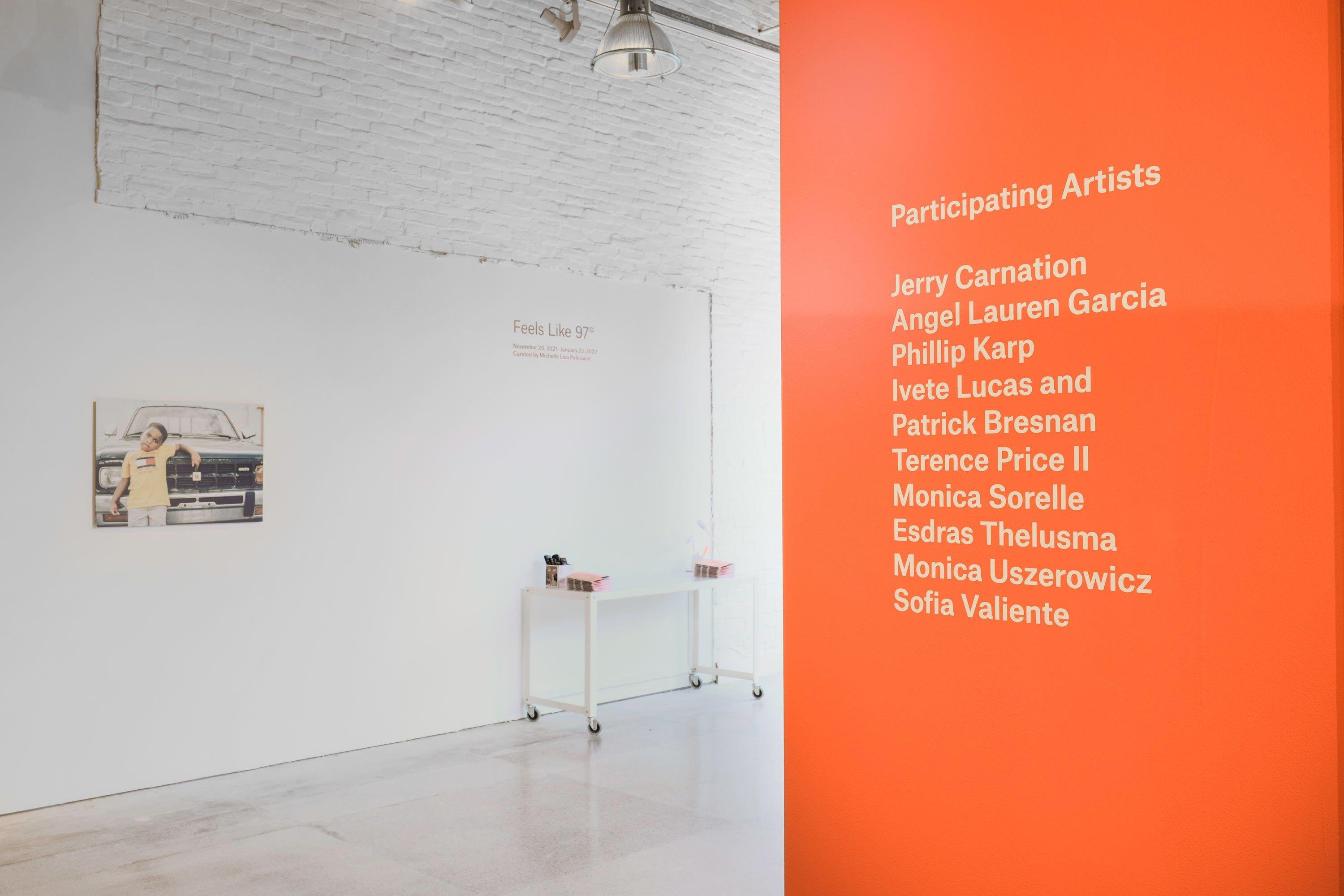
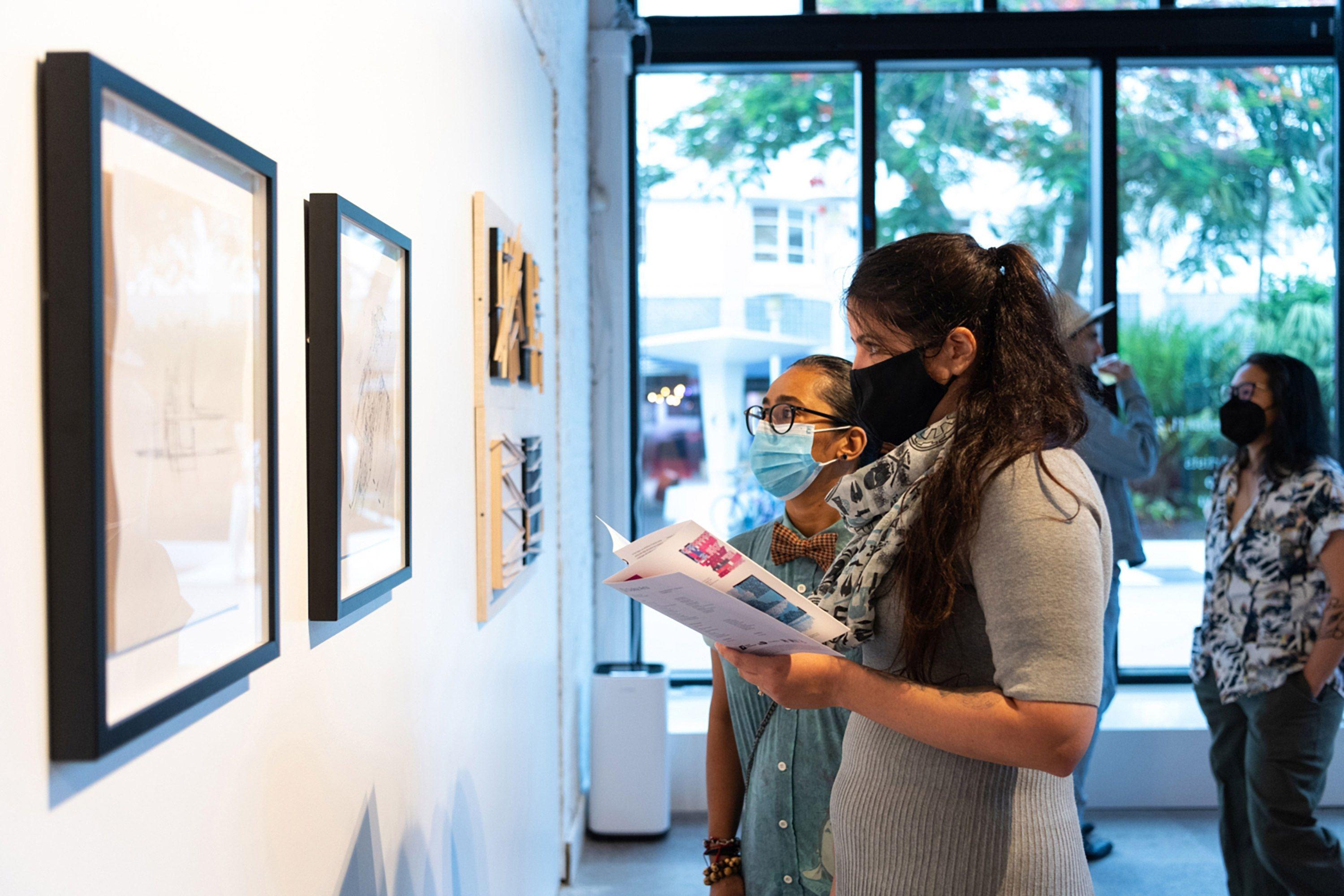
Some of the most prominent arenas for Oolite Arts are exhibitions, classes, and residencies.
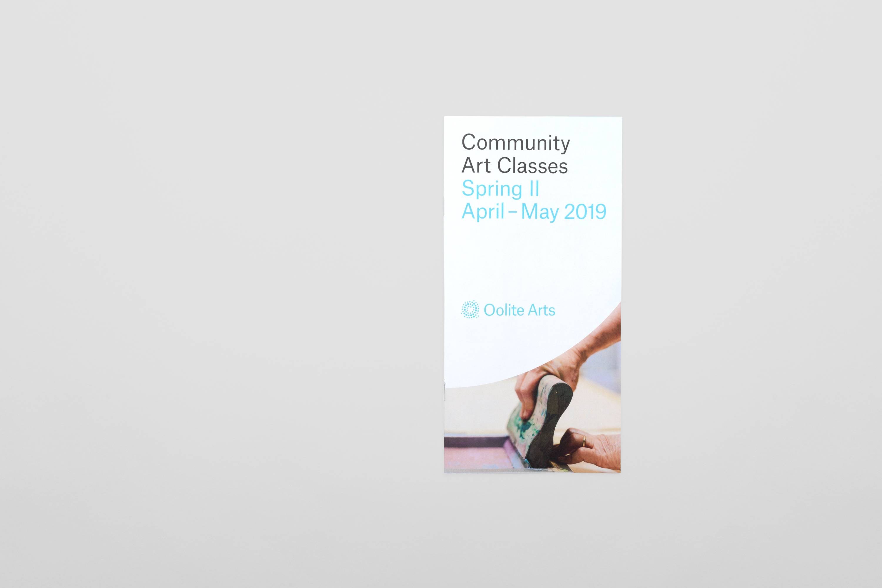
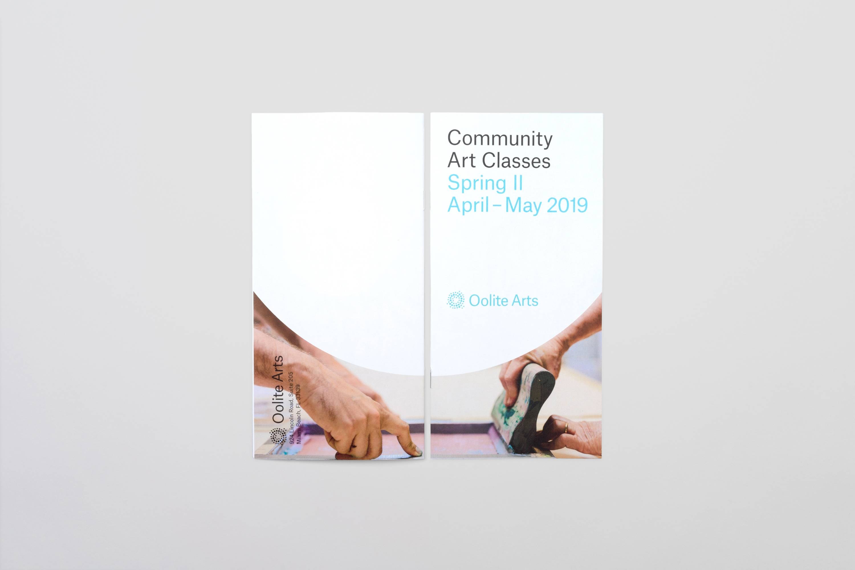
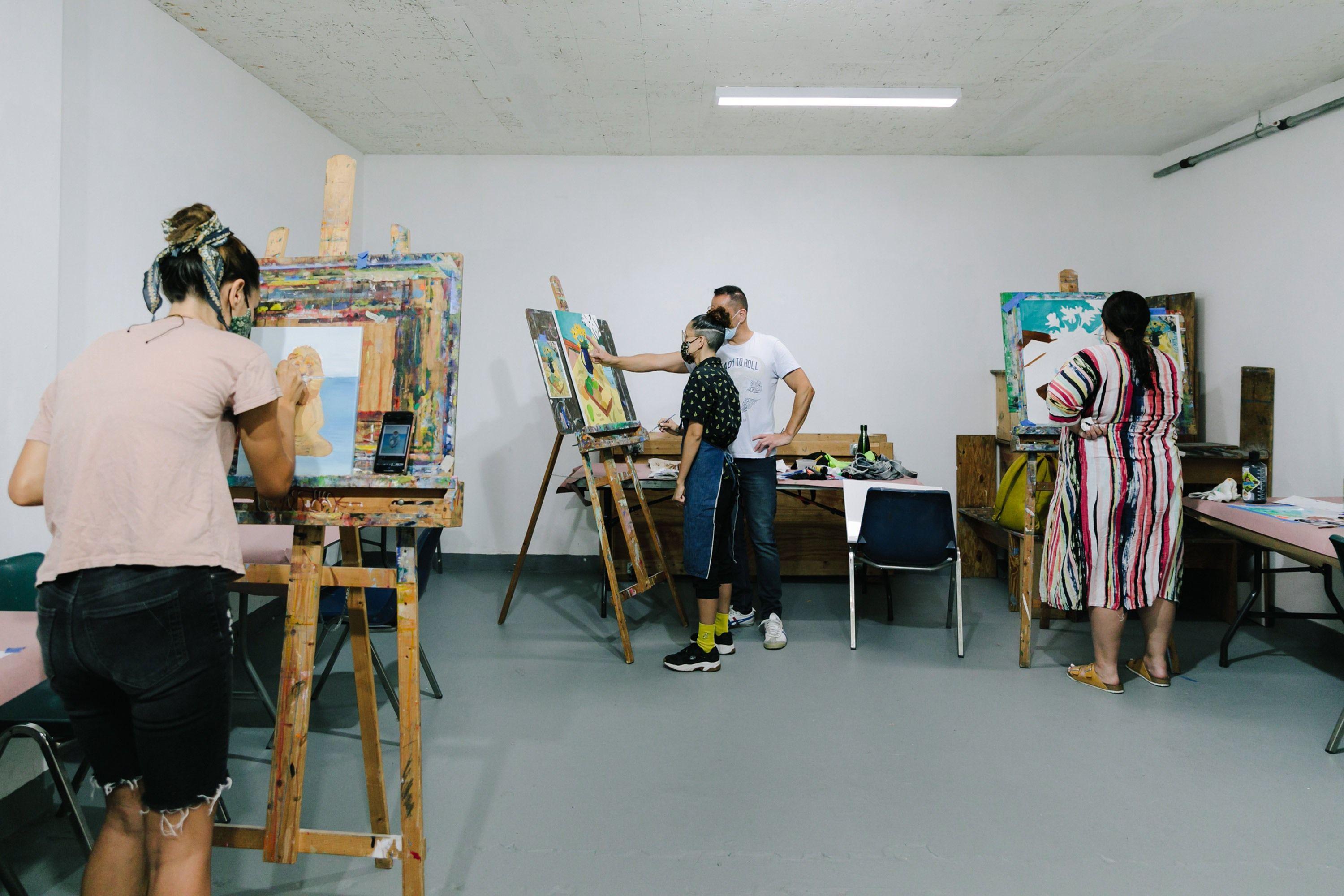
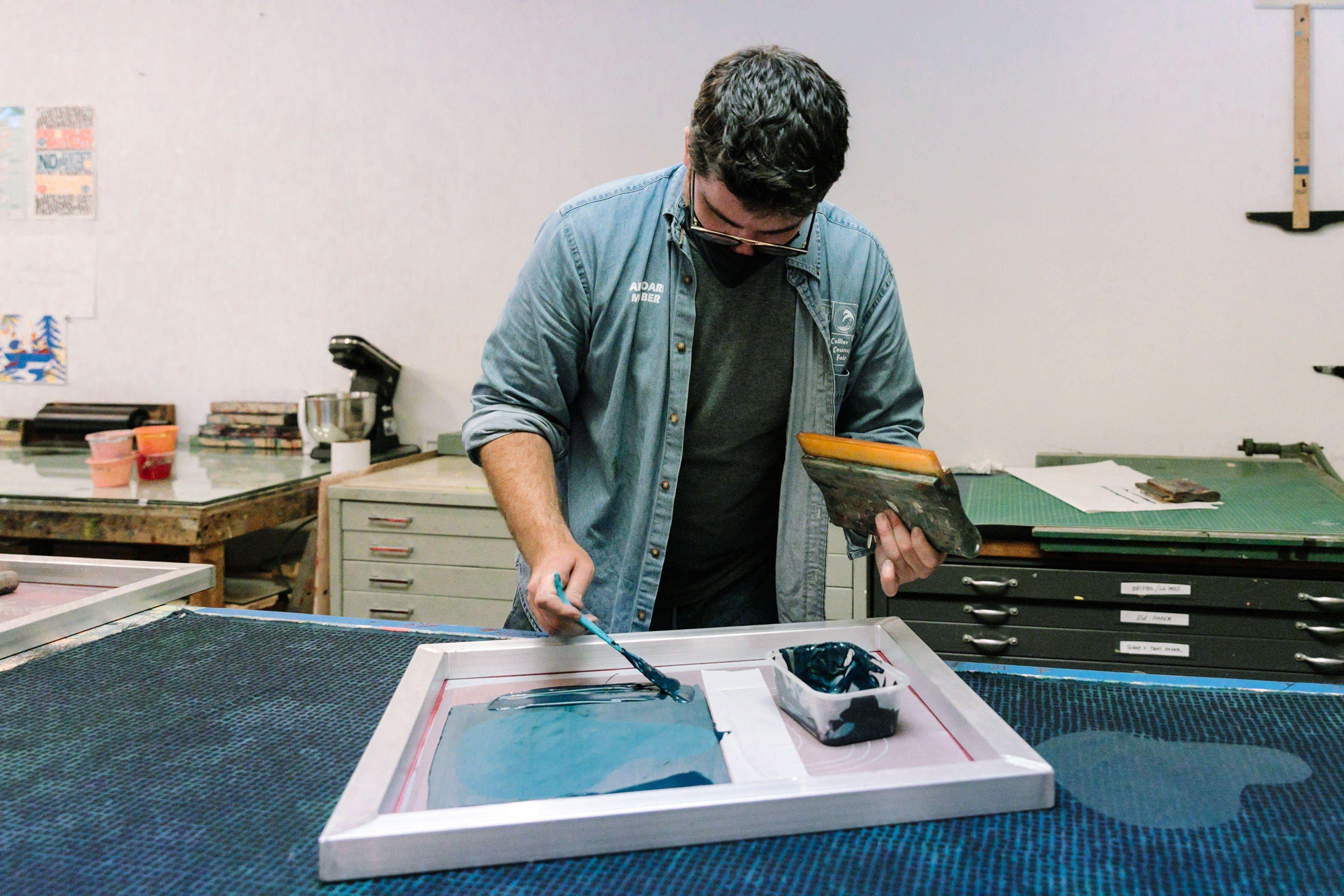
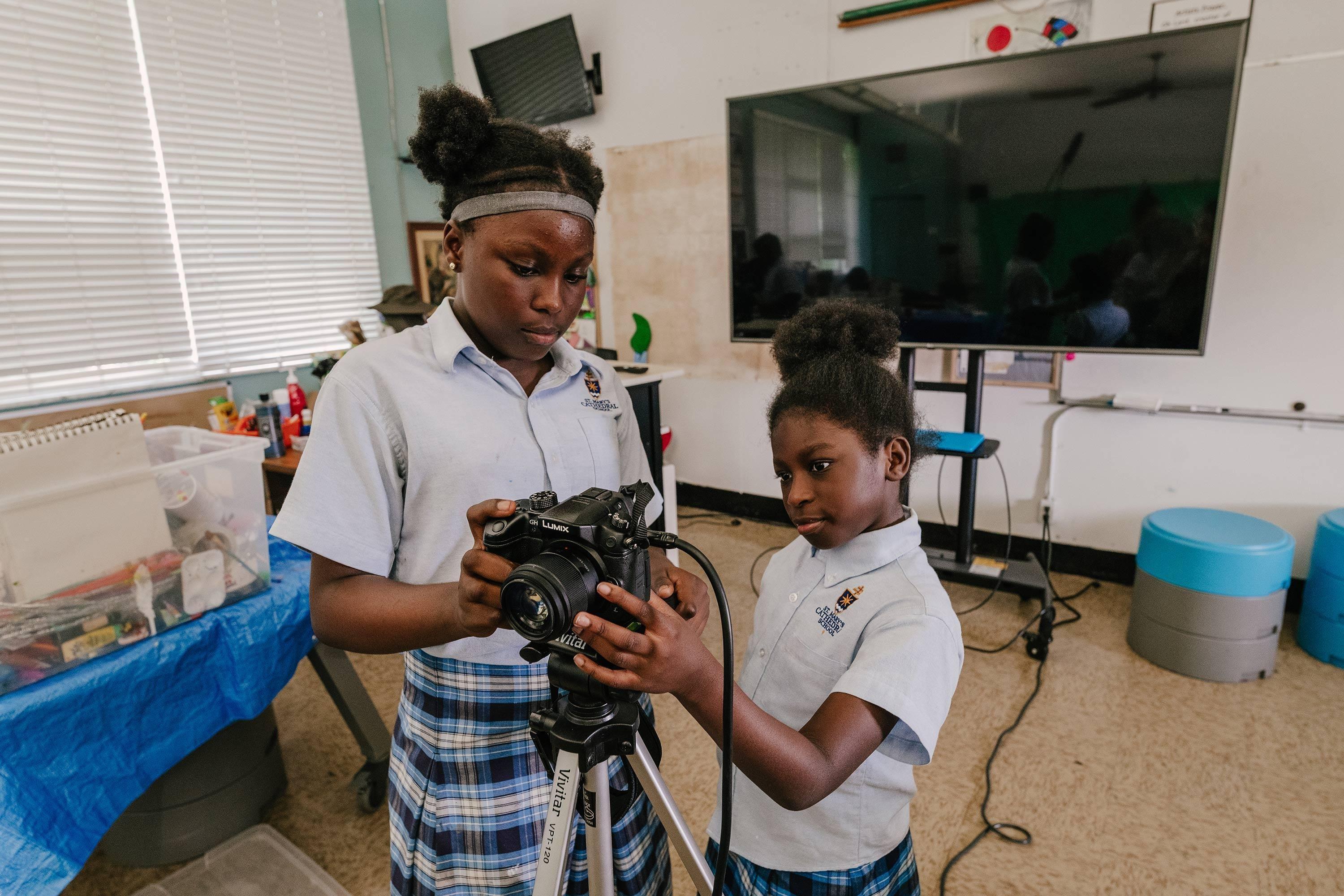
Art Classes photographs by Diana Larrea
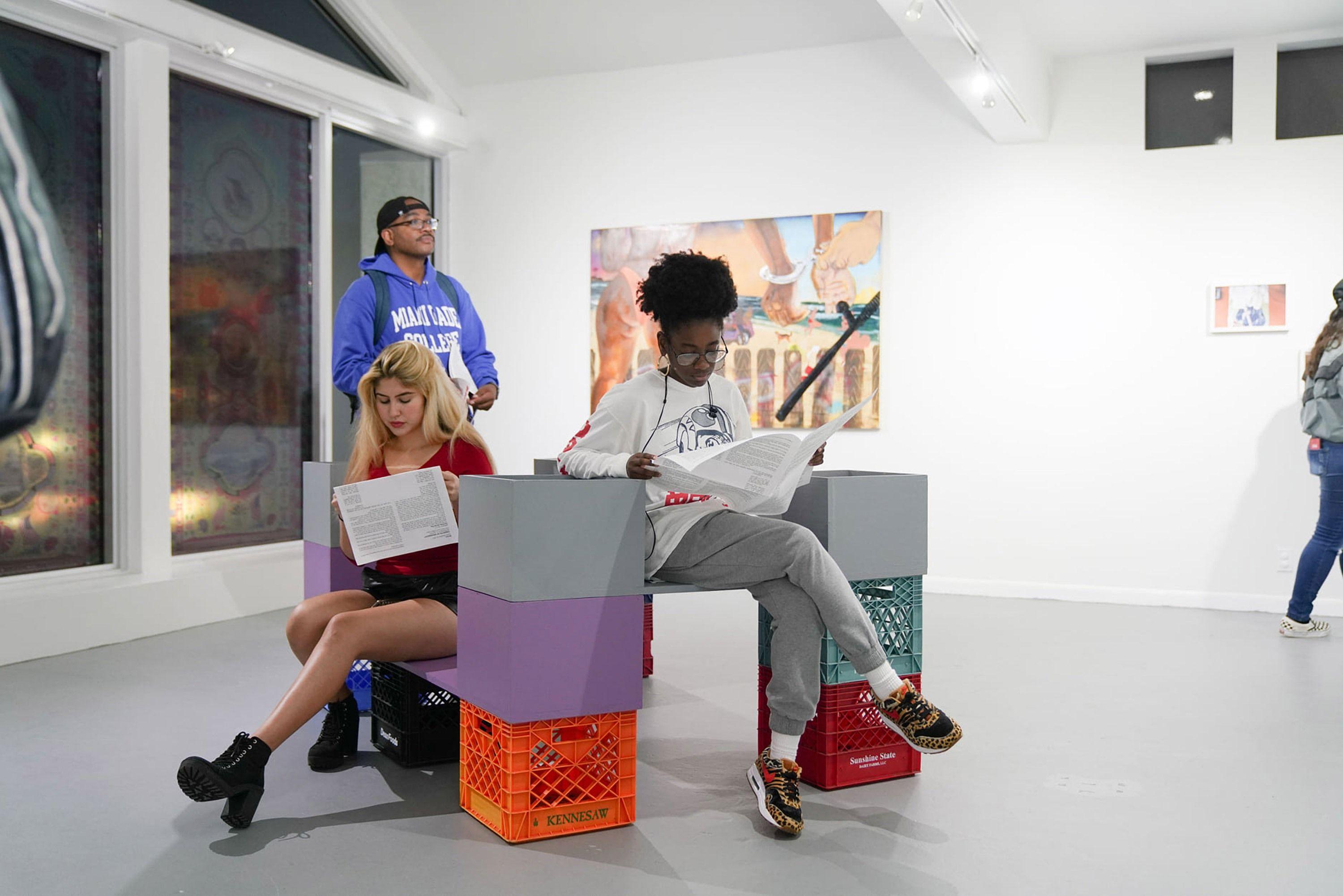
In gallery photograph courtesy of Oolite Arts
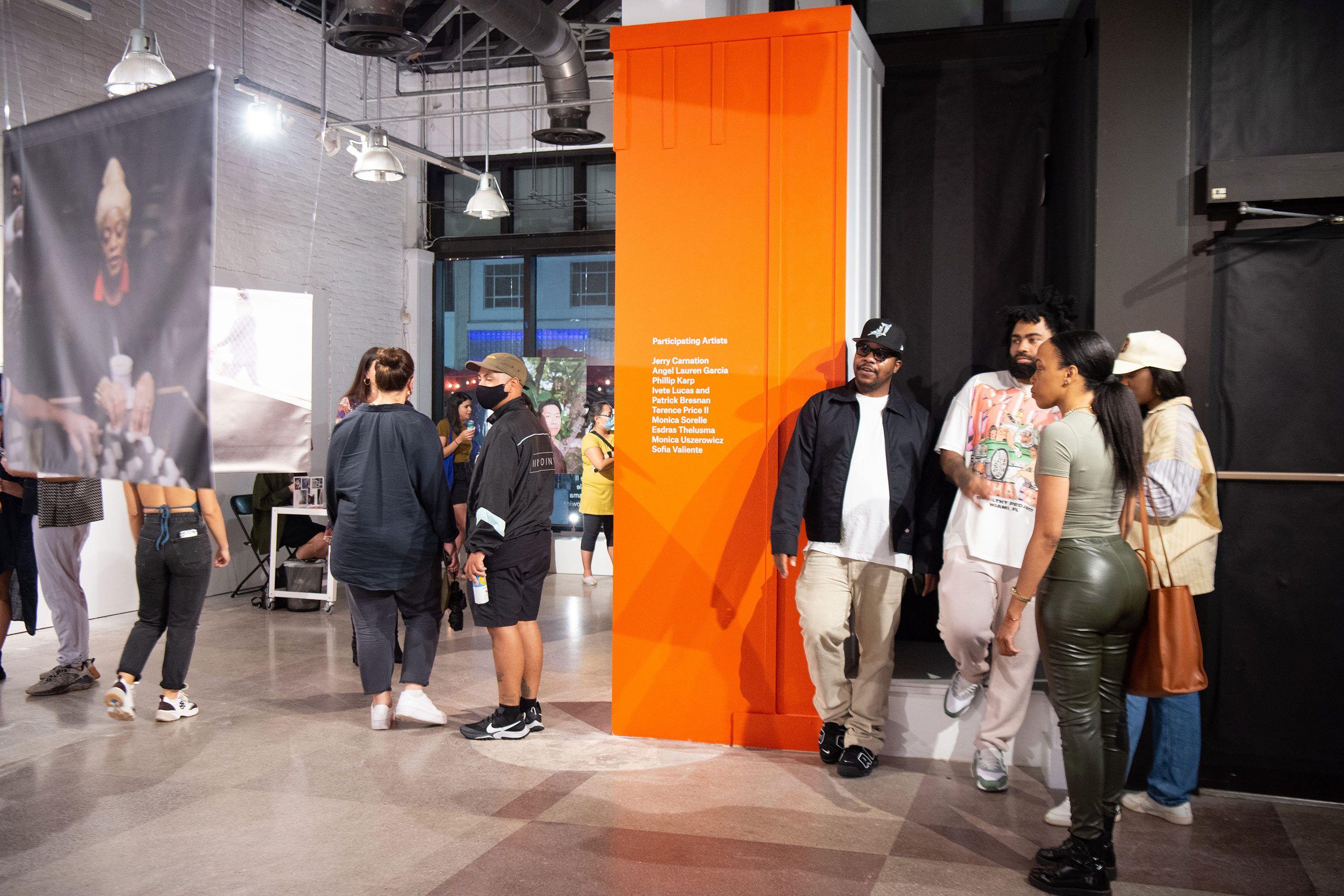
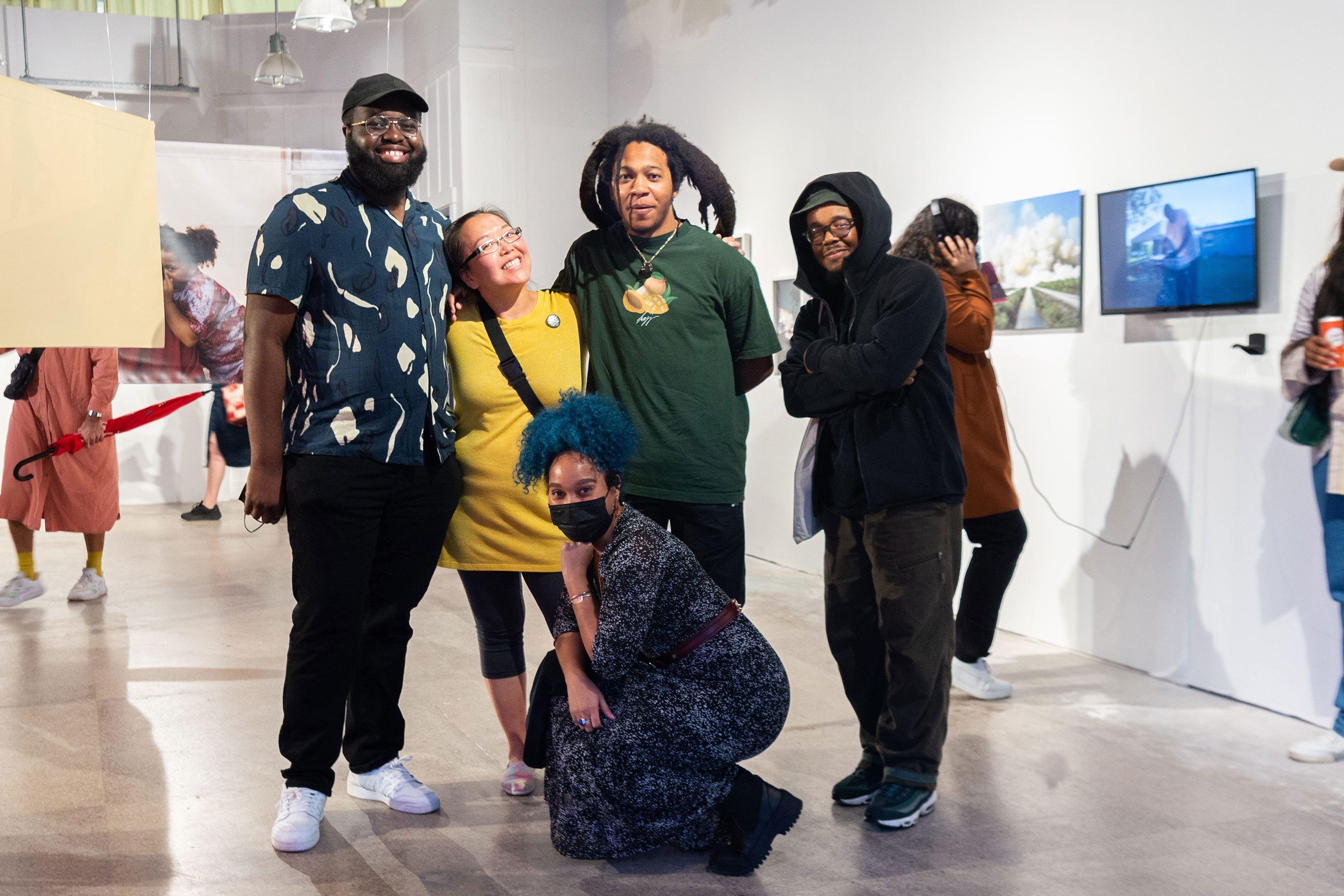
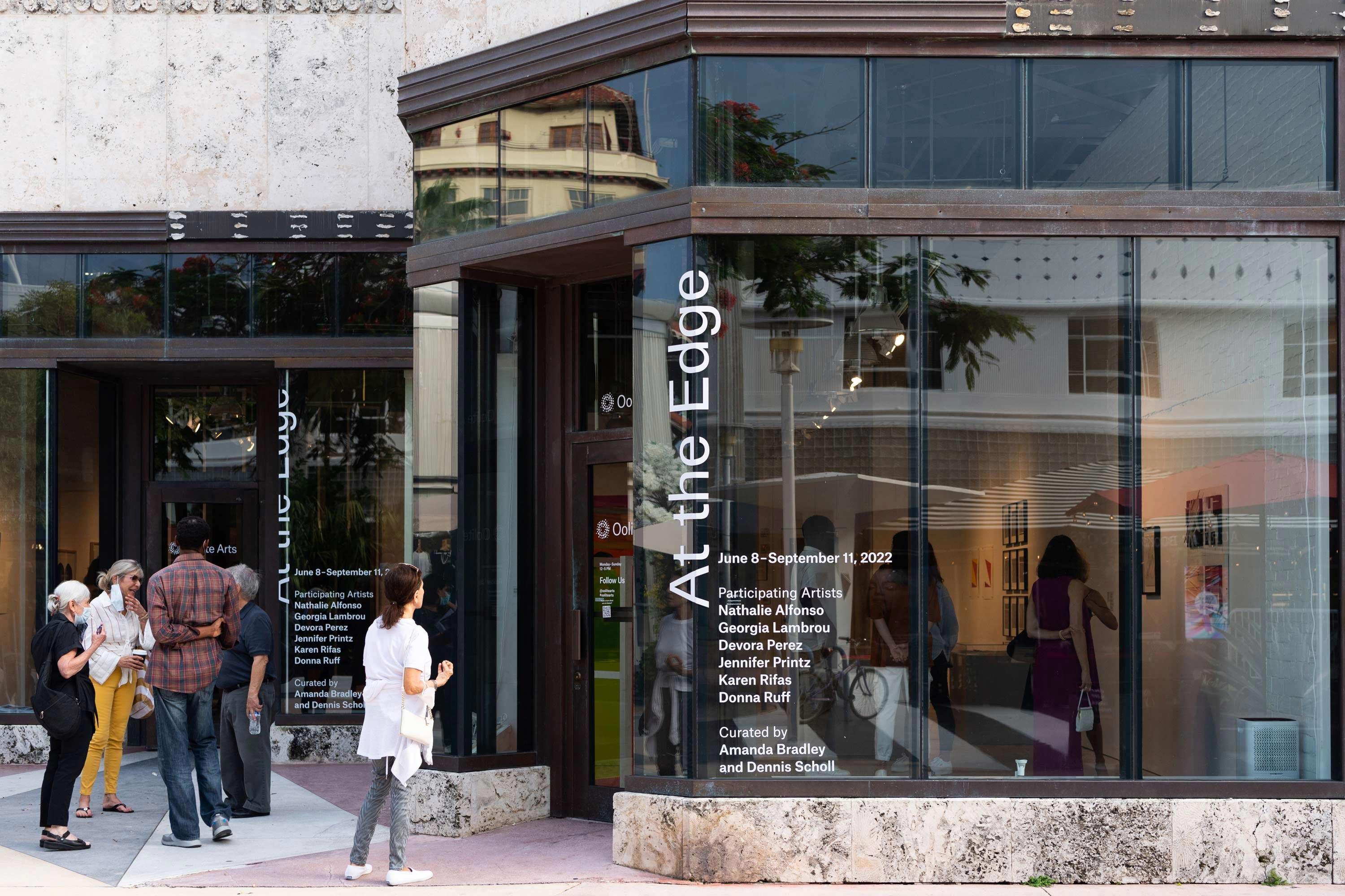
Opening reception photographs by WorldRedEye.com, installation photographs by Pedro Wazzan