O, Miami
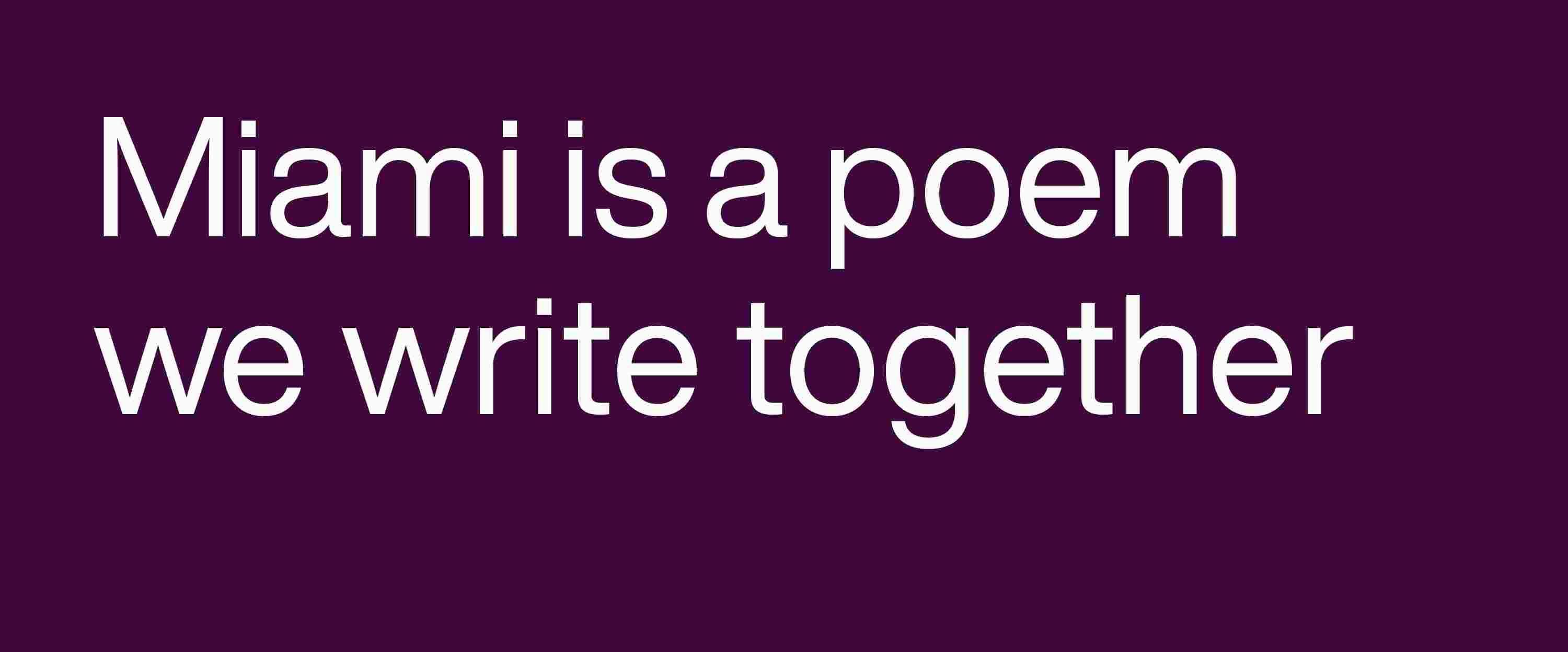
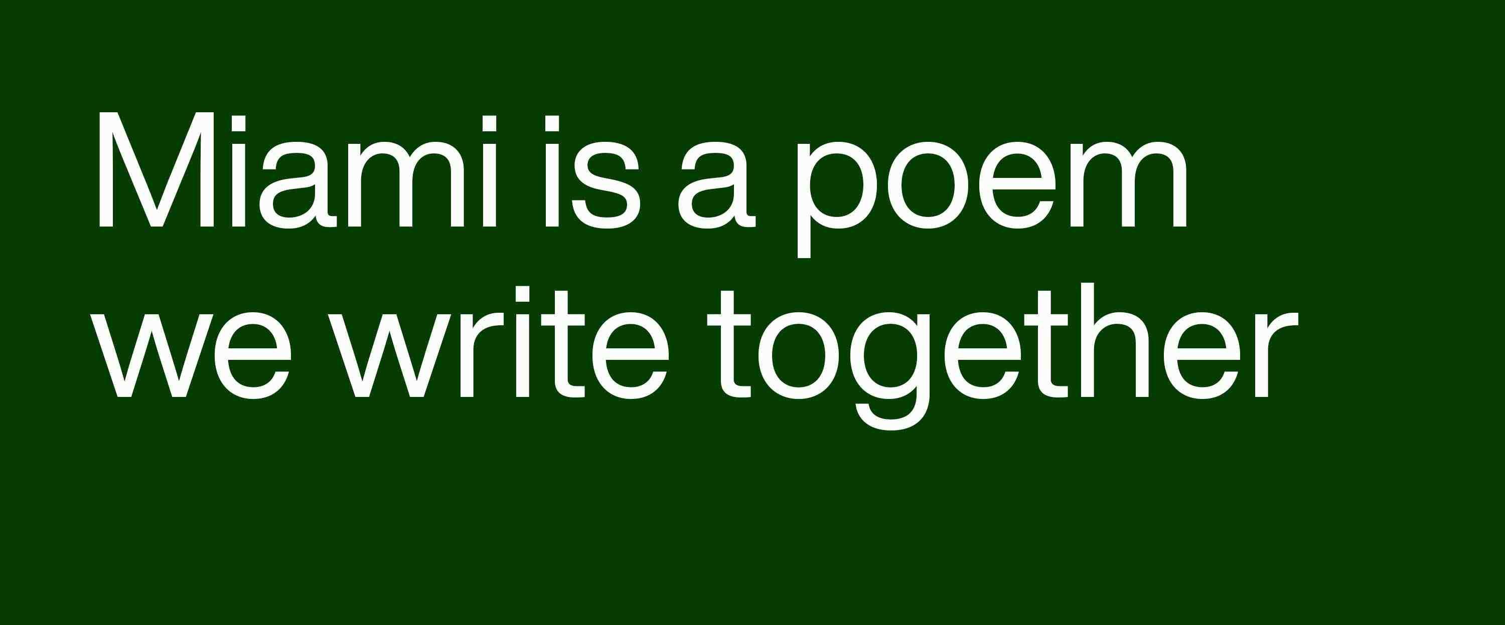
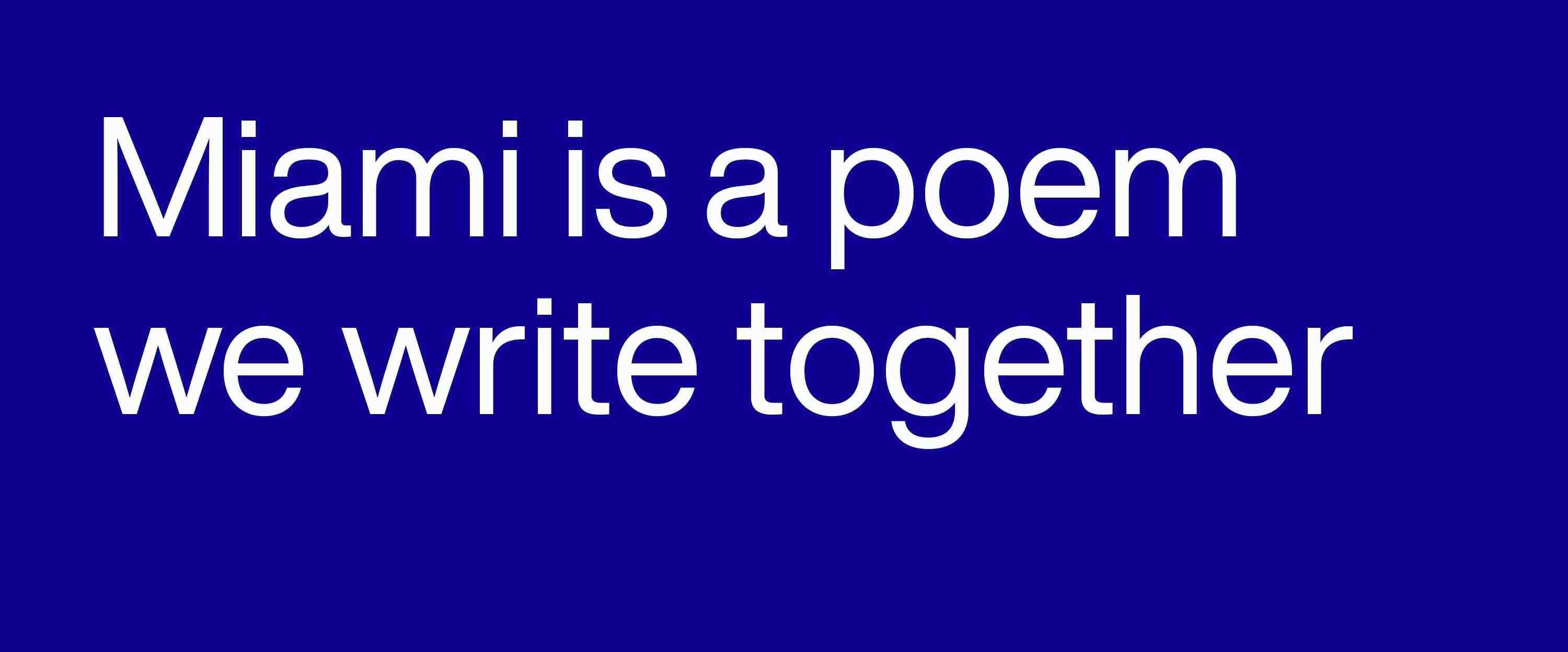
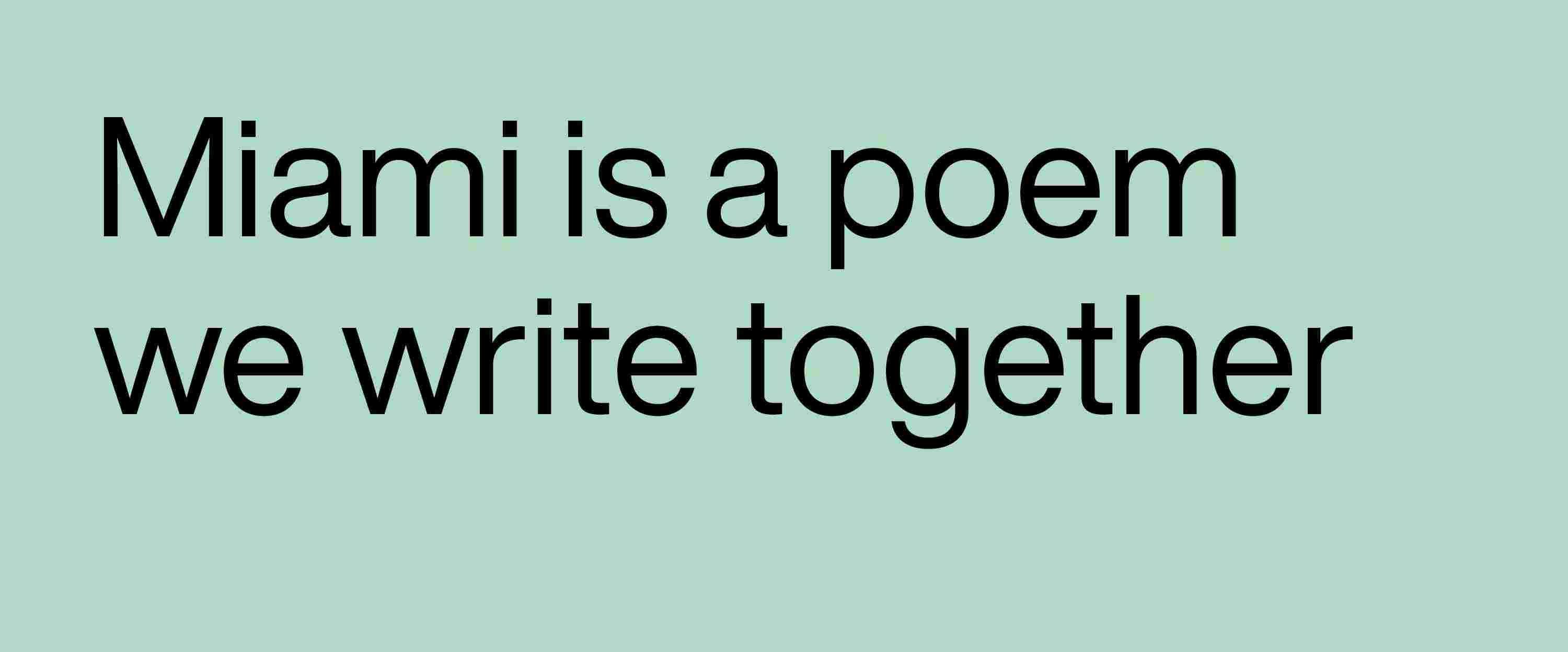
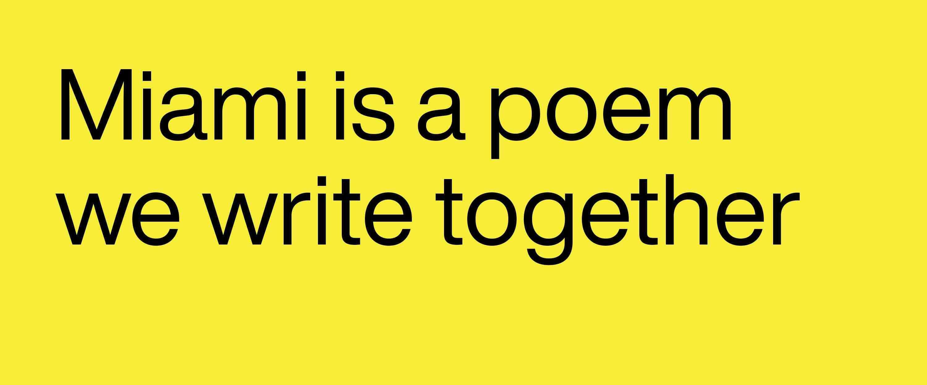
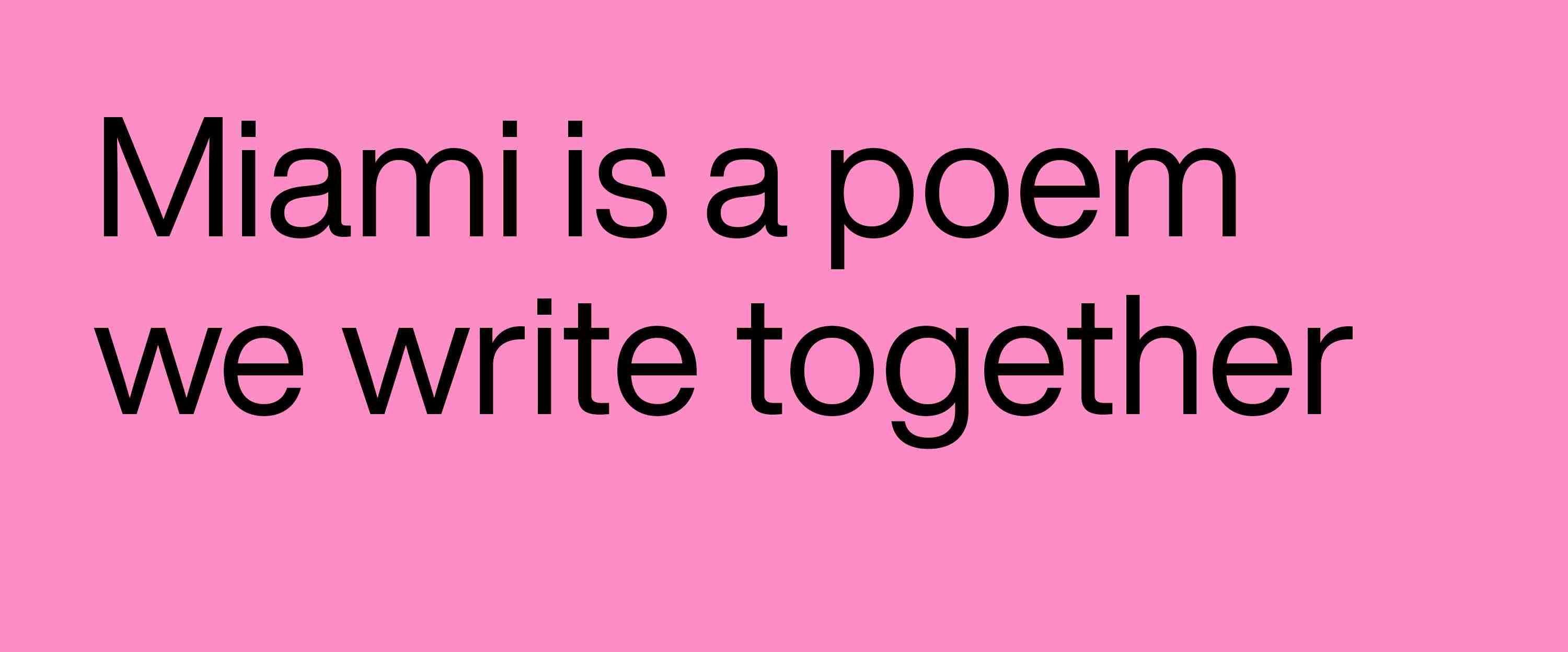
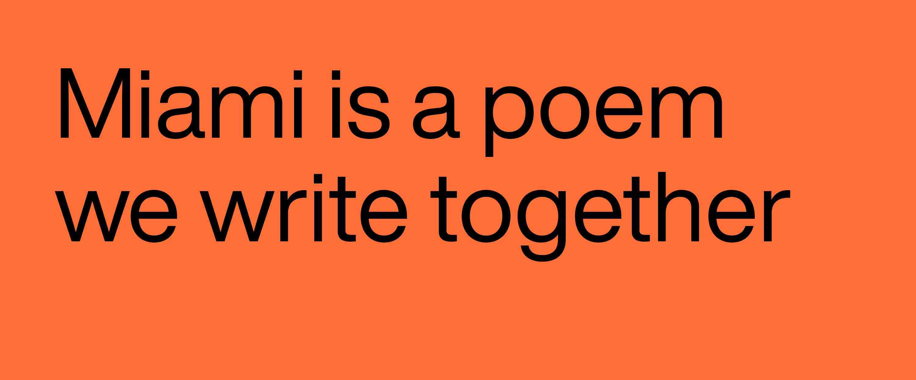
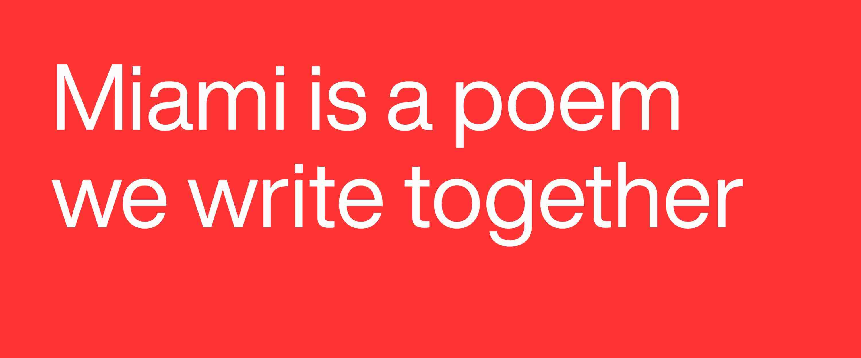
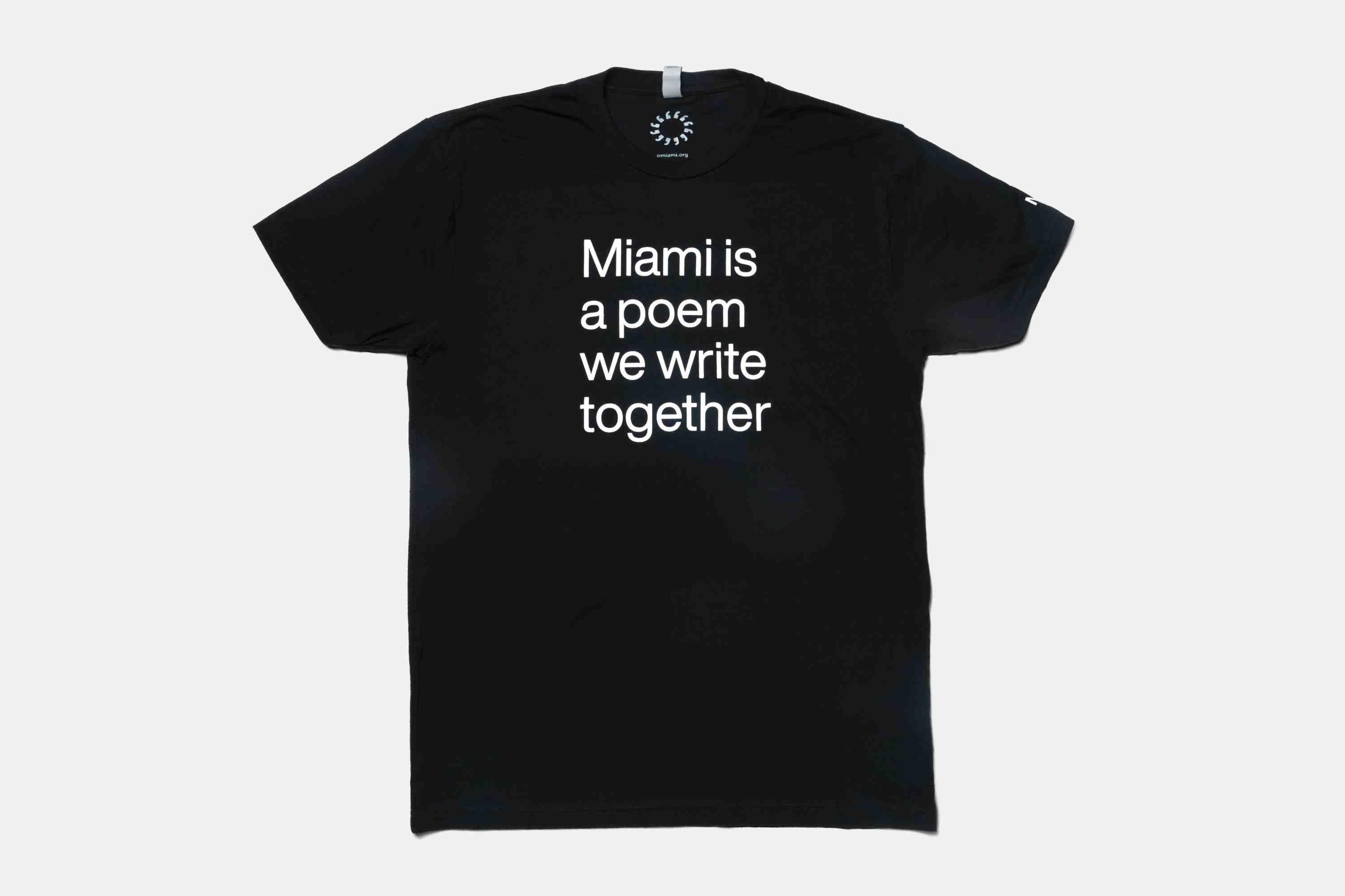
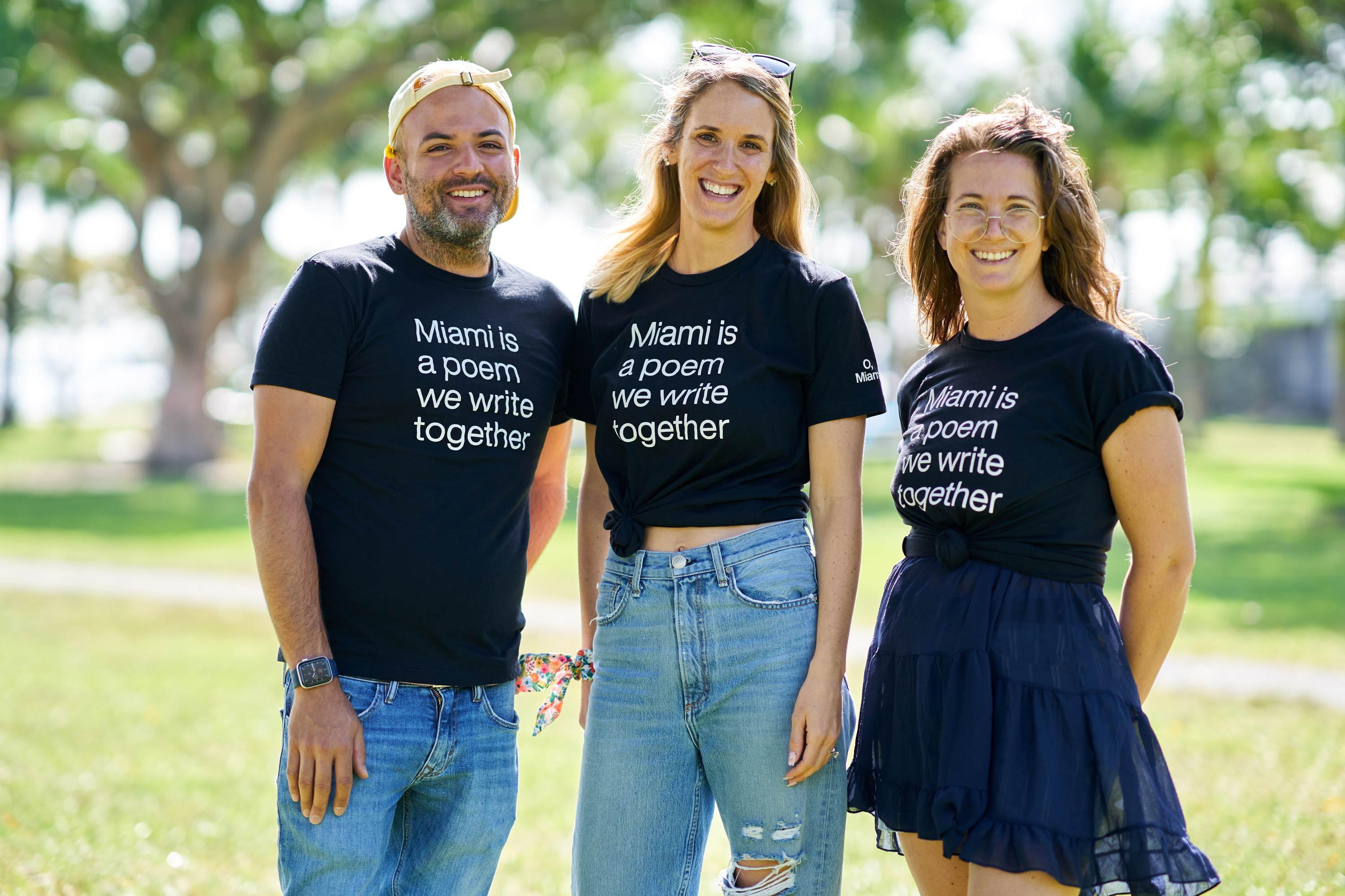
Miami is a poem we write together
O, Miami builds community around the power of poetry. Through collaborations, projects, events, and publications, they create a platform for amplifying Miami’s voices, investing in a new shared narrative of their city and a more equitable picture of its future.
The logo for O, Miami, is meant to convey brightness, surprise, and joy. It invokes images of the sun through the use of commas, which formally connect the imagery of the logo to the “O, Miami” name. Metaphorically, the sun is comprised of language (or an element of language). The logo is also made of many commas to represent the many voices involved; O, Miami is a community.
Placement is crucial in this design. The organization name is center-justified, with adjustments to align the comma with the second “m” in Miami. This helps avoid confusion of the character with an apostrophe. The image of the text echoes a landscape, with “Miami” as the skyline and “O,” like the sun.
In 2020, we won a bid to rebrand the organization and unify its various programming branches under one identity. After seven months of collaborative work, our design result was made public.
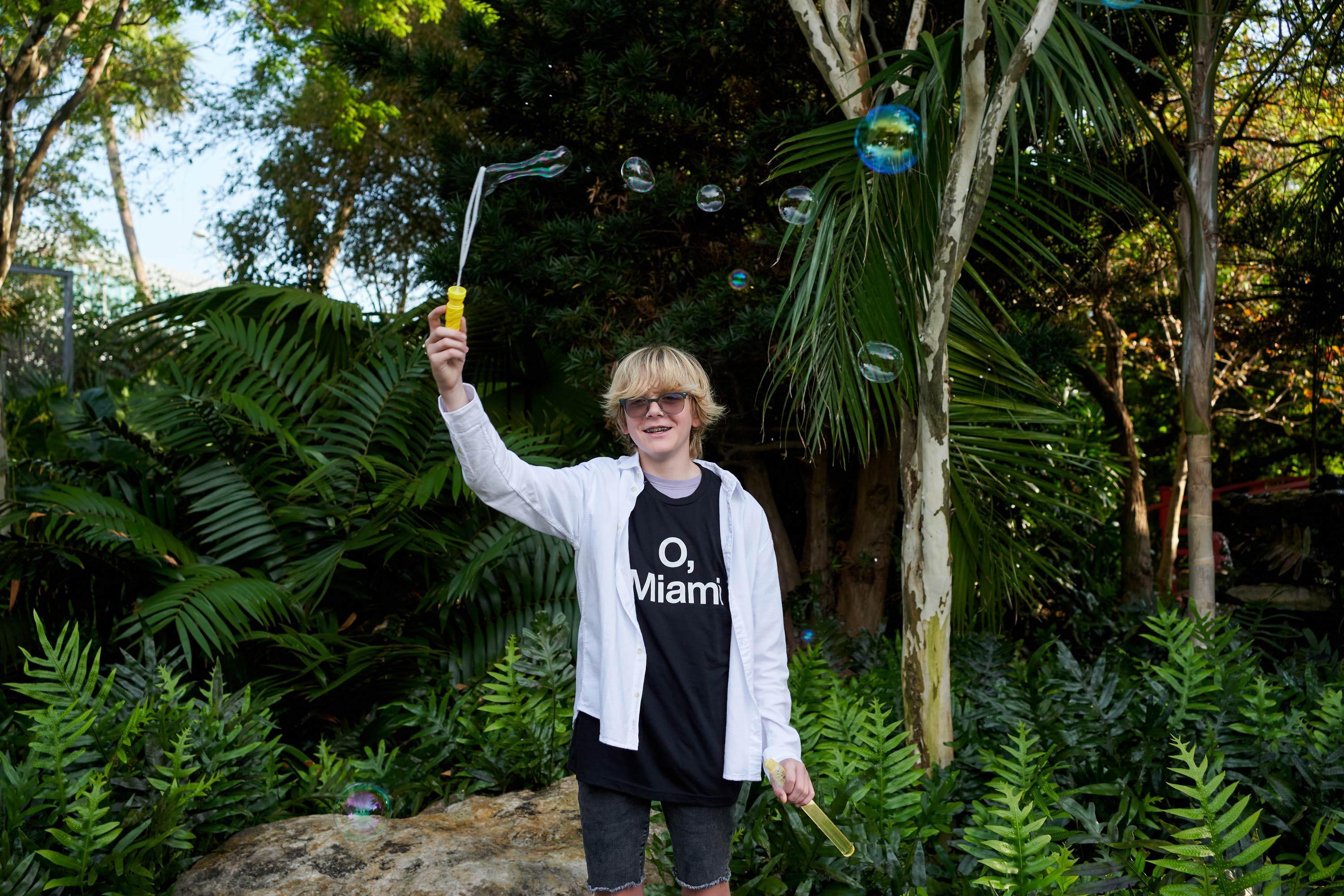

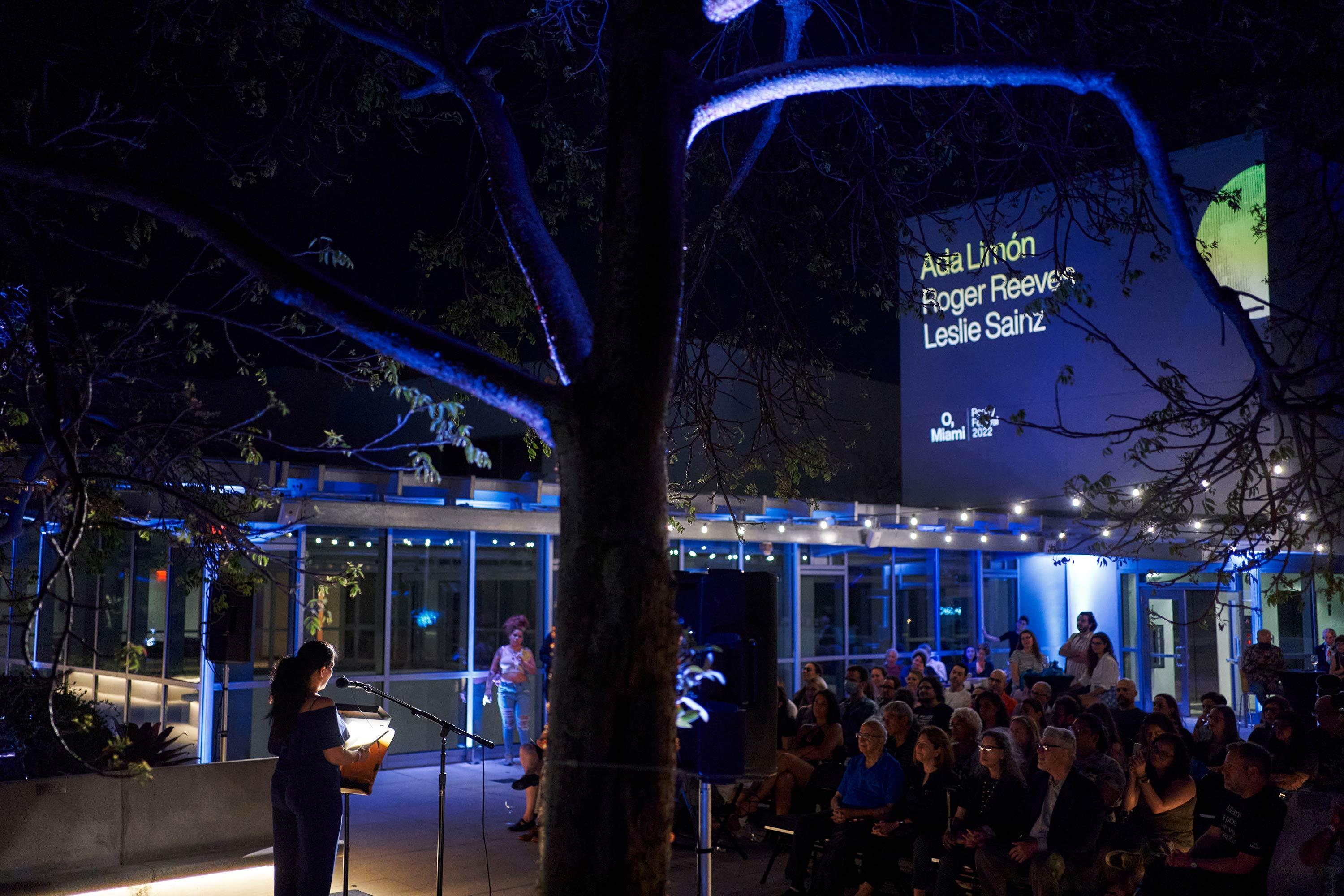
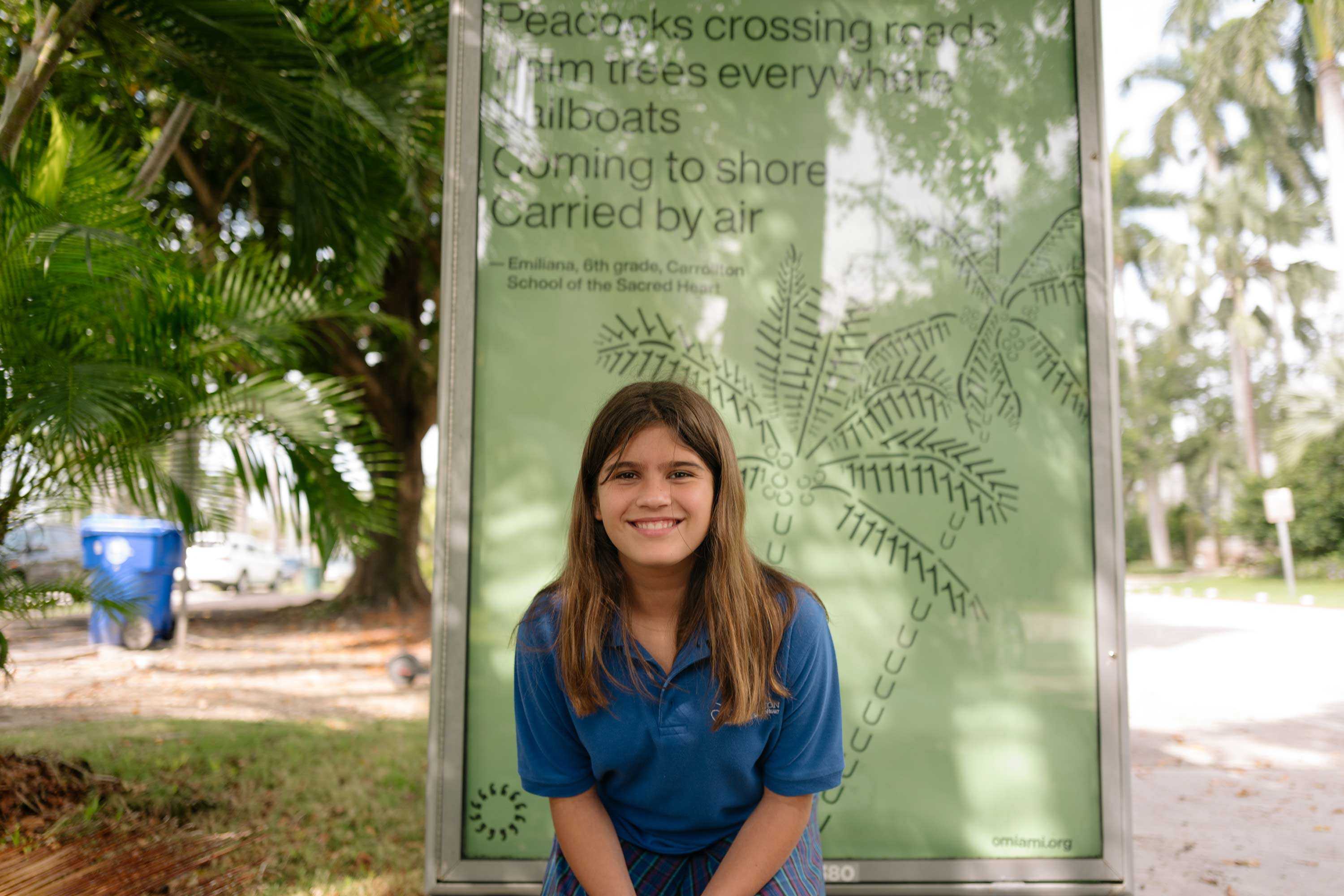
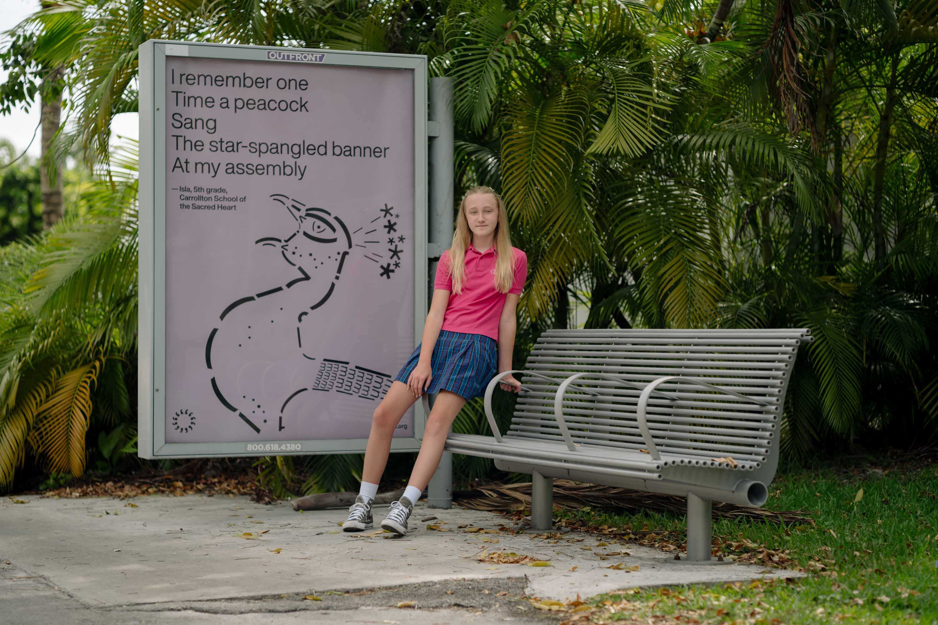
Photographs by Chantal Lawrie
Context
O, Miami grew organically in its first years. During that growth, they created many separate programs with different names to help activate their mission. But unfortunately, their audience couldn’t recognize the relationships between these various programs.
As part of O, Miami’s 10th anniversary, we began a months-long process of establishing a brand identity that would unify the organization’s many efforts. During the workshop, core values surfaced: creativity, surprise, fun, education, inclusivity, and progress. We then used those to articulate goals for the rebrand: reduce confusion between the comma and an apostrophe, represent poetry and Miami, and exhibit brightness and joy.
Brand Identity Elements

Before color, movement, or typography, one of our first priorities was to address the organization’s name. The “O” in O, Miami stands for Ode, but was often confused. This misconception often resulted in use of an apostrophe instead of a comma, and distanced the organization from its poetic core.
Part of our solution was to have O, Miami italicized when written. Poetry collections are formatted this way, and by having the organization match case, it becomes poetry itself. This better solves the problem of how people write the org name, separating it (and its intention) from the surrounding text.
“Black and white is an antidote to the super saturated universe that is Miami.”
Campbell McGrath, poet and board member, during the brand discovery workshop
Two core personality traits of O, Miami are brightness and joy, which almost demand the inclusion of color in their visual language. When combined with the idea of printed text on paper, O, Miami’s color approach is established: black and white + one background color.
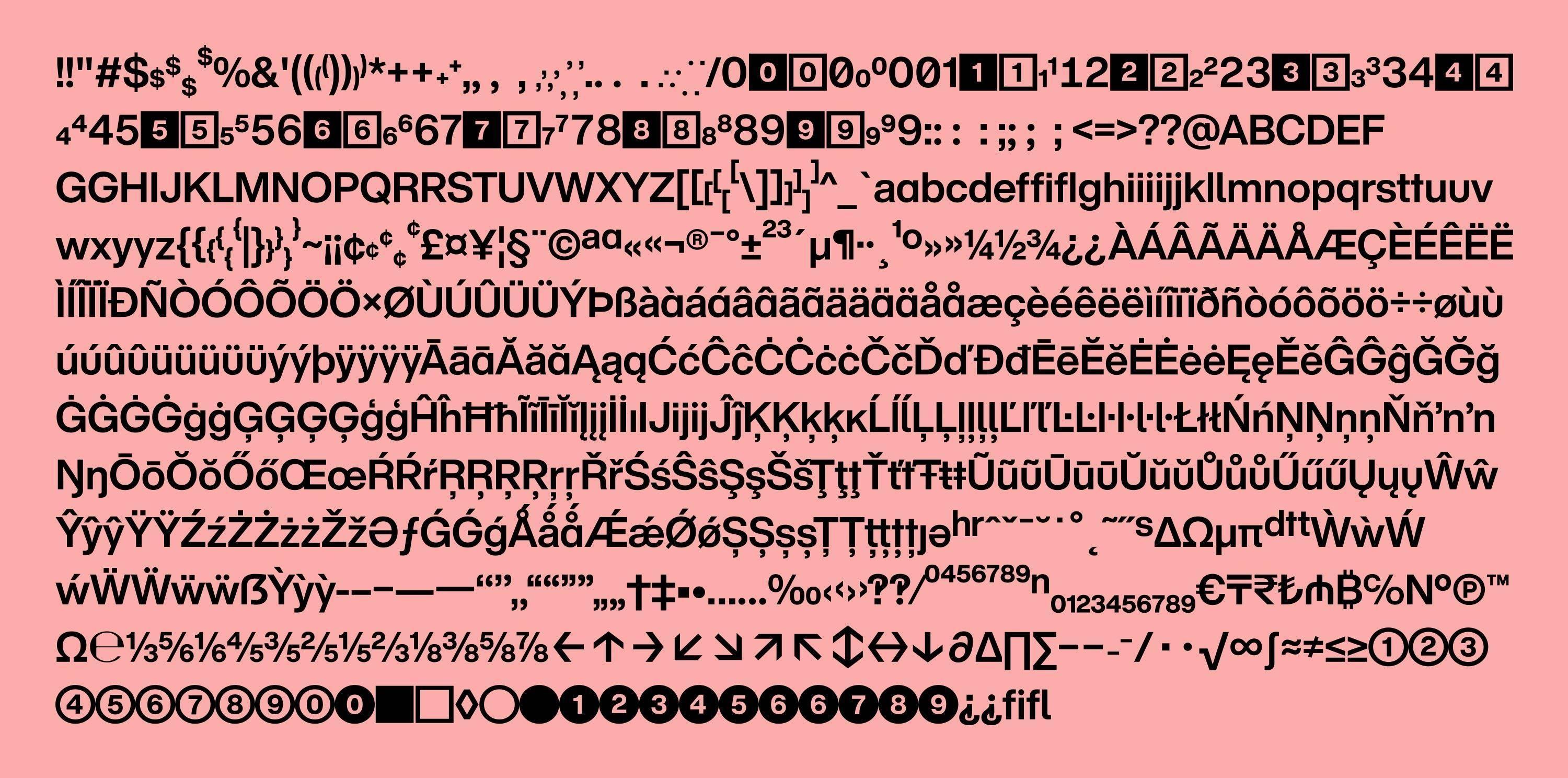

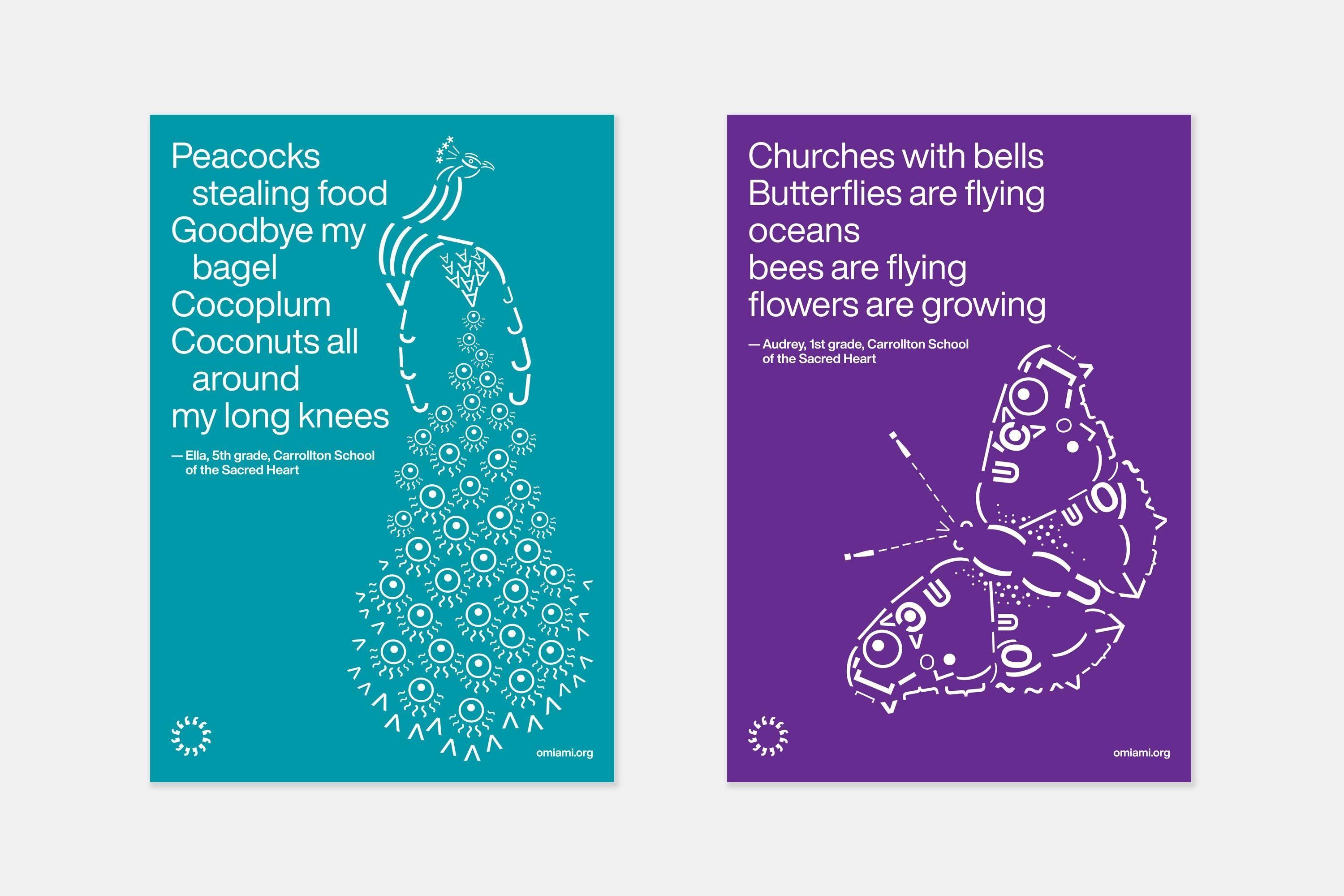
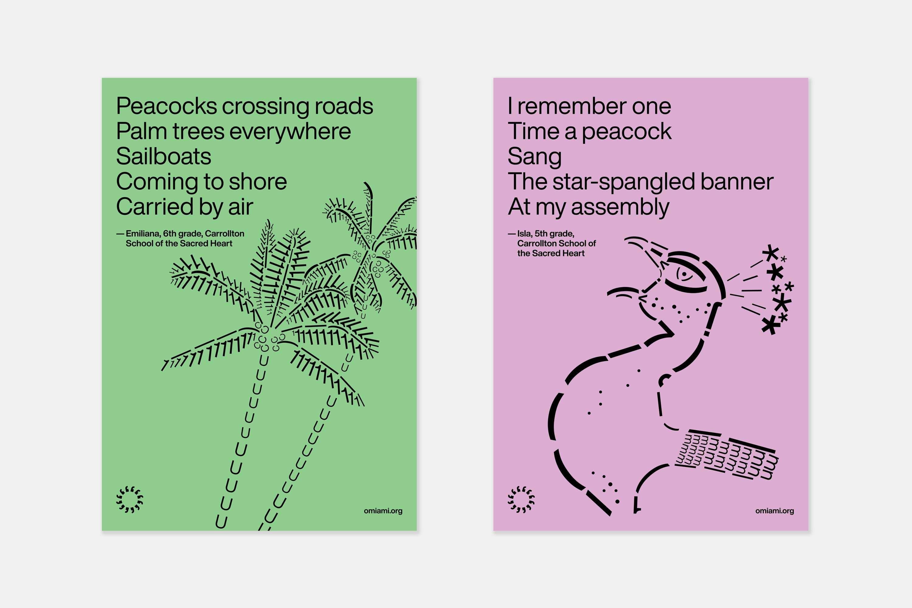
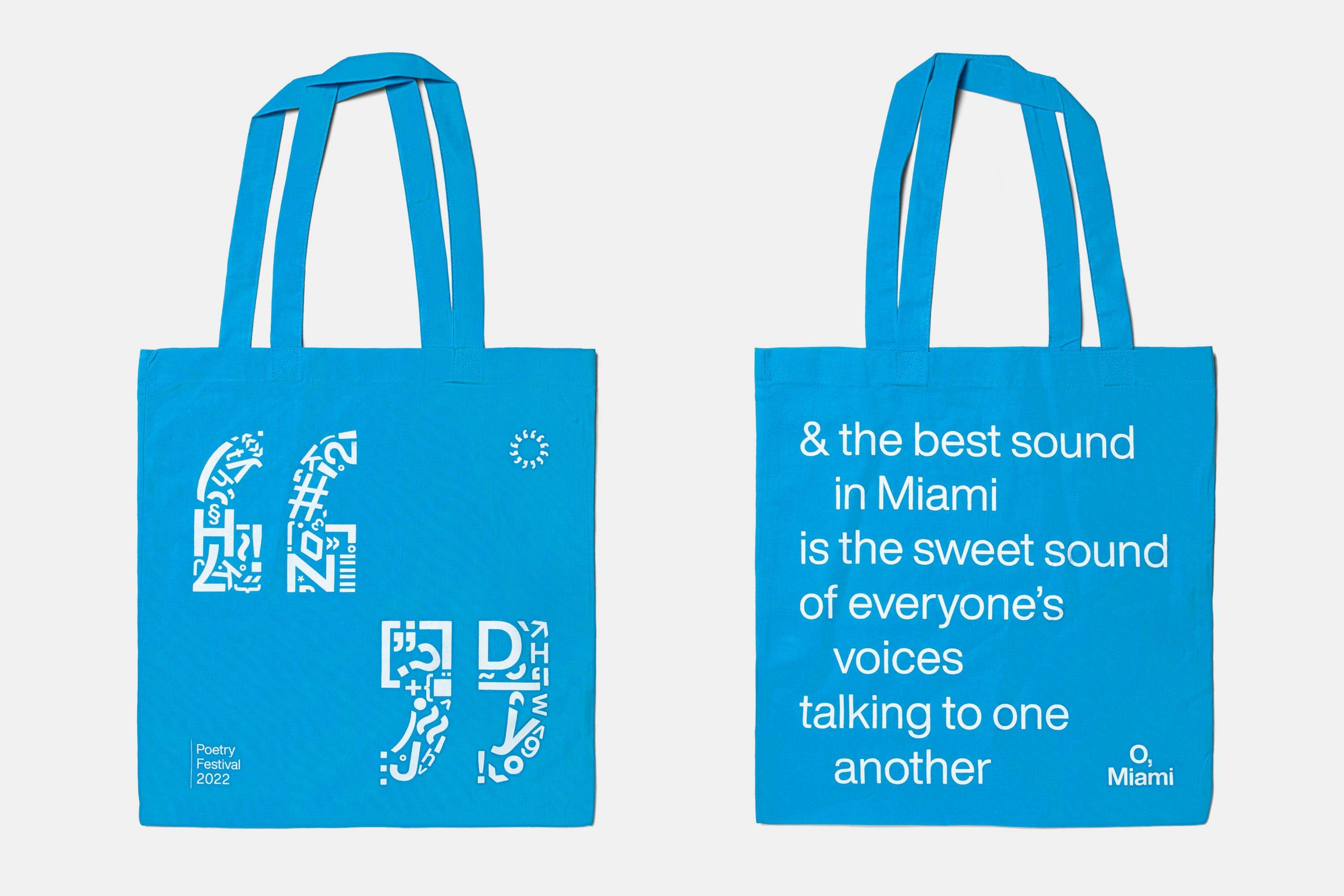
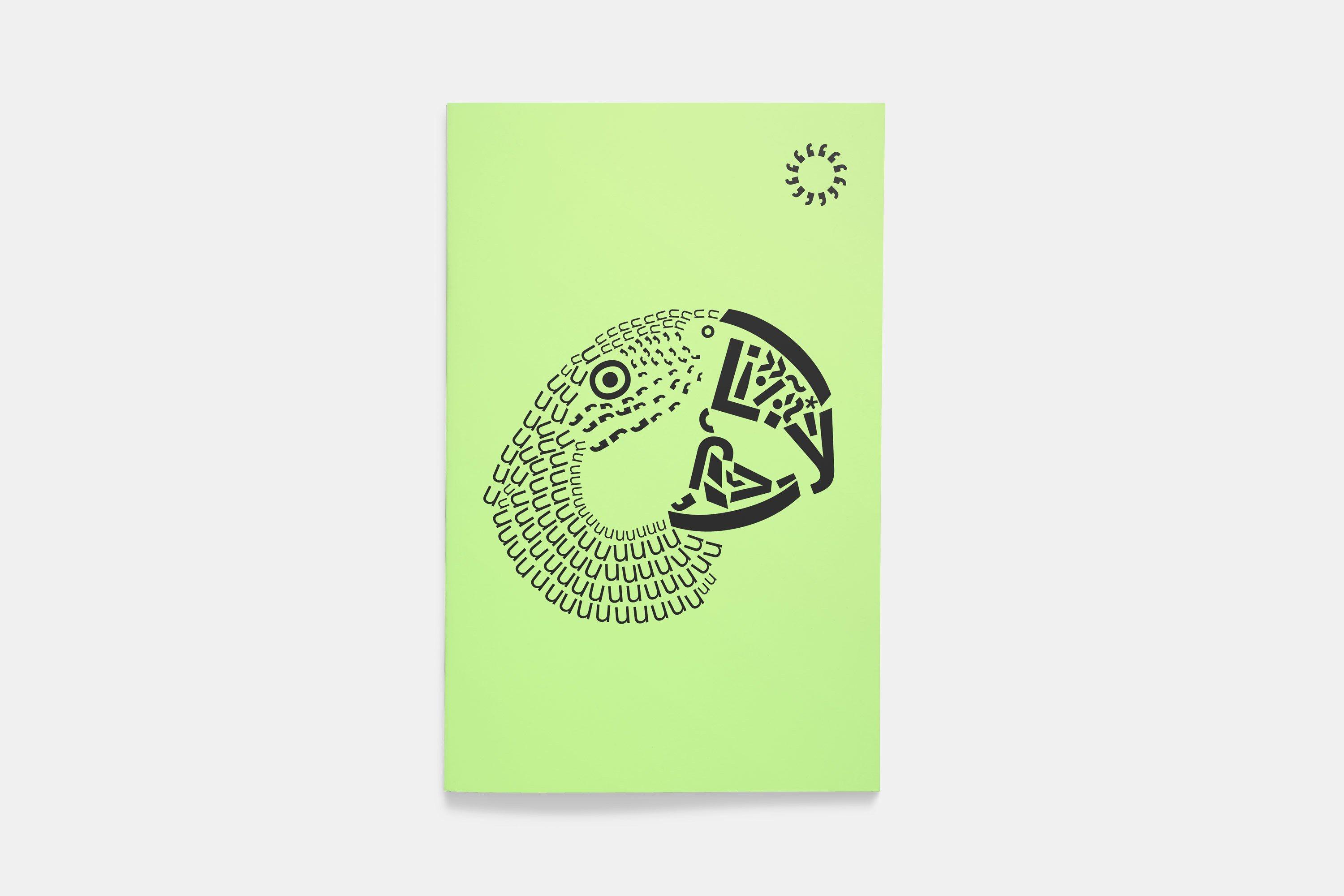
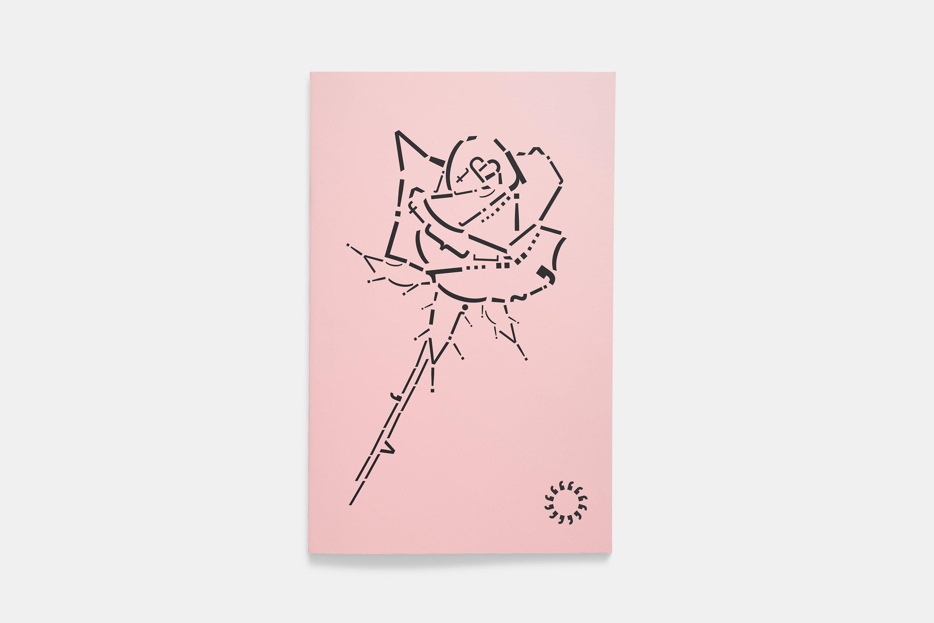
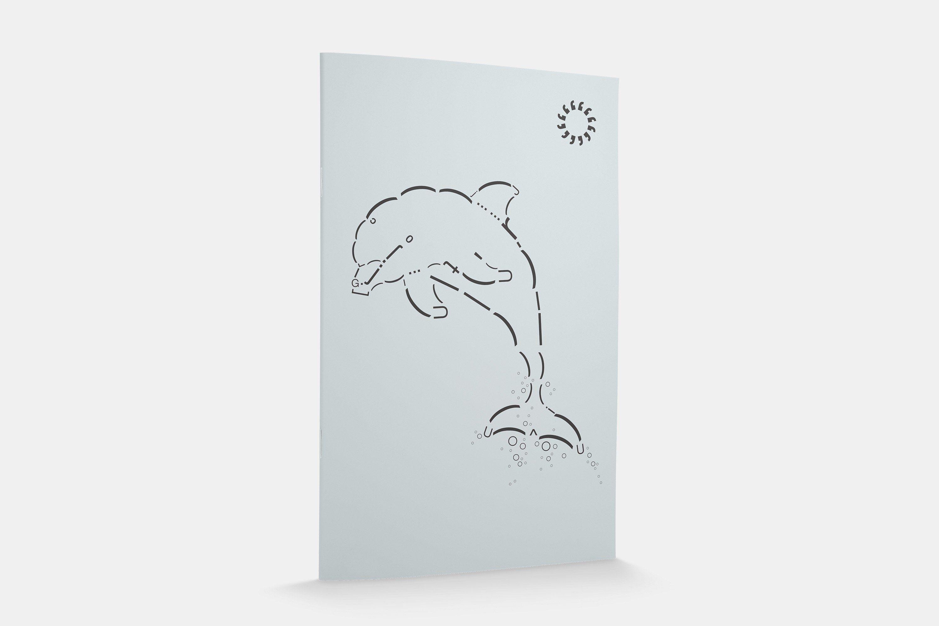
One tenet of the O, Miami graphic identity is creating imagery out of language. Even outside the logo mark, graphics are designed using available characters within Helvetica Now’s glyph set—the brand’s singular font family. The alphabet used for reading and writing becomes a toolkit for image-making, play, and experimentation.


We limit ourselves to using set point sizes, imagining we’re in a letterpress studio with access to a type drawer cabinet stocked only with certain sets of metal type. Parentheses become the curve of a flamingo’s neck, asterisks become the ripples on an alligator’s tail, commas become a kitten, etc.


In Use
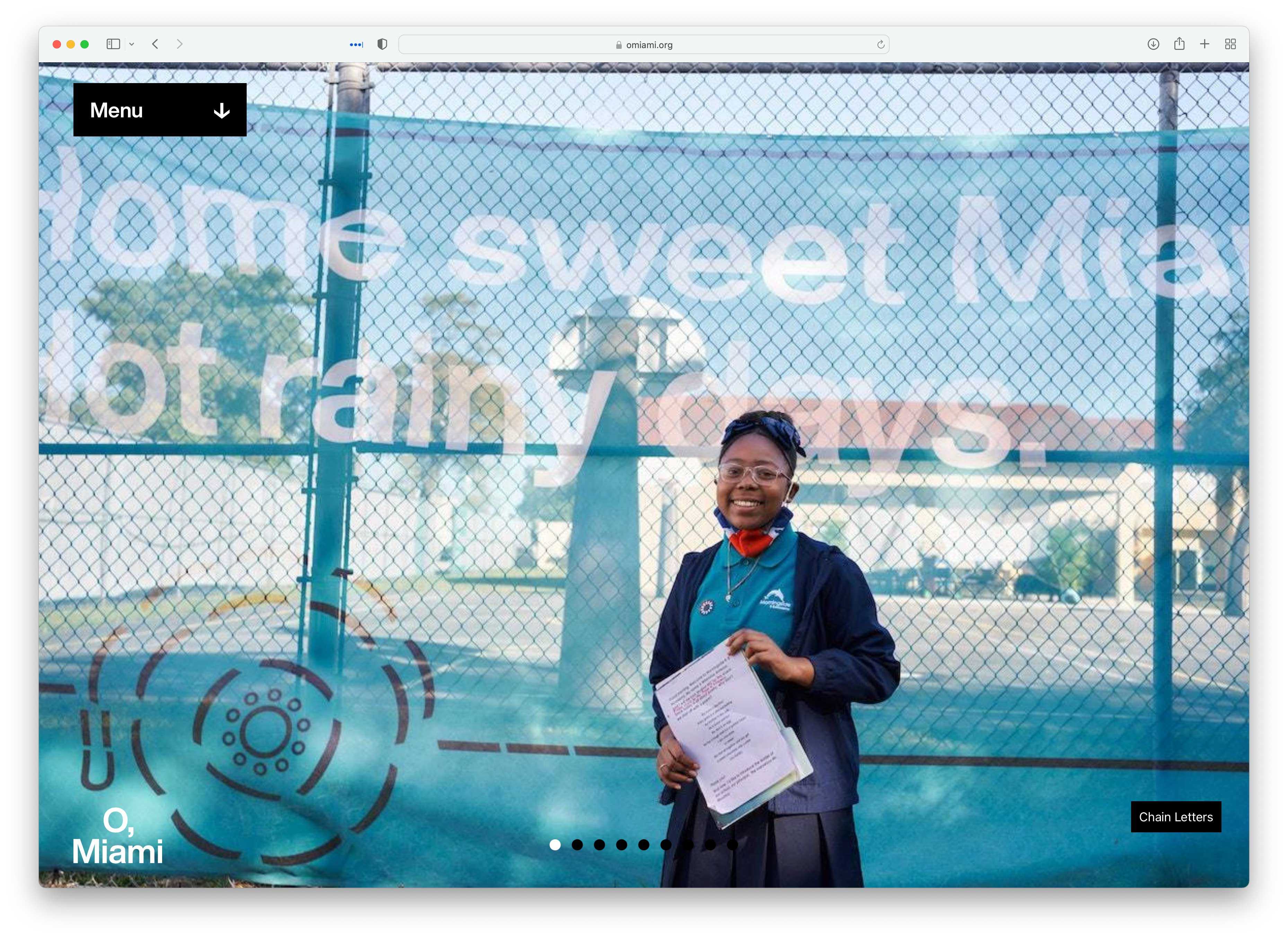
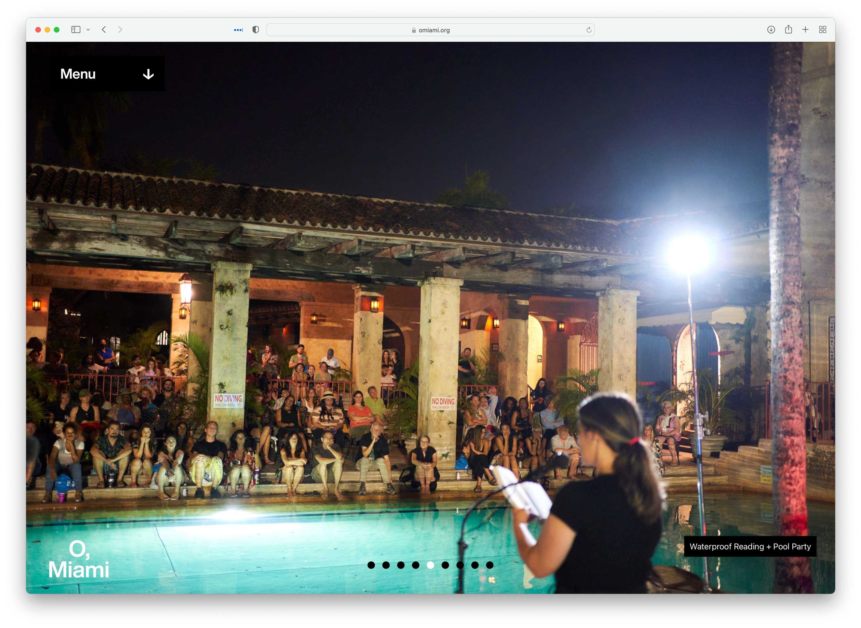
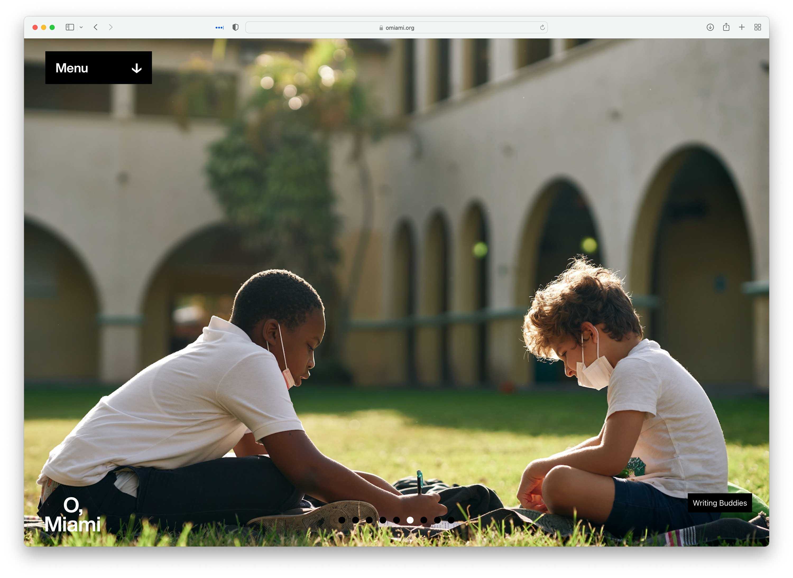
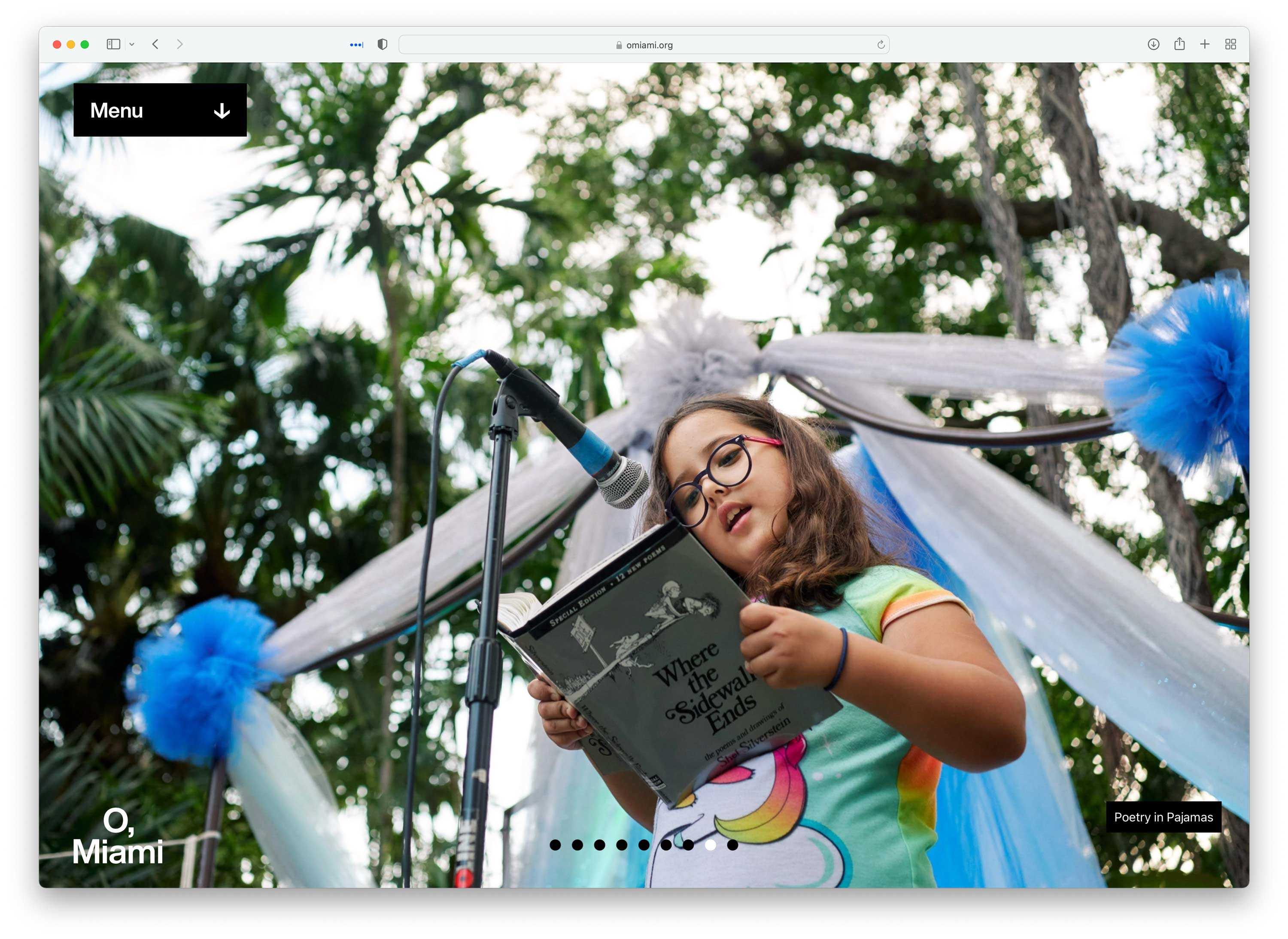
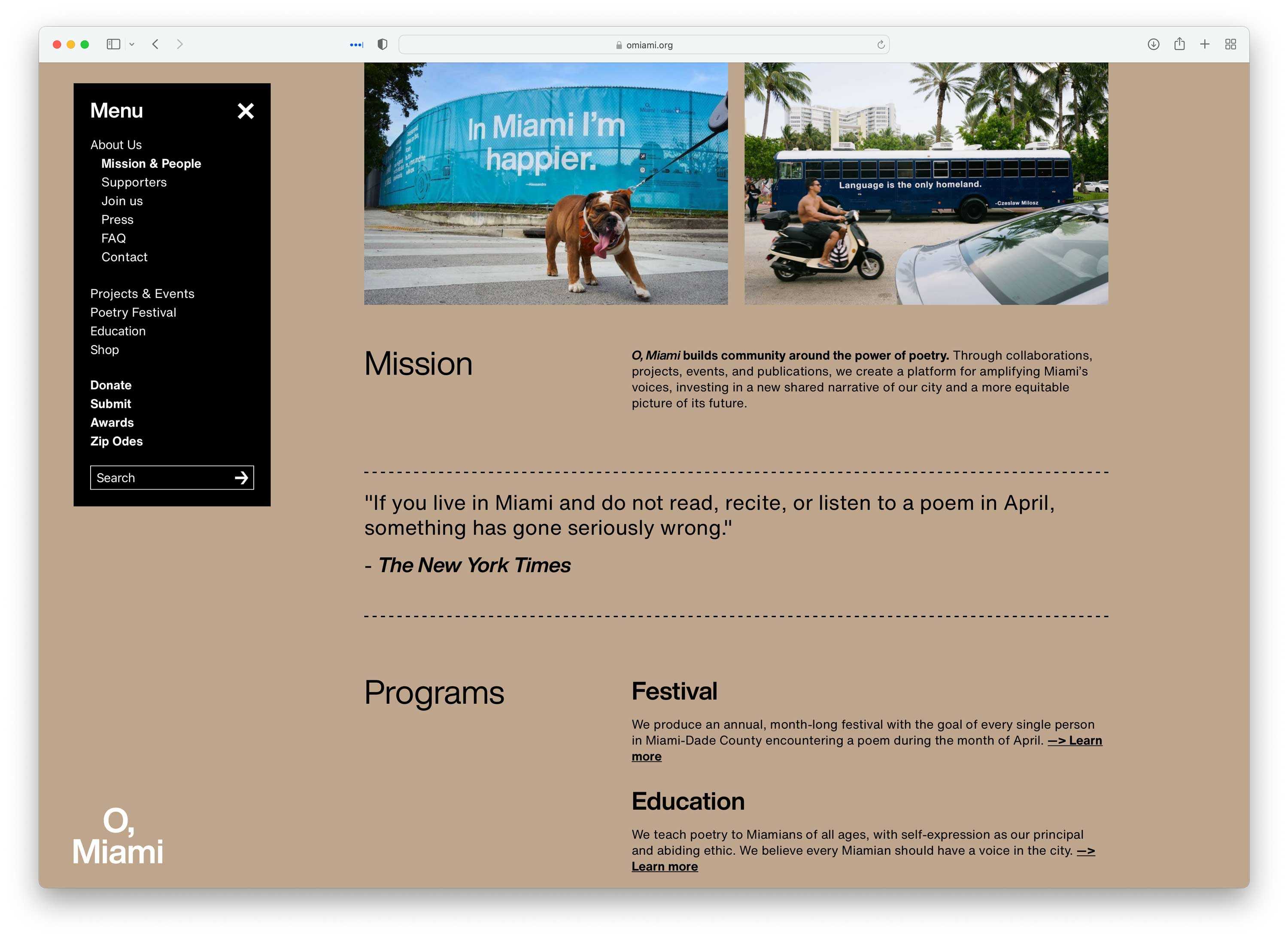
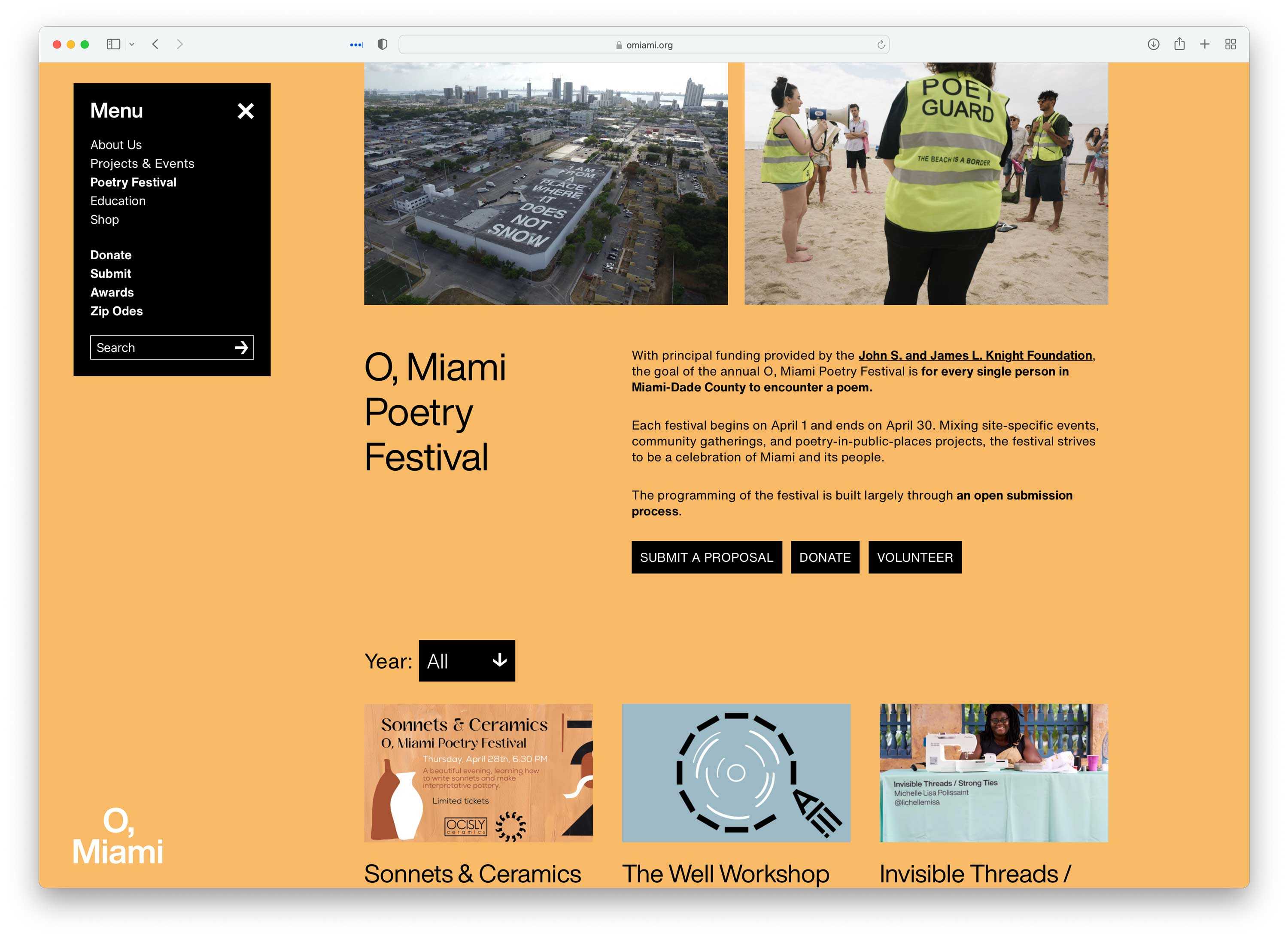
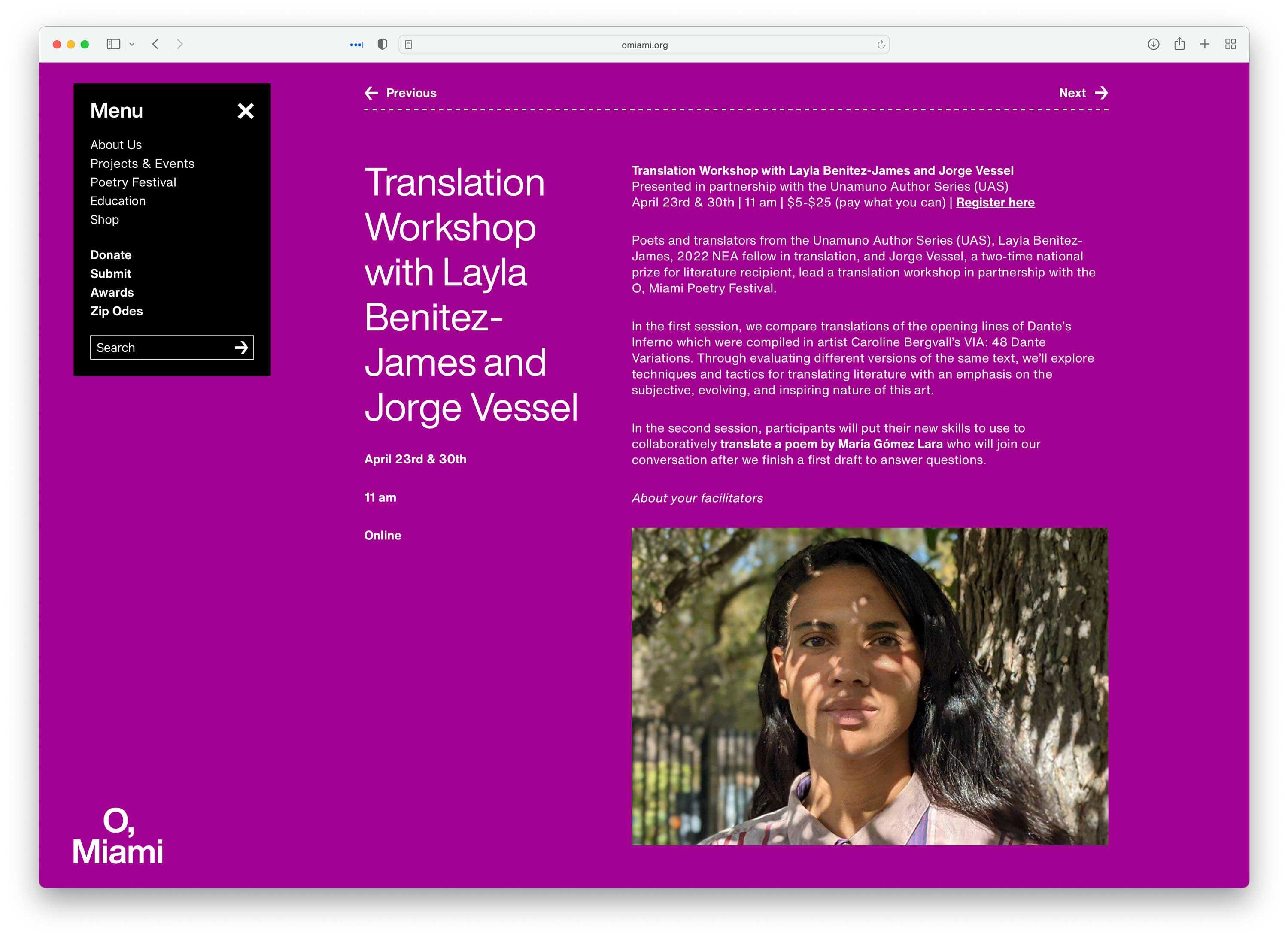
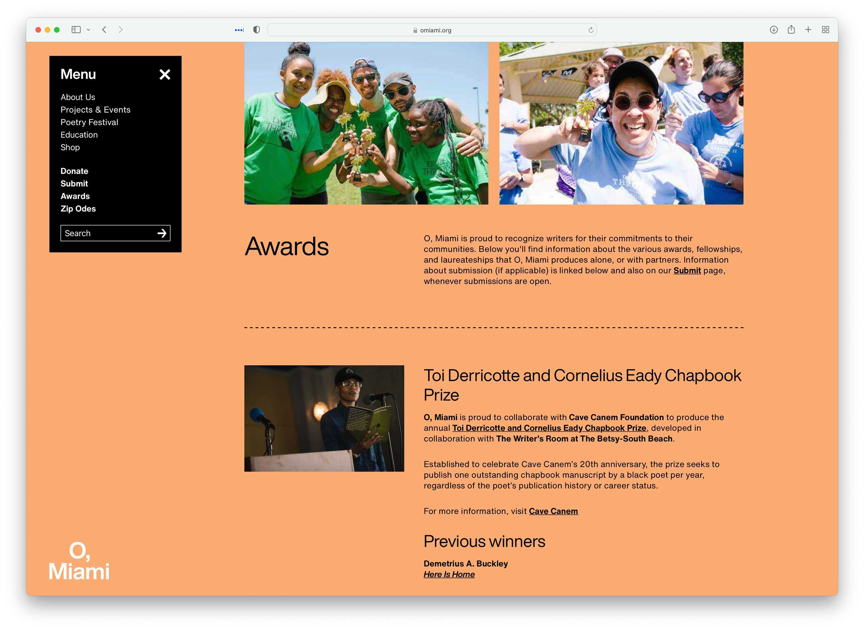
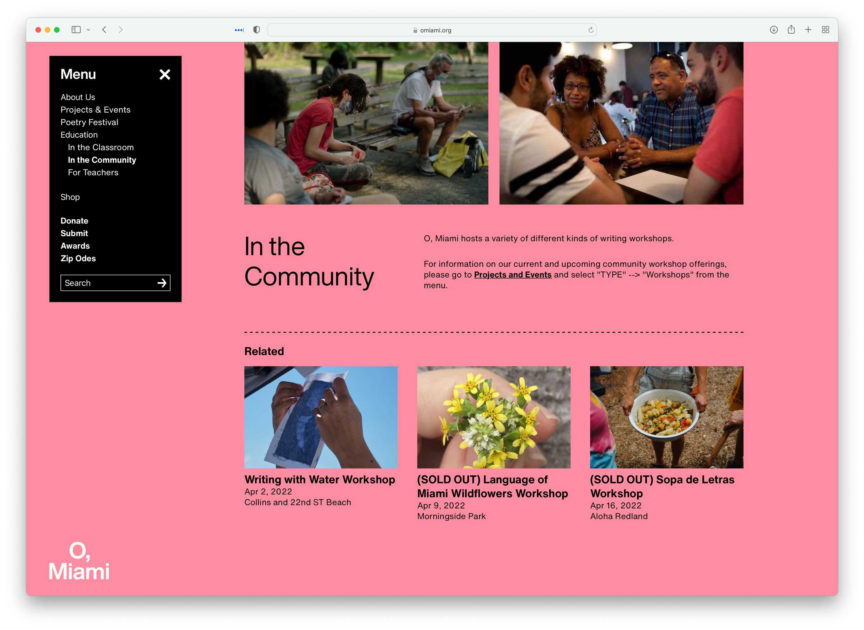
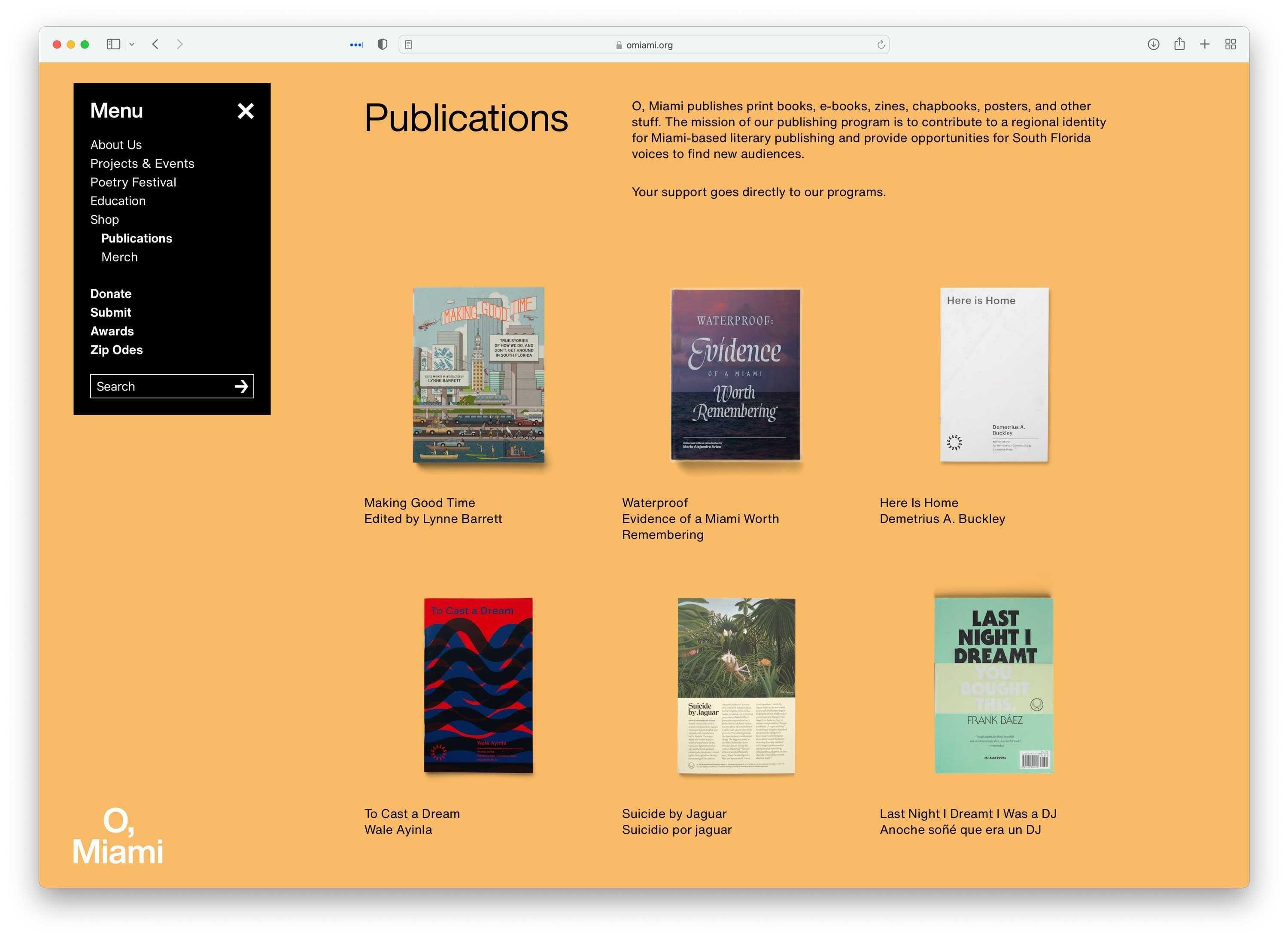
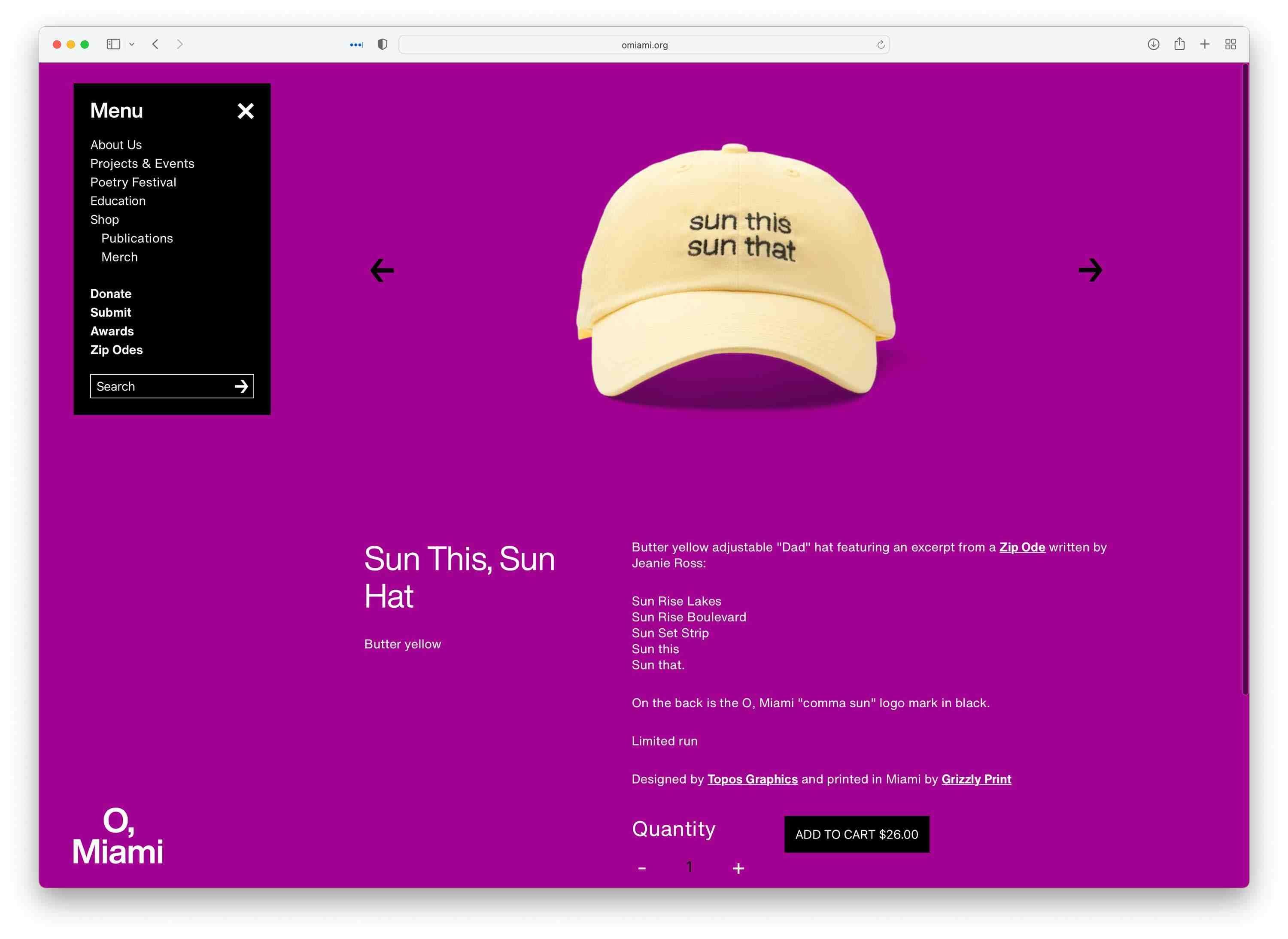
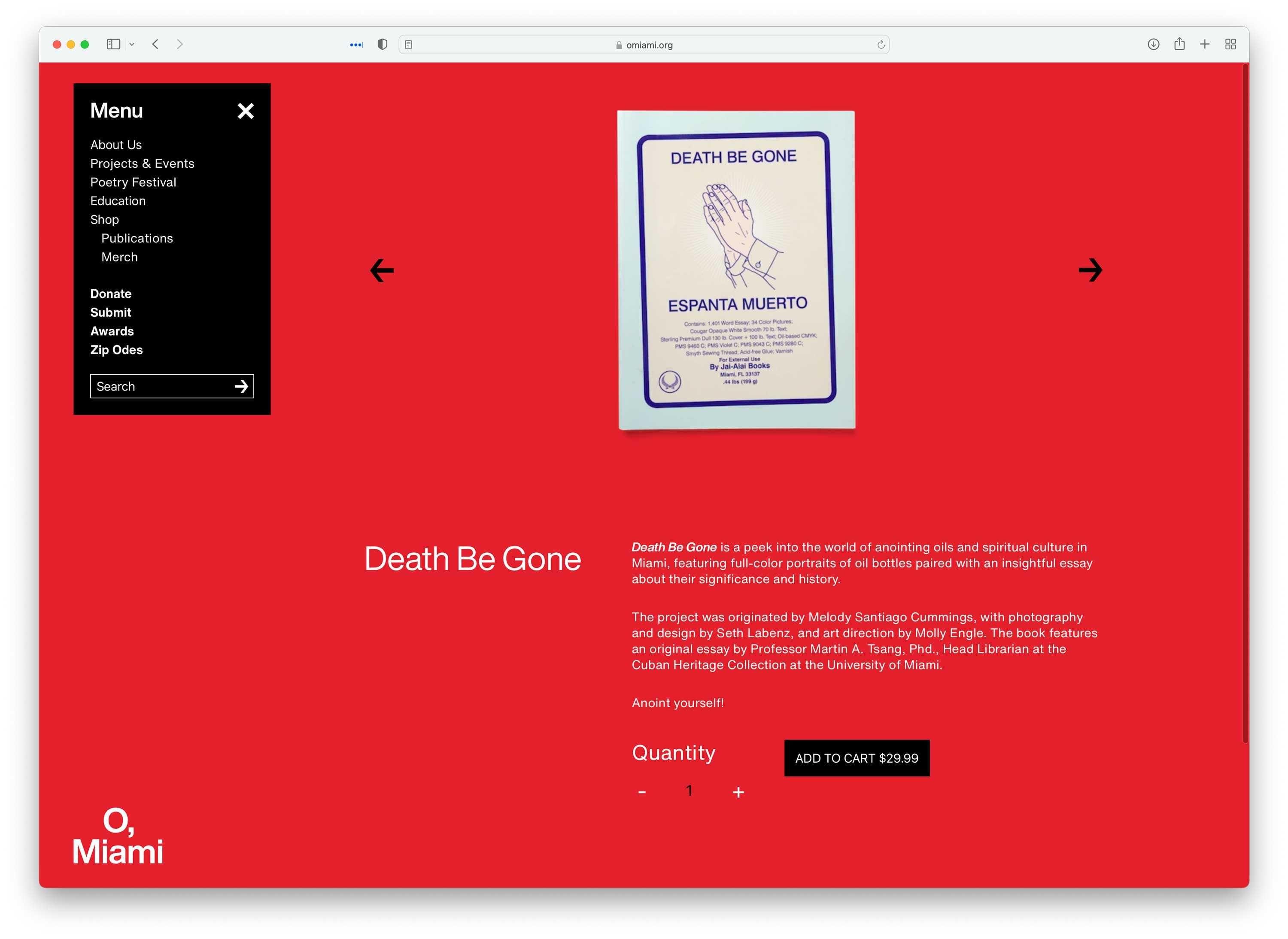
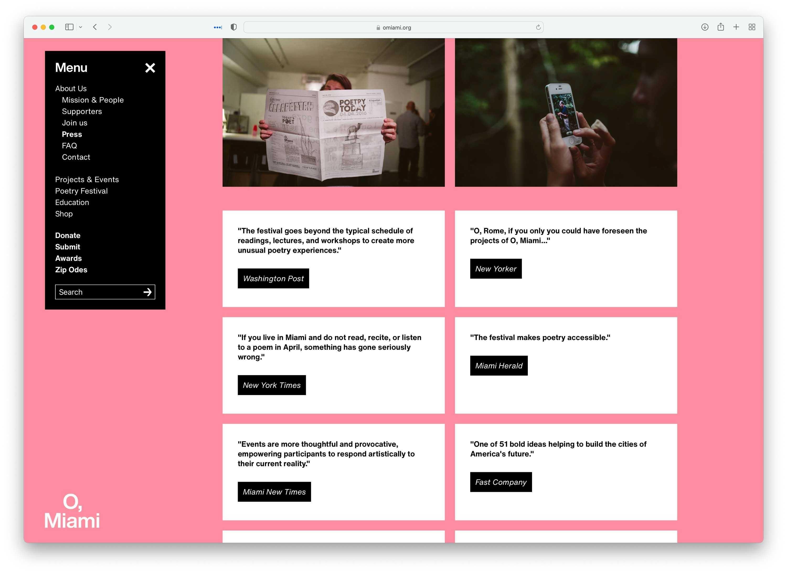
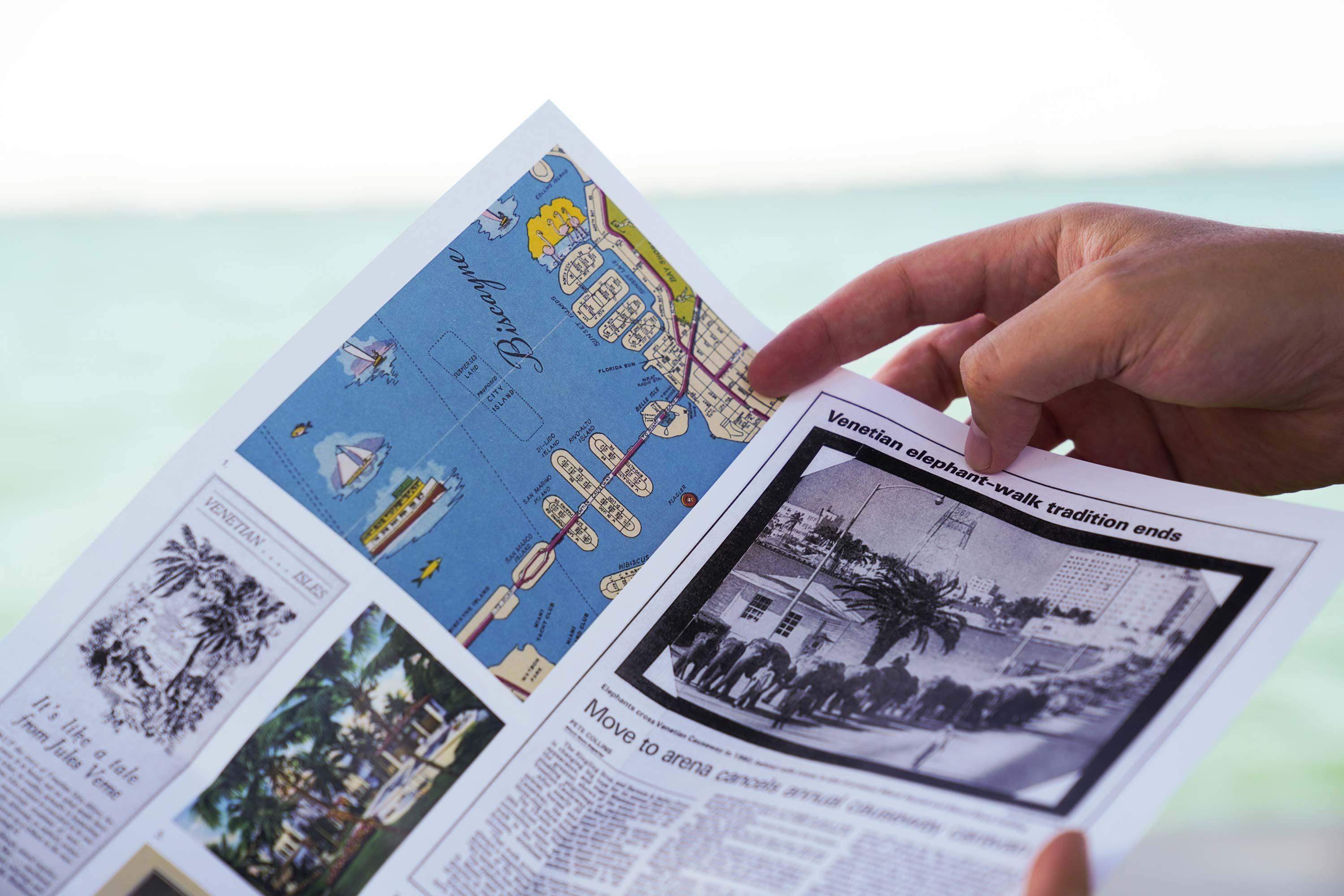
One place of great importance for O, Miami is their website. It is an ever-growing archive and a place of exploration. Each exhibit connects to related projects, events, or publications. Together it presents the whole ecosystem that is O, Miami.
Photographs by Gesi Schilling
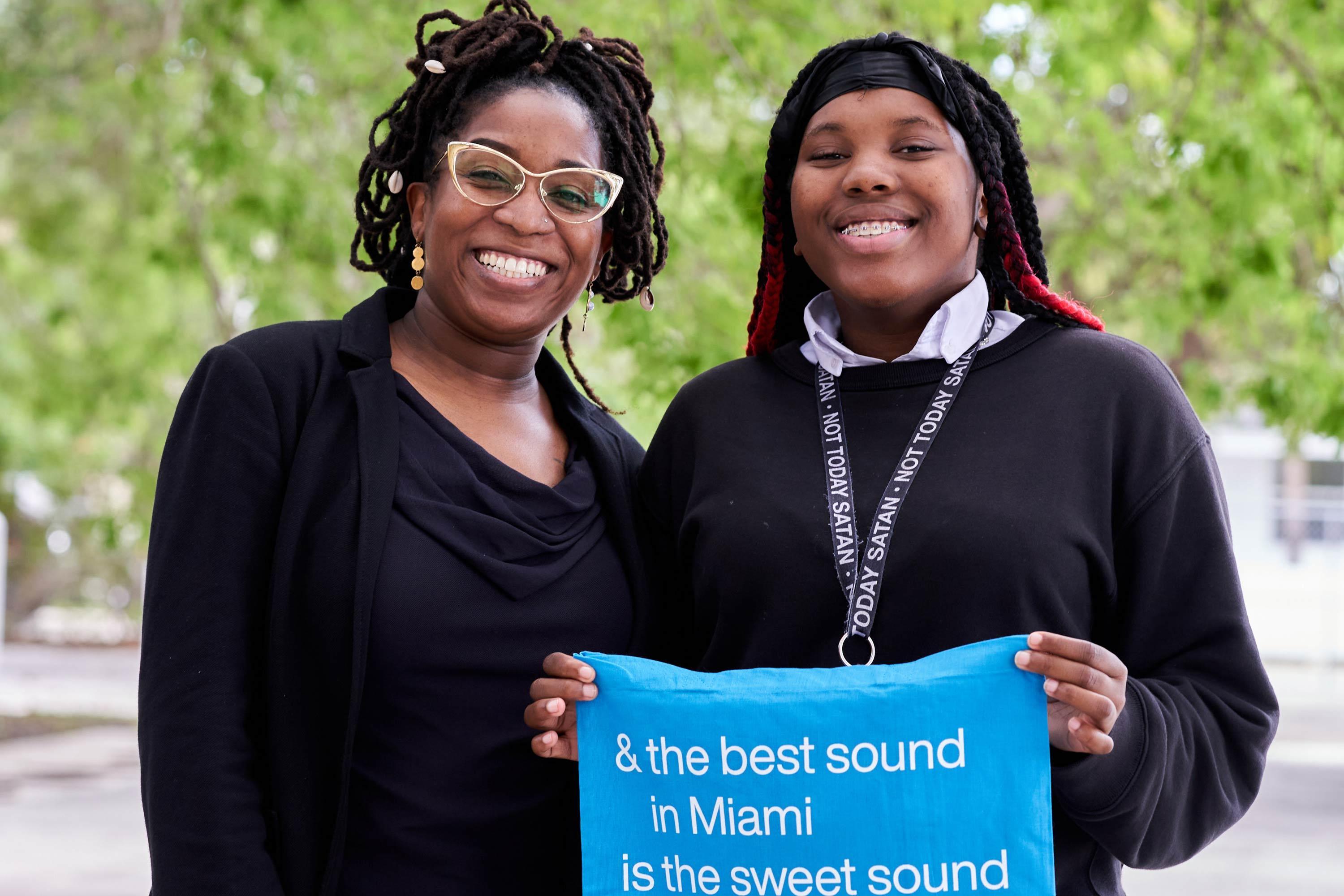
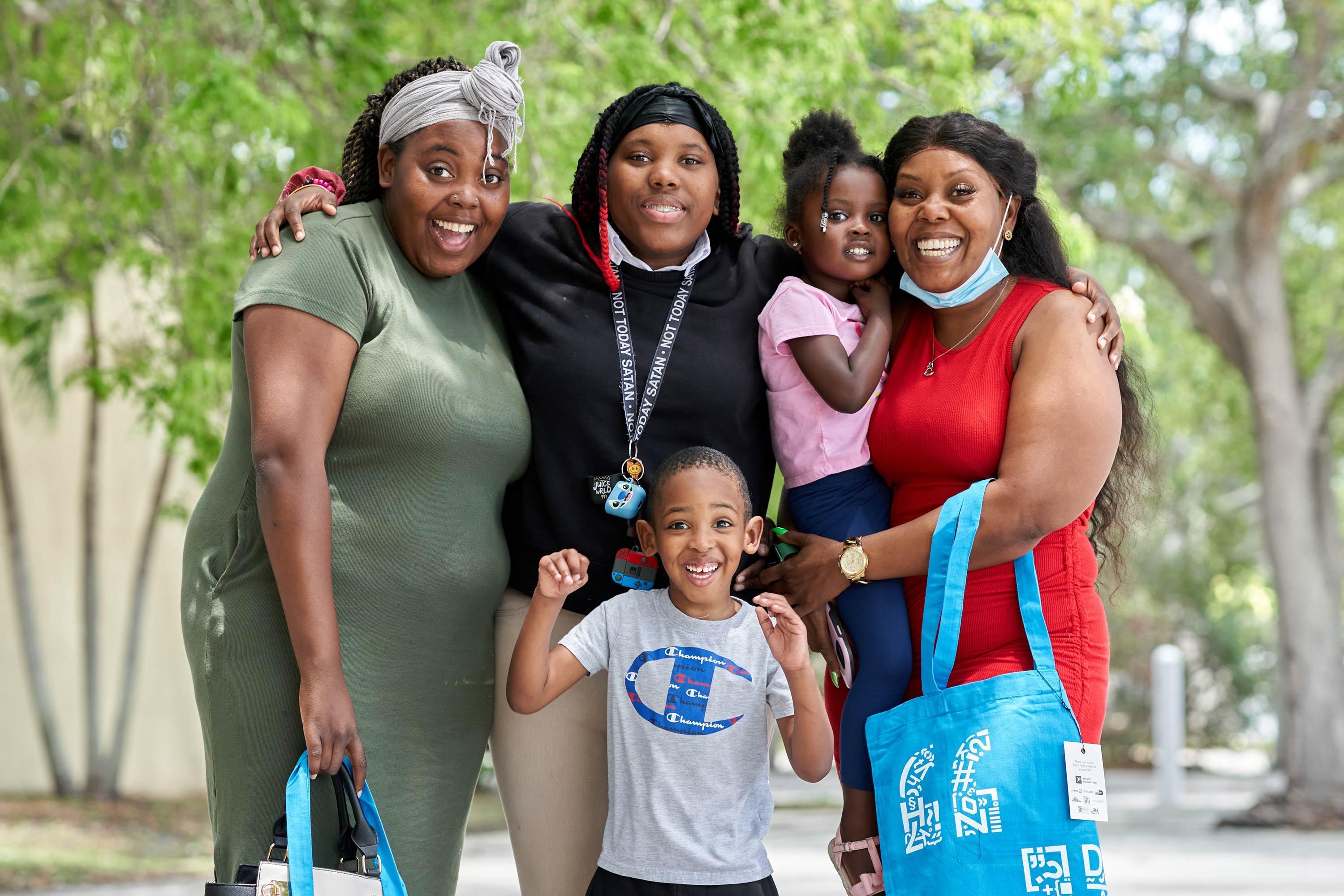
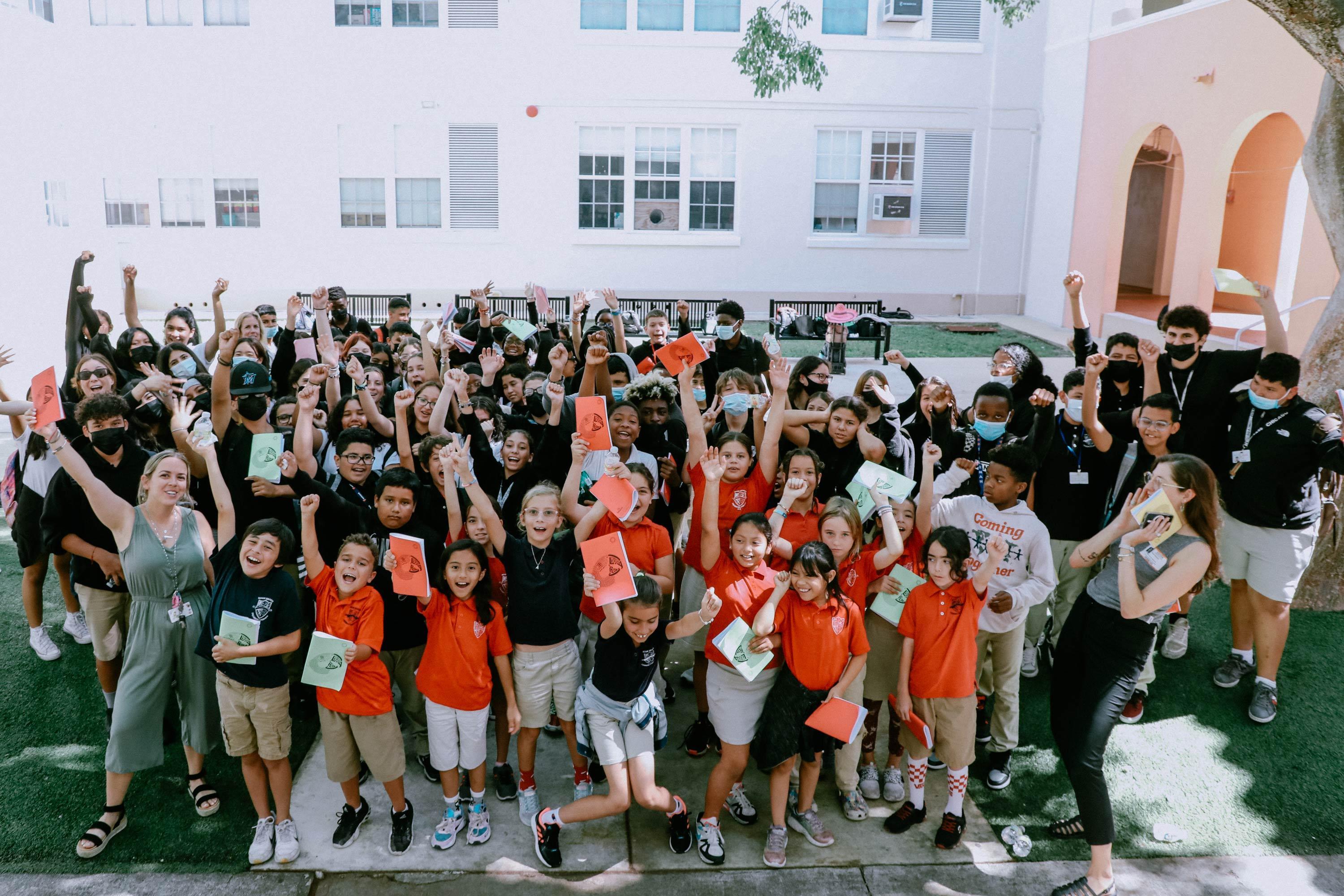
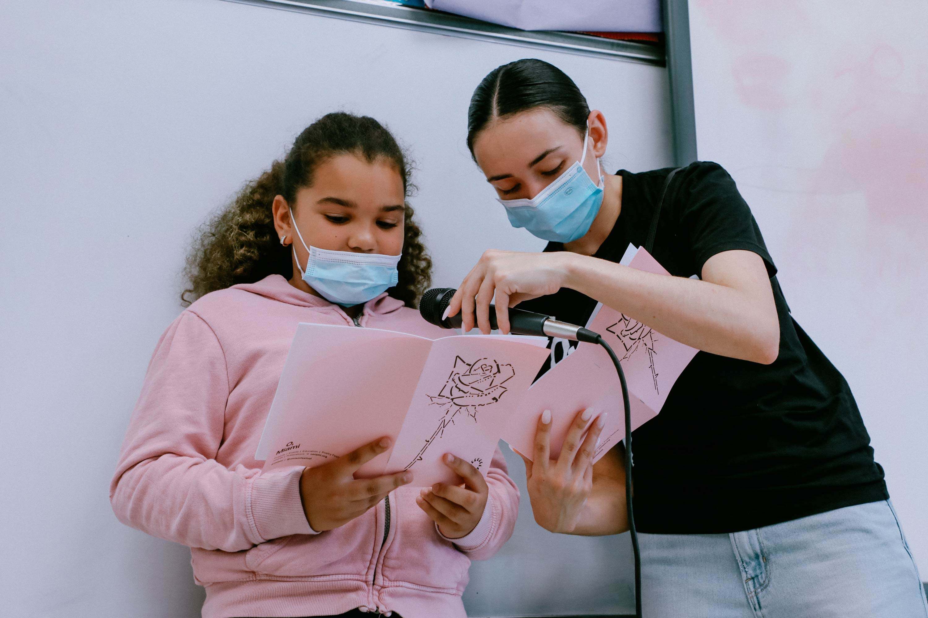
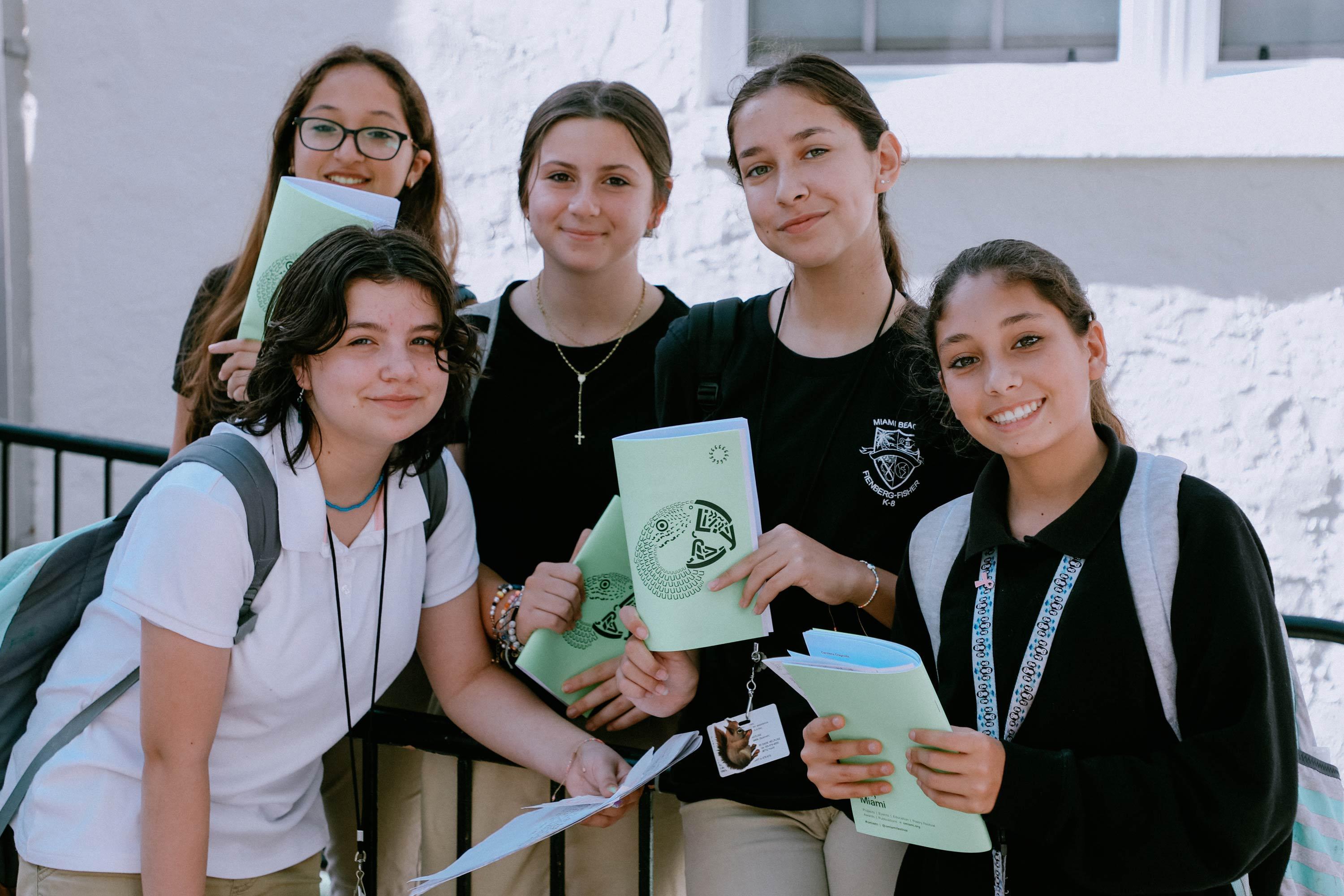
Left to right: Mrs. Mesra Pierre, M.Ed., Assistant Director of High School Academics at The SEED School of Miami and Kyndra, Student at The SEED School of Miami. Photograph by Chantal Lawrie


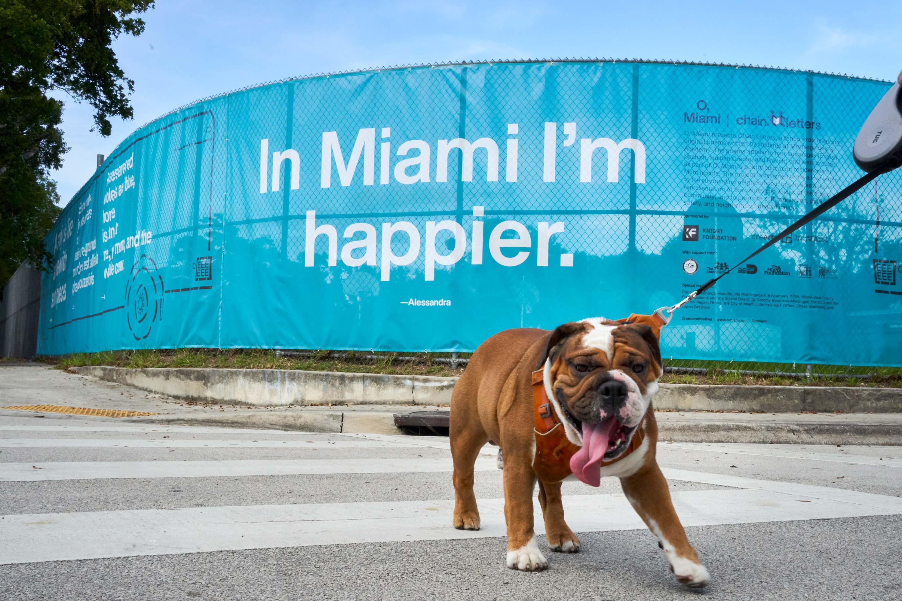
Photographs by Chantal Lawrie
Photographs by Liliana Mora


Photographs by Venessa Diaz
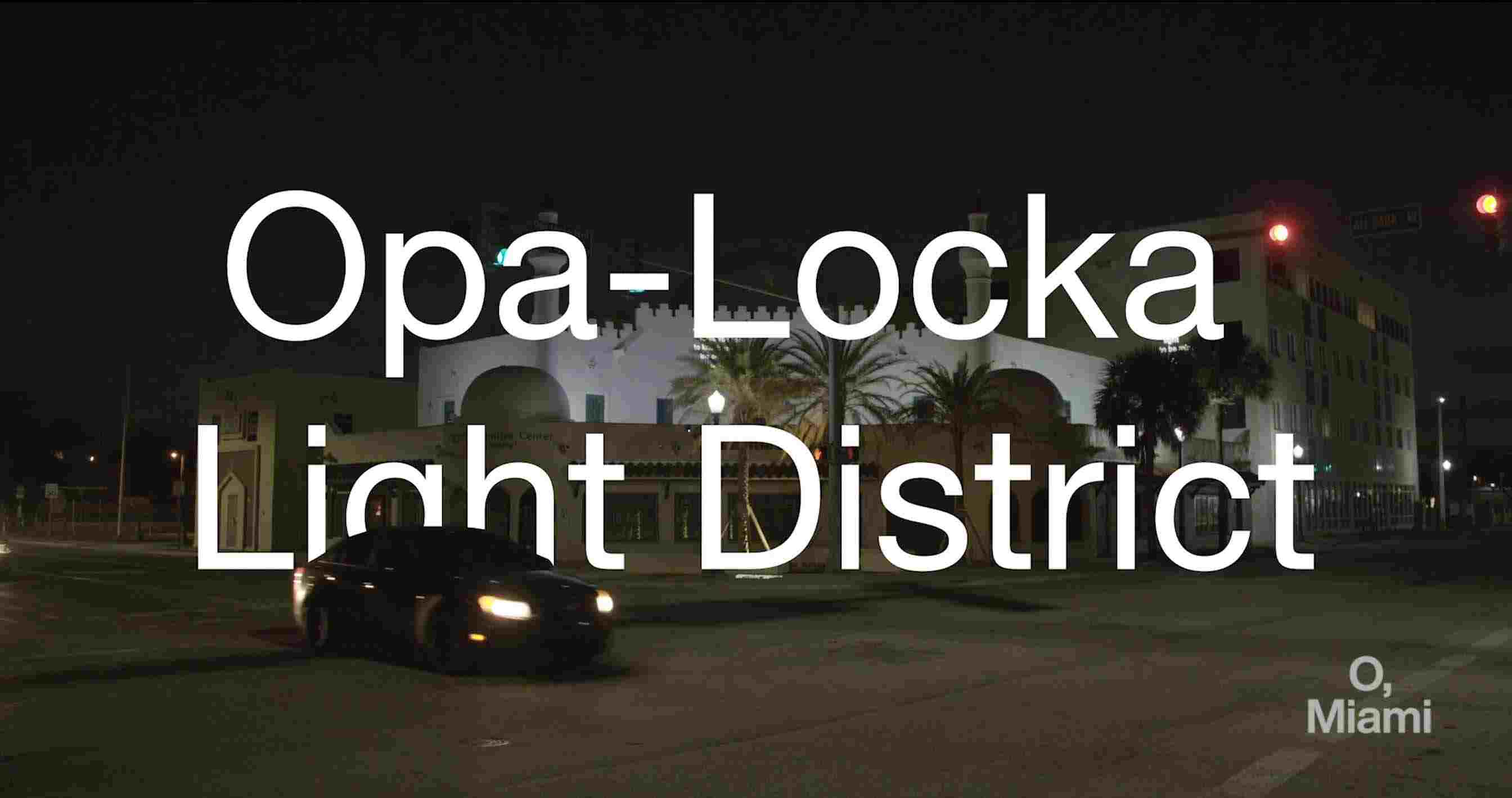
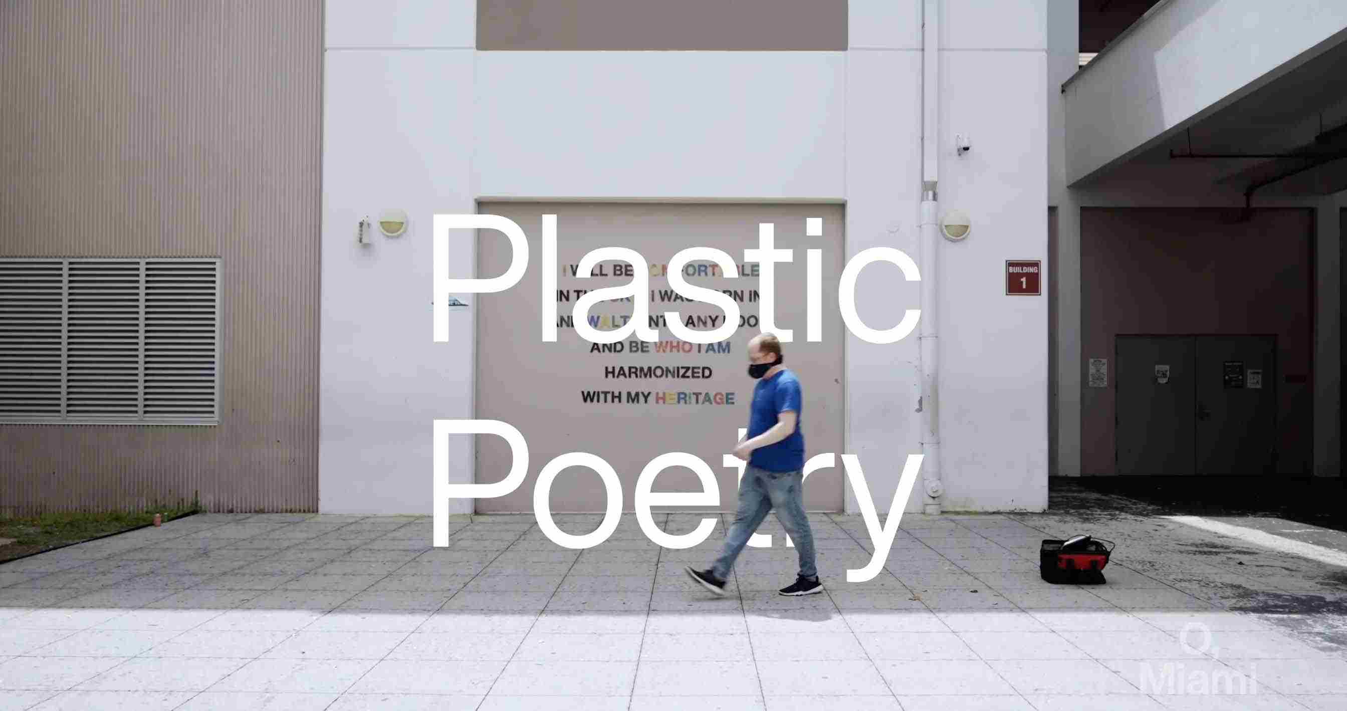
Given that many of their projects are event or time-based, video is often the ideal format to document a project for O, Miami. Video titles give the text a larger-than-life presence. Quick cuts, blinking, and typing is paired with smooth motions for an overall professional approach to movement.
Across videos and social media posts, the motion graphics for O, Miami are designed to emphasize the importance of letters and words. On theme, the illustrations are a nod to the letterpress, and the moving text is a nod to the typewriter.