Take Me (I’m Yours)
The Jewish Museum
Rooted in the tradition of relational aesthetics, the Take Me (I'm Yours) exhibition encouraged visitors to participate, touch, and take home works of art by 42 international and intergenerational artists at The Jewish Museum.
We worked on overall space design, exhibit collateral, and supplementary materials intended to activate the exhibit for patrons.
September 16, 2016 – February 5, 2017.
View the exhibition page at TheJewishMuseum.org.
More about the exhibition’s design: “Unconventional Design for an Unconventional Exhibition,” which includes an interview with Seth and Roy
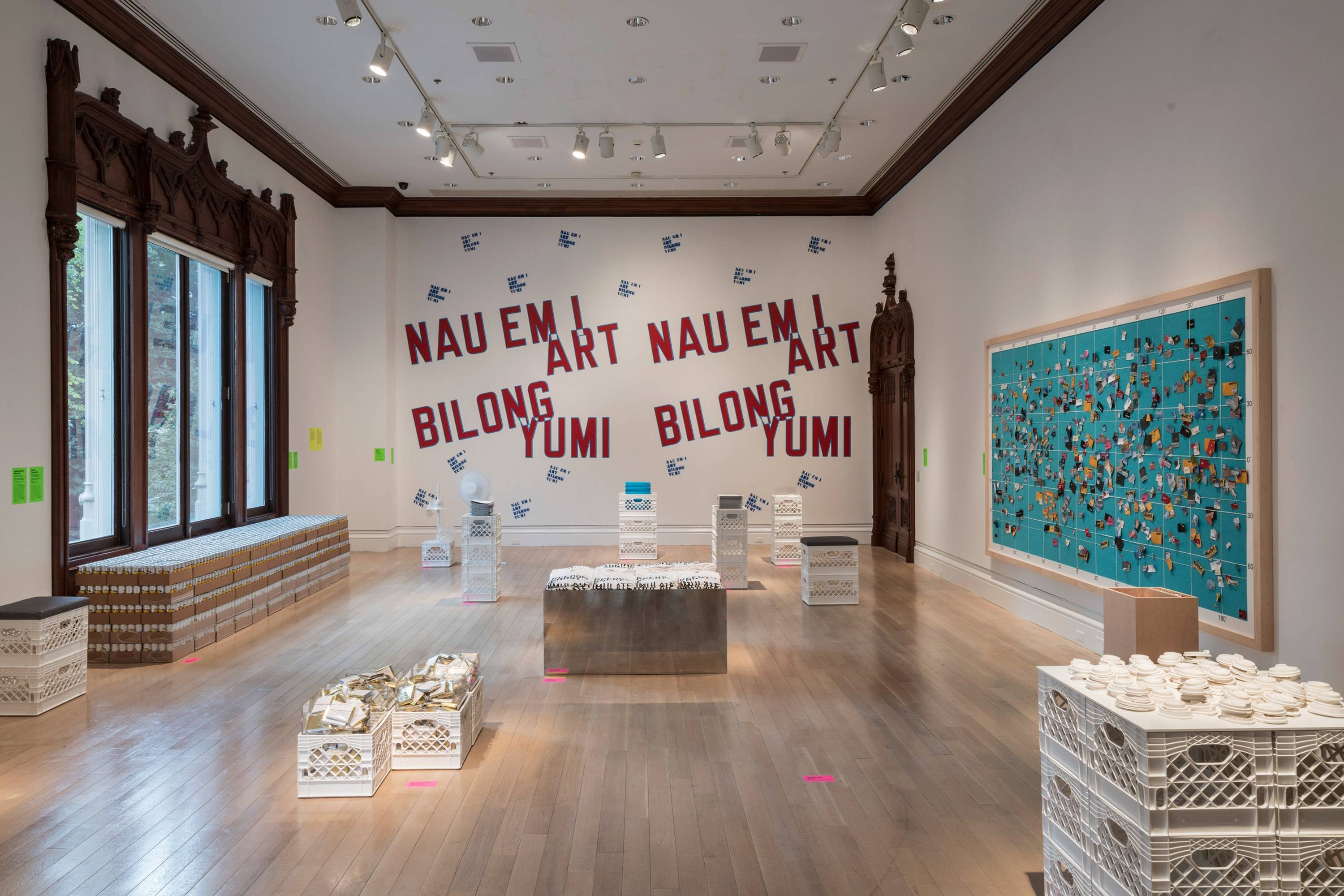
Exhibition title wall design; neon sign fabrication and installation by Lite Brite Neon
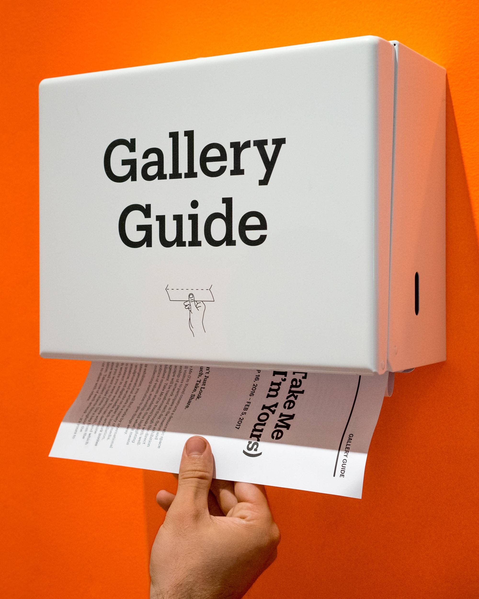
We repurposed a towel dispenser—something known for its accessibility and costlessness—for the distribution of the exhibit guide.
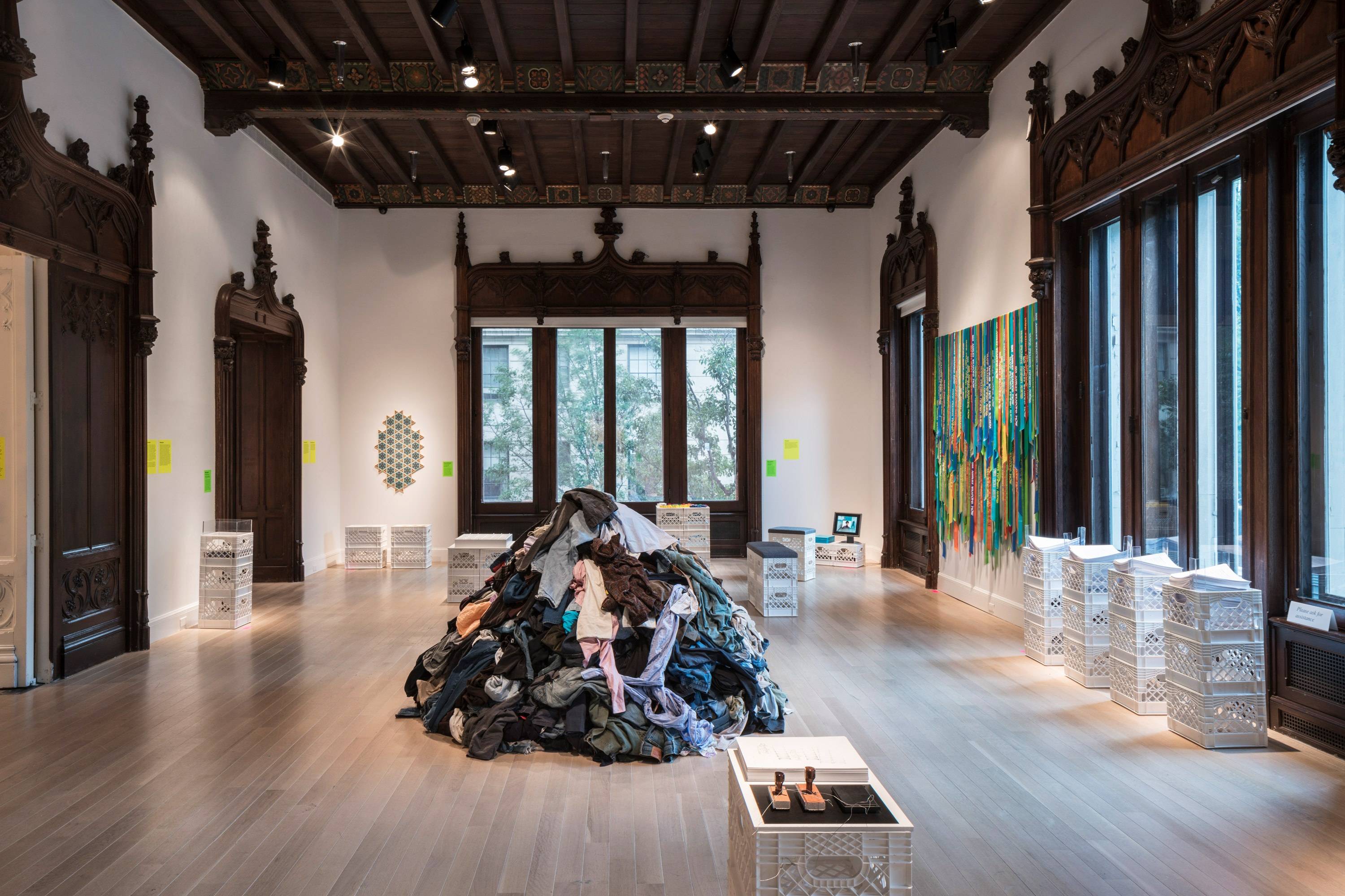
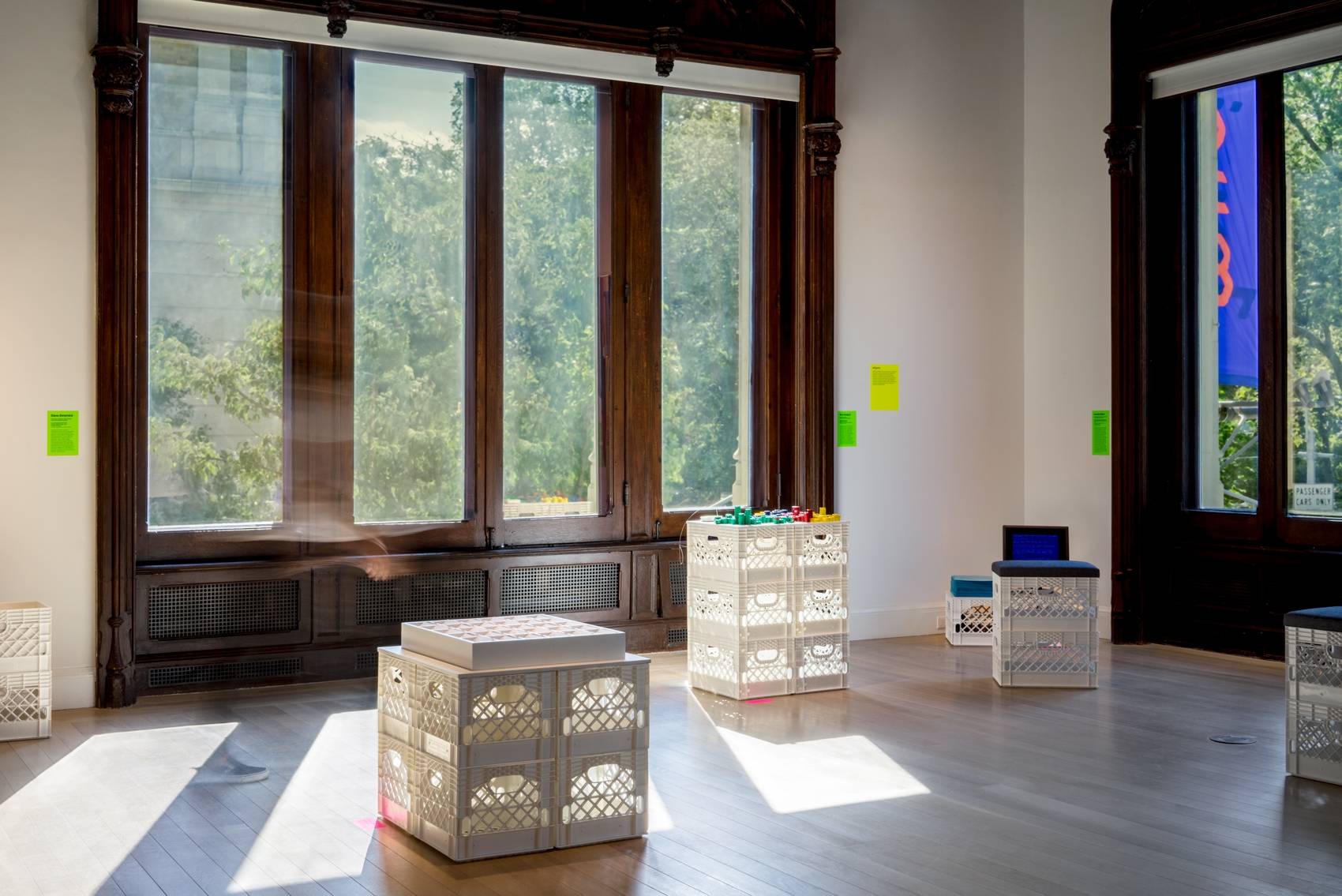
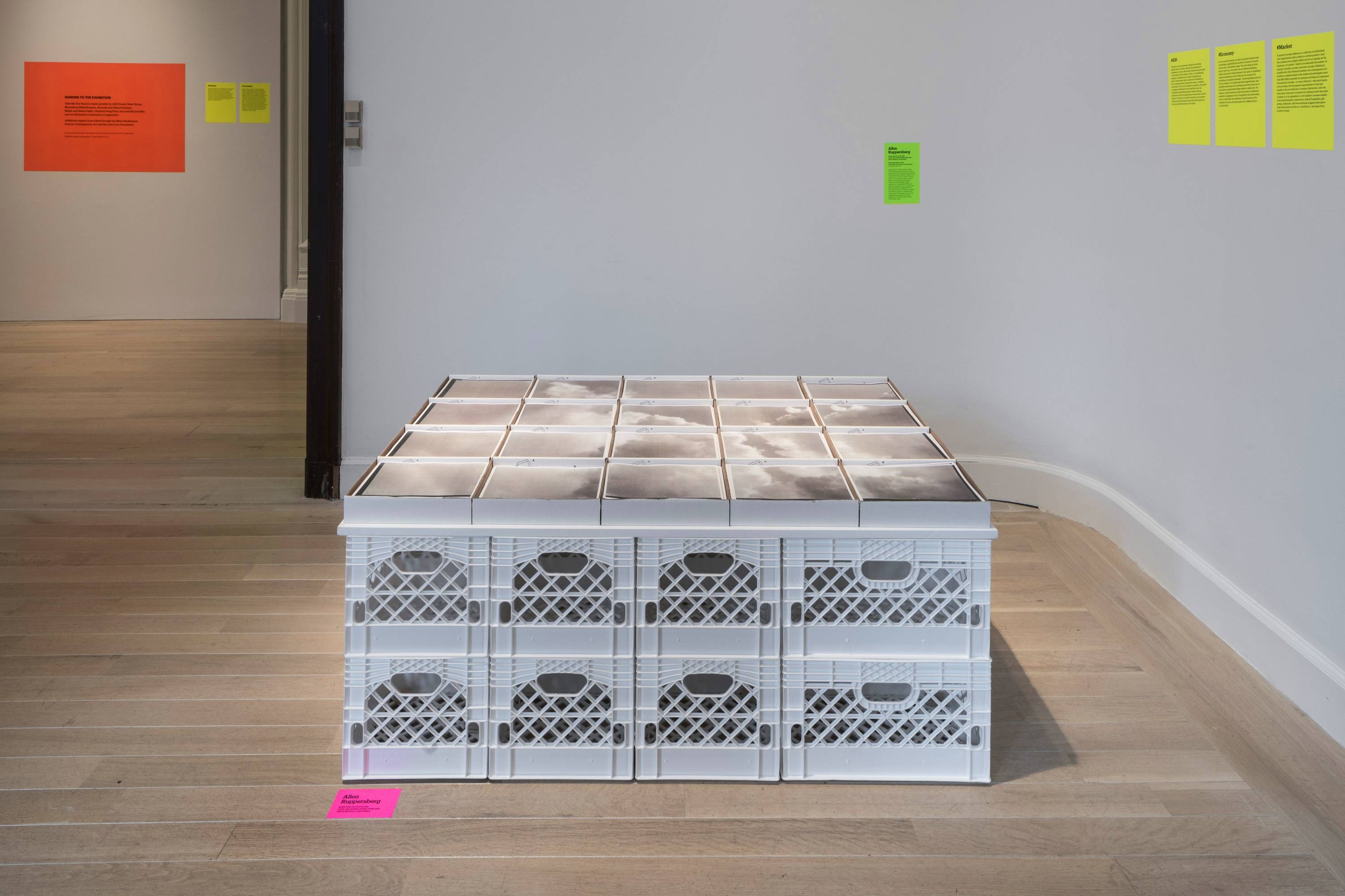
In an attempt to encourage visitors to do what they are not typically supposed to do in a museum—touch, take, and own the art—our design subverted the typical museum space by referencing high-traffic retail spaces. Like dollar store products, the artworks are displayed so that consumers are inclined to engage with and acquire what speaks to them.
Photographs by David Heald
Photograph by Will Ragozzino
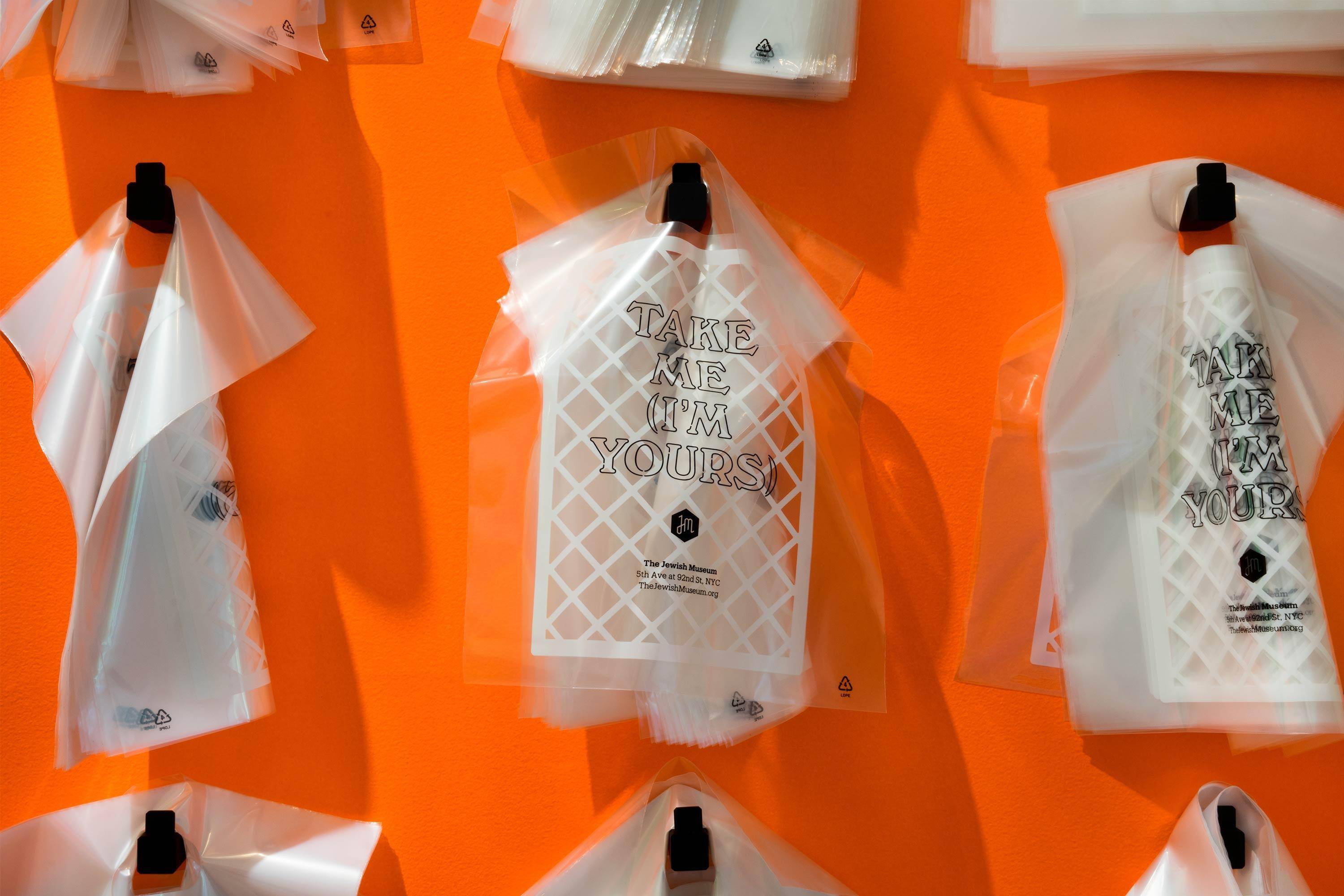
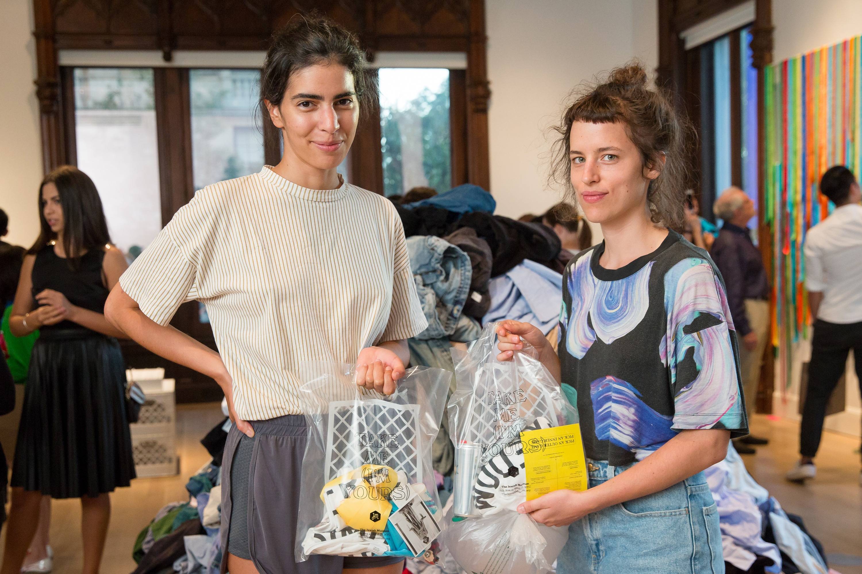
We created takeaway bags for the exhibition’s entrance. Their design included the exhibition’s title and a reference to our white milk crate displays. These bags were mainly transparent and served as a container for the Museum visitors/participants to display their new art collection.
Photograph by David Heald.
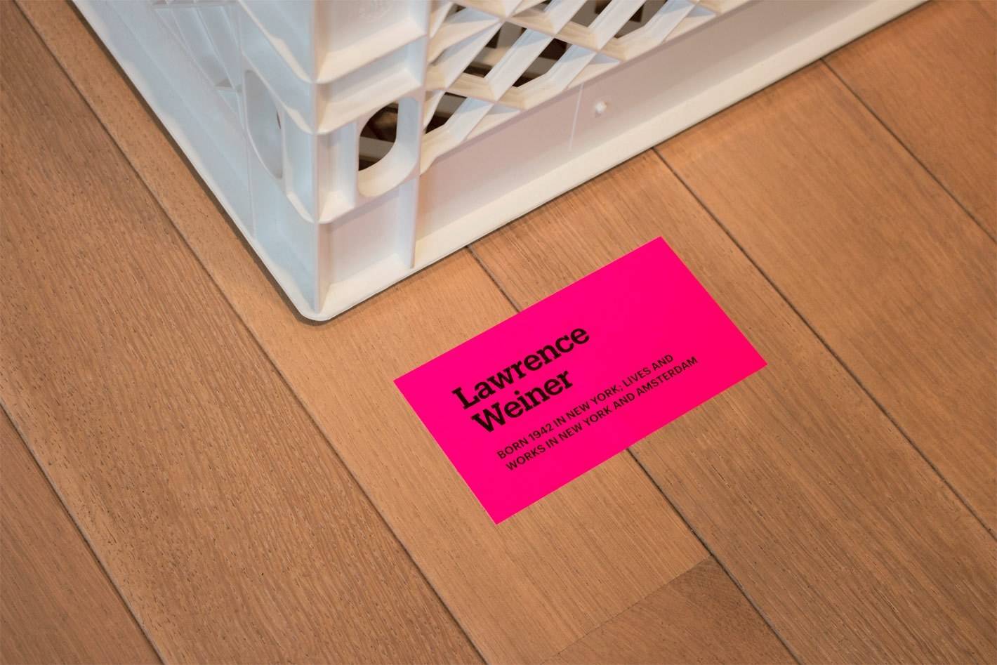
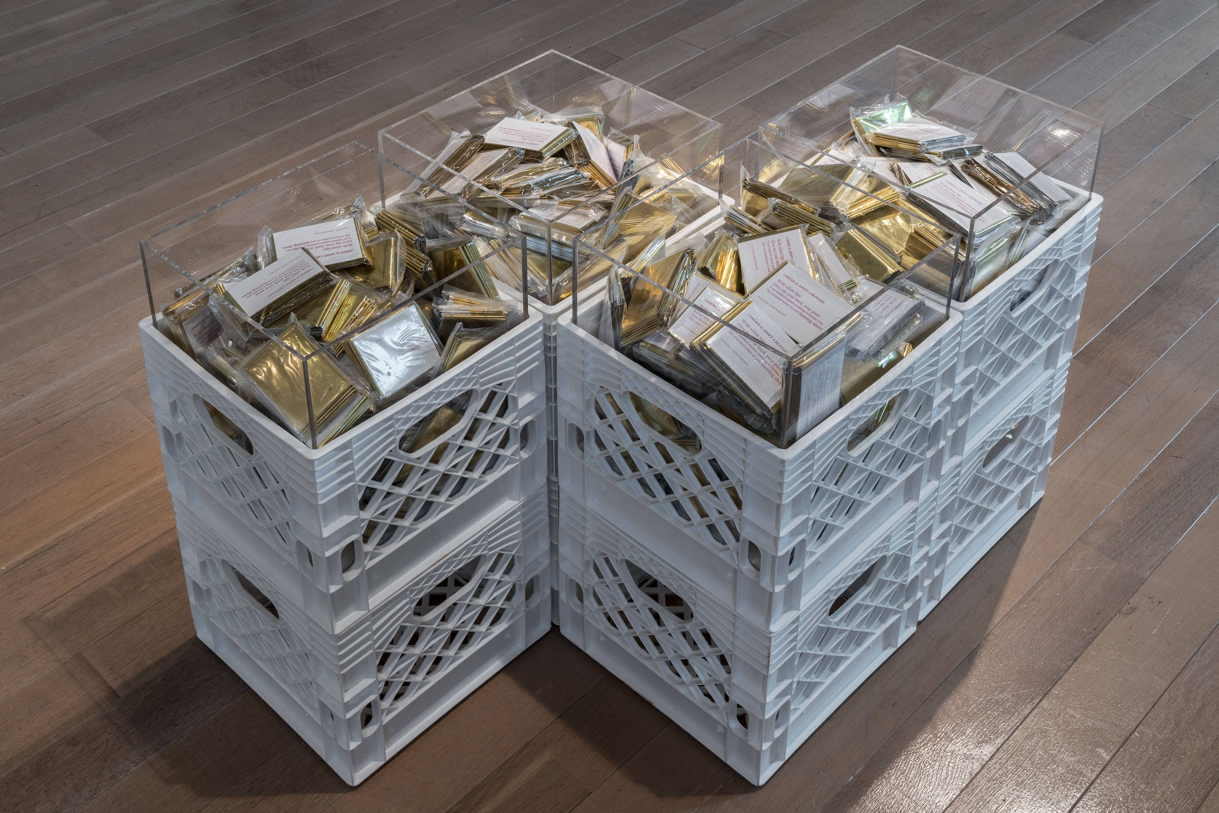
We used neon and adhesive paper labels to reference retail sale displays. Readymade milk crates helped to create bargain bin-esque exhibition displays; they functioned as containers and pedestals for loose artworks, as well as subliminal encouragements for guests.
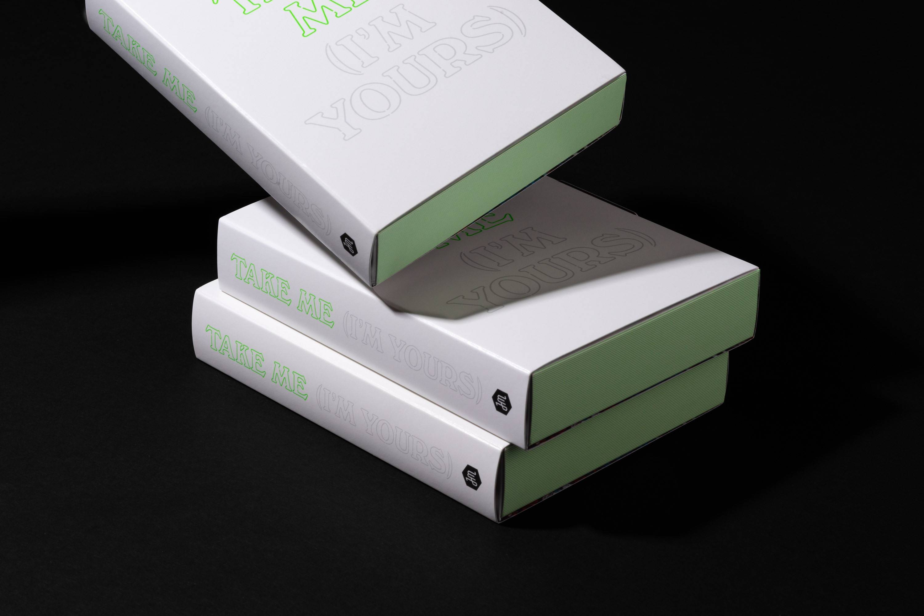
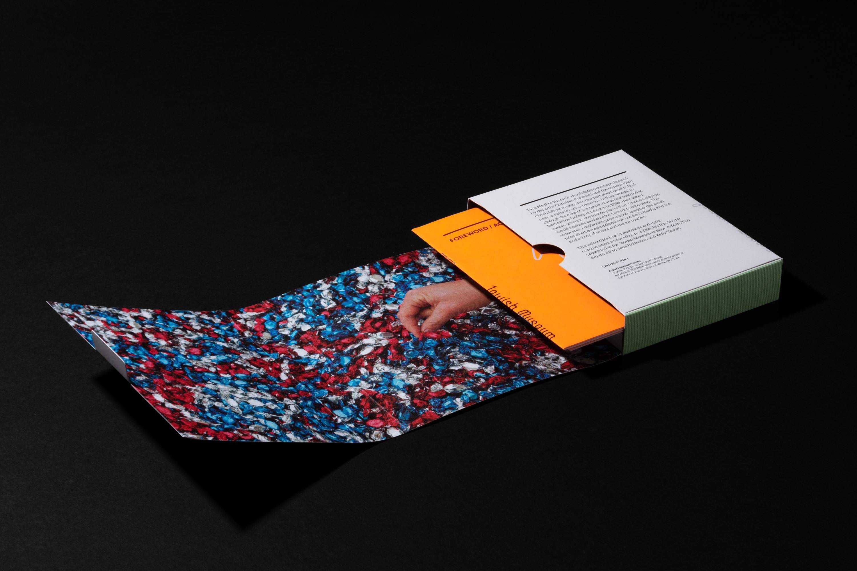
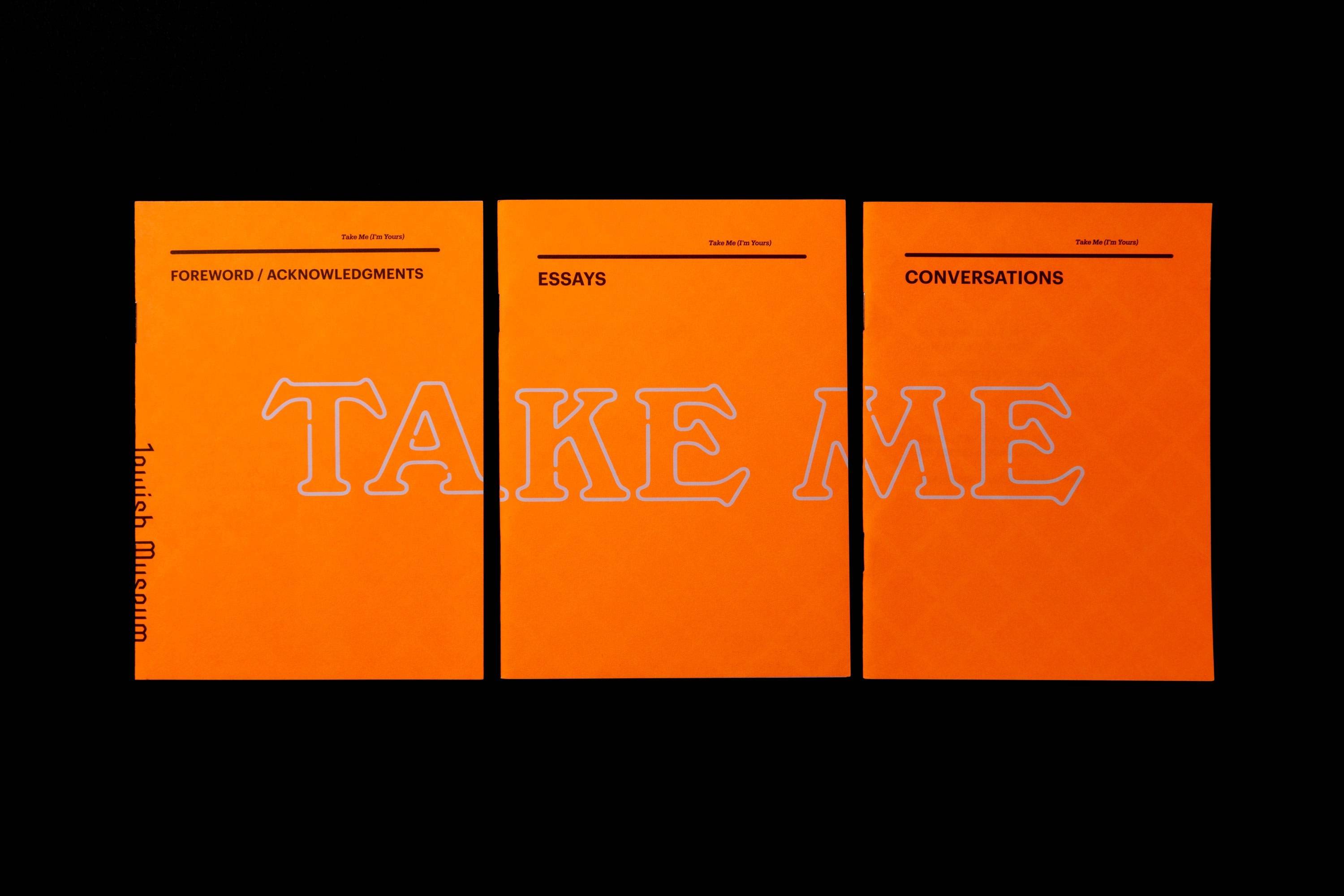
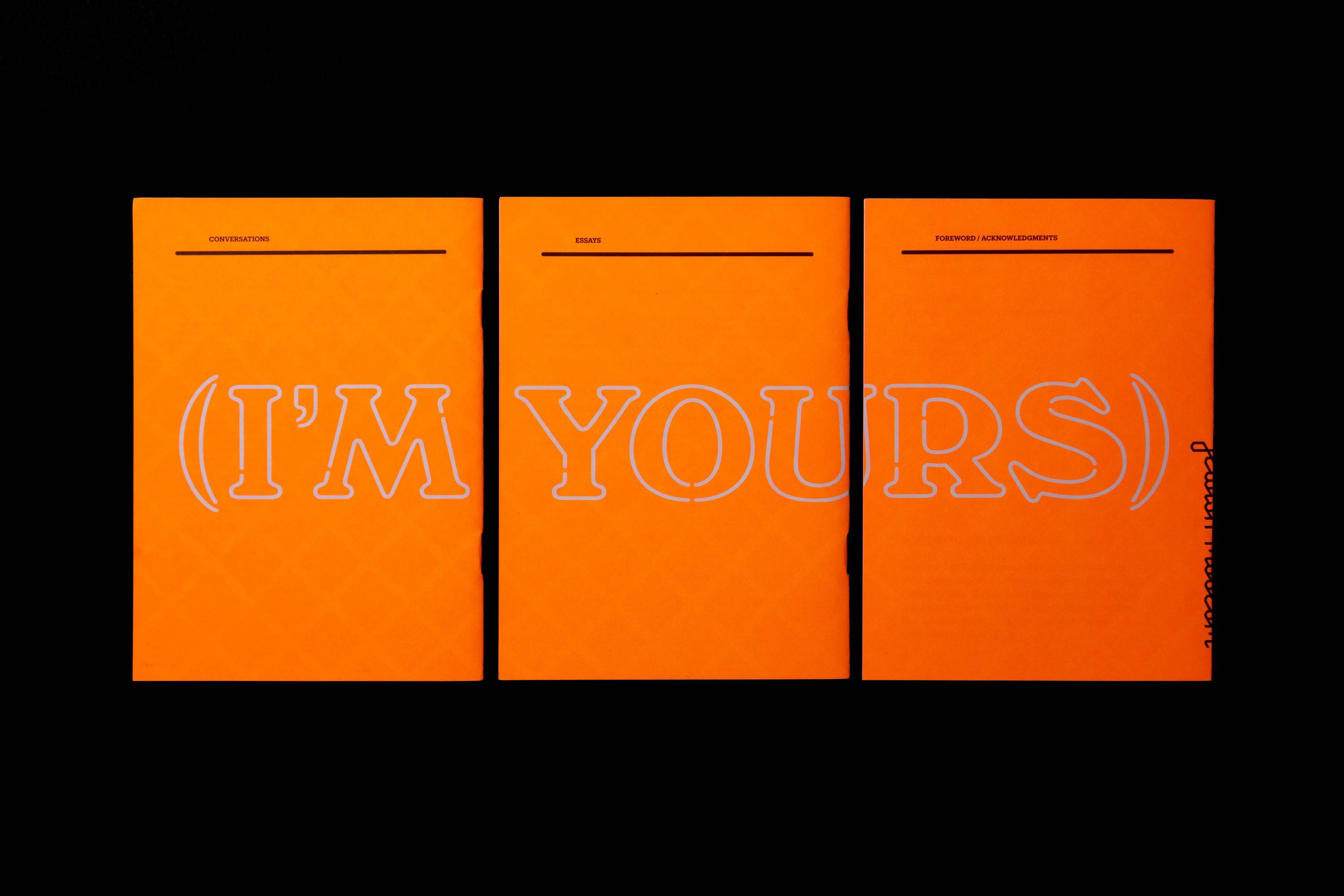
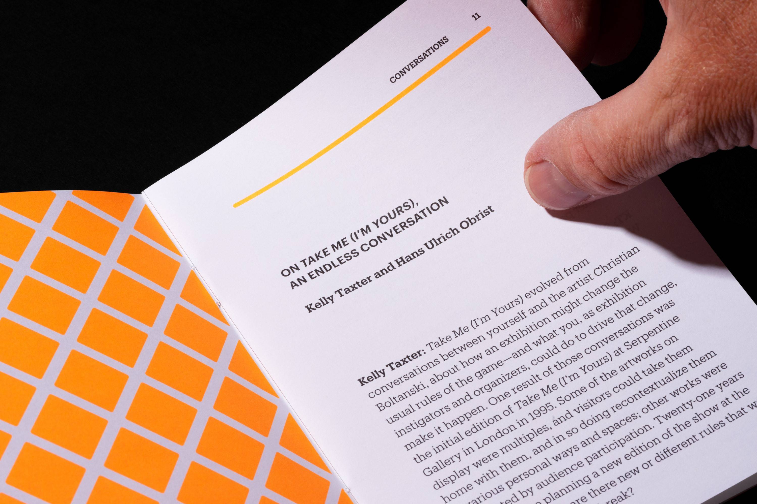
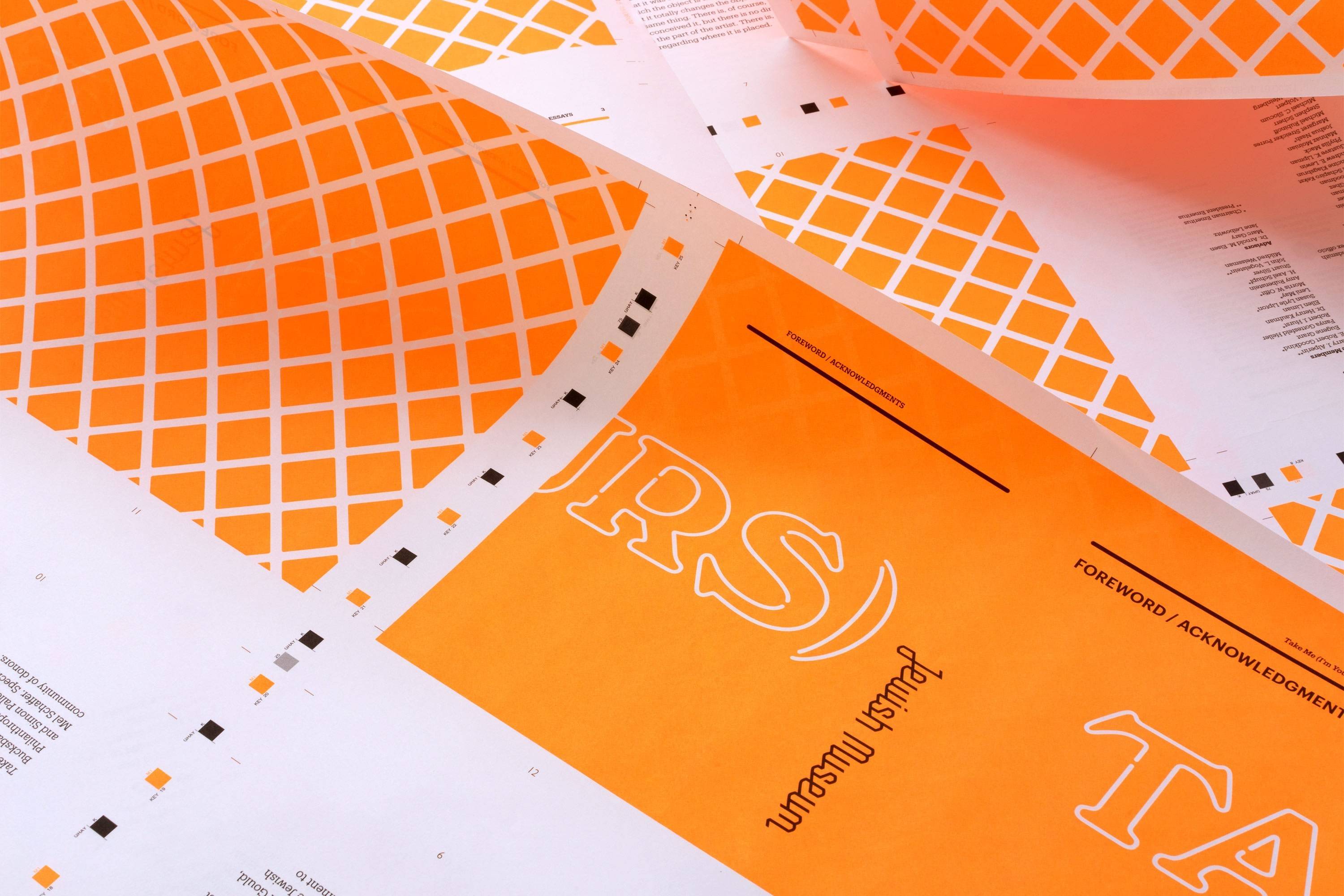
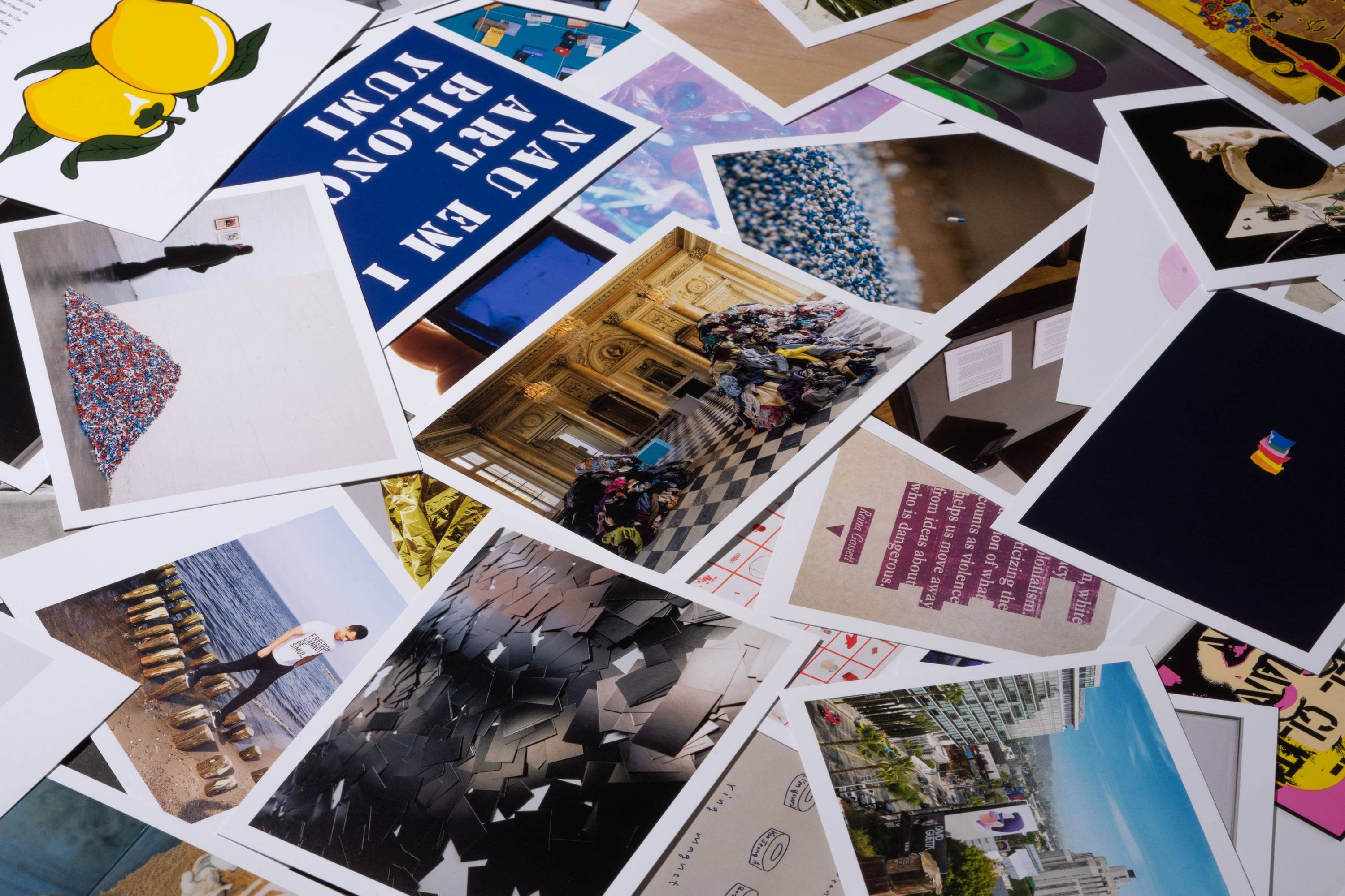
We created this exhibition catalog design; the box contained over 40 postcards and three separate but connected saddle-stitched booklets.
Image detail of Felix Gonzalez-Torres’ “Untitled” (USA Today), 1990
To attract attention and inhabit the retail theme, digital marketing assets utilized big-box sales vernacular and neon colors.